Yearly Analytics
✕
Overview
Context
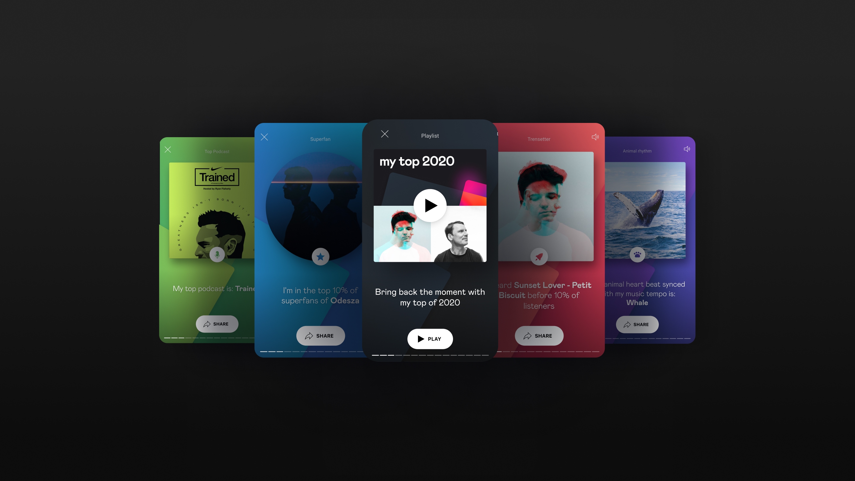
Deezer, a music and podcast streaming app, has launched an event called <MyDeezerYear>, which is an annual recap designed to show users their consumption patterns. Through such data, users can gain a better understanding of their musical tastes and habits.
Needs
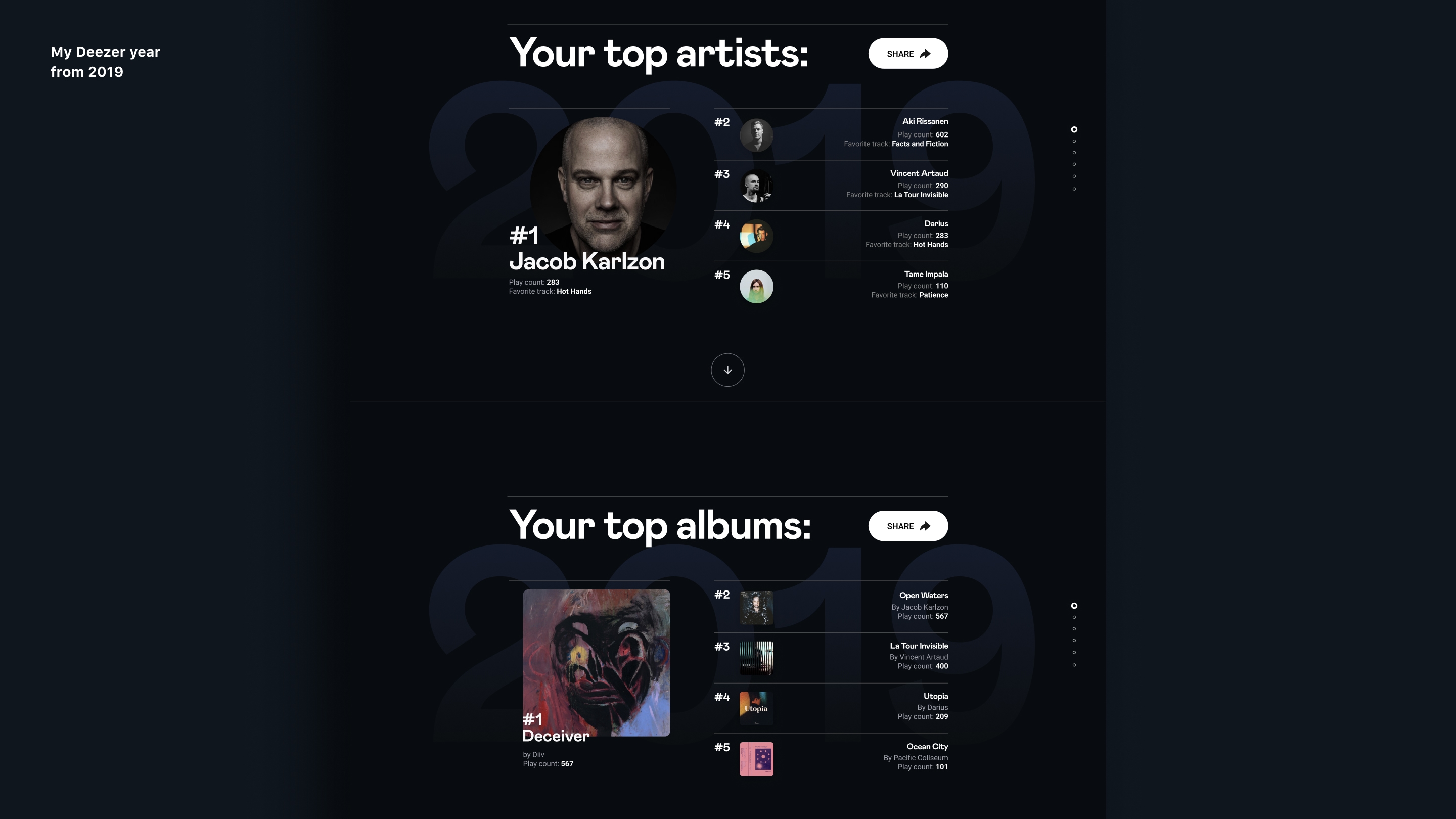
In 2019, the first annual recap was launched, showcasing users’ top 5 songs and artists, along with their listening habits. Despite its success, there were a couple of frustrations with the previous experience:
- User need: Easy access within the app and the ability to share content directly on mobile.
- Business need: Increase sharing rates by establishing a sustainable framework that endures within the app.
Overview
Goal
Deezer aimed to achieve a promotional effect through the yearly recap, not only ensuring that users enjoy the content but also encouraging them to share it as a sign of appreciation. To fulfil this business goal, we had to ensure user satisfaction, aligning the needs of both the business and the users.
Problem to solve
How can we establish a sustainable framework for the yearly recap that users will appreciate and that will endure within the app?
Contribution
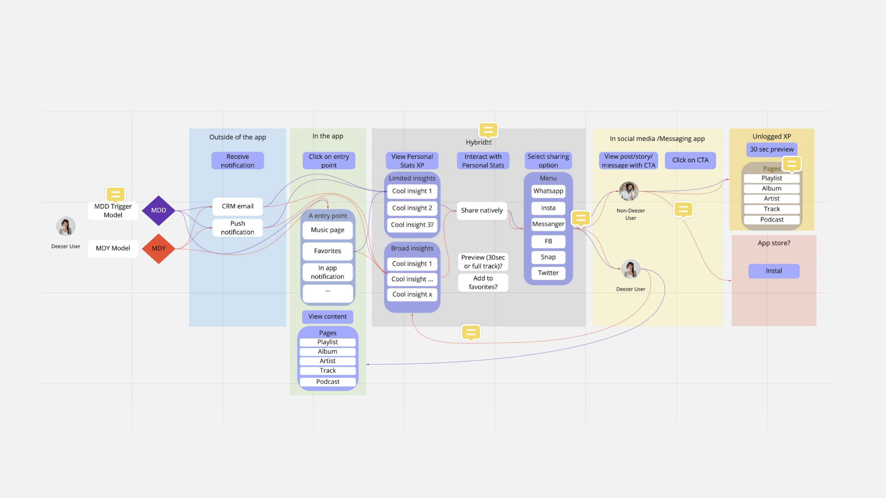
My role in this project initially involved reevaluating the previous experience through the new design. Considering the business’s requirement for a sustainable framework, I had to transform an external experience into a seamless native in-app interface. My primary focus was on resolving users’ frustrations while aligning with the business needs.
Process
Design needs
Durability
Because the recap was planned to be created regularly, we had to build a robust framework capable of accommodating various types of content that could change over time. The potential evolution of content was highly likely as users might appreciate or dislike the content during user tests or product launches. Additionally, if the app introduces a new feature, it could generate a different type of data, leading to new types of content.
Shareability
In order for users to share, they needed to be satisfied with both the content and how it was presented on their social media platforms. Transforming raw data into an engaging and easily digestible story required a strong narrative structure.
The hook model
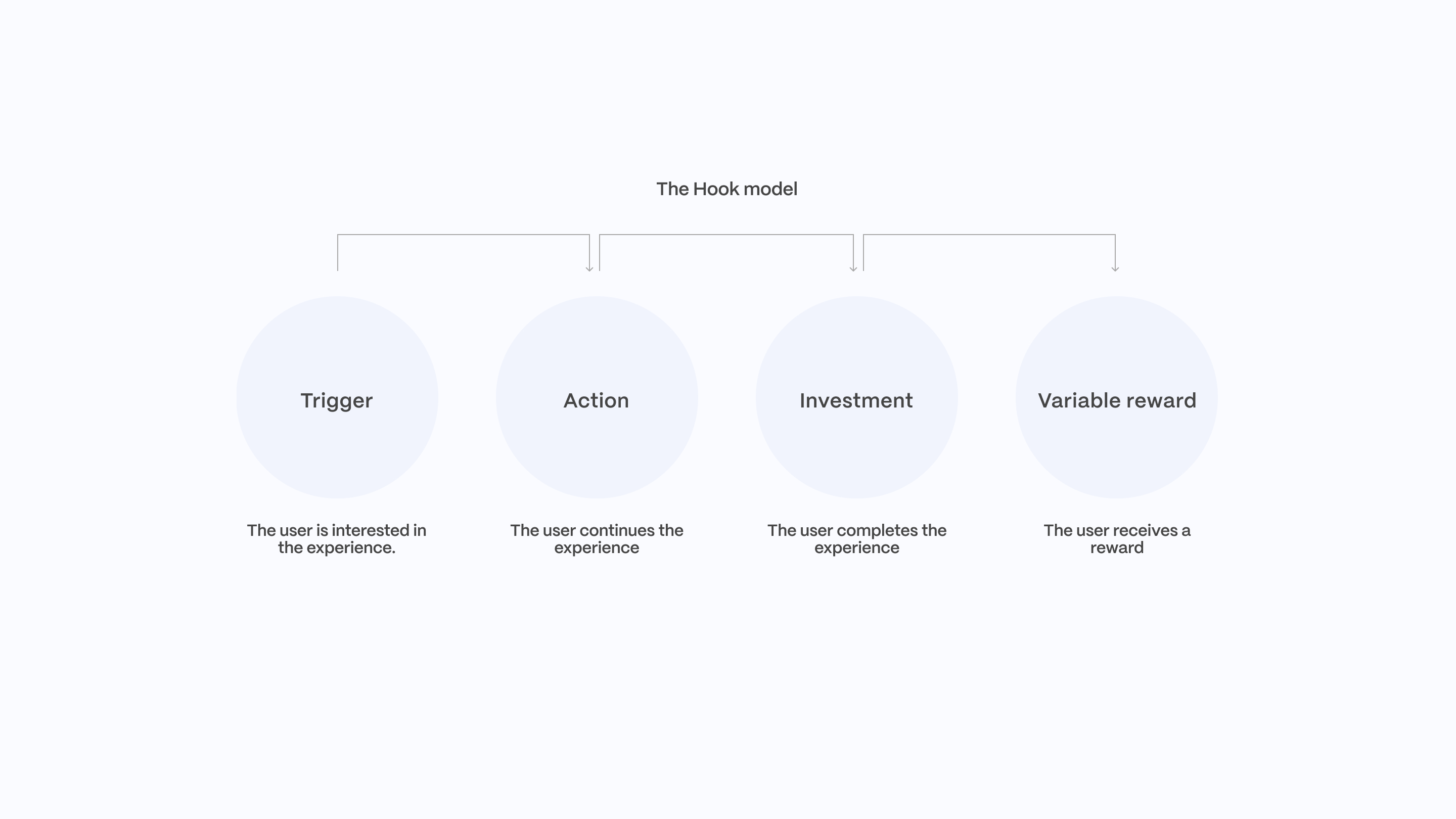
To create an engaging story experience, we drew inspiration from the well-known hook model defined by Nir Eyal, comprising trigger, action, investment, and variable reward. To pique users’ curiosity at the start of the experience, we opted to provide content that users are already aware of and familiar with. When users embark on a new experience that places them in an unfamiliar state, it is essential for them to recognise something familiar to spark curiosity from the beginning.
Landing page vs Fragment page
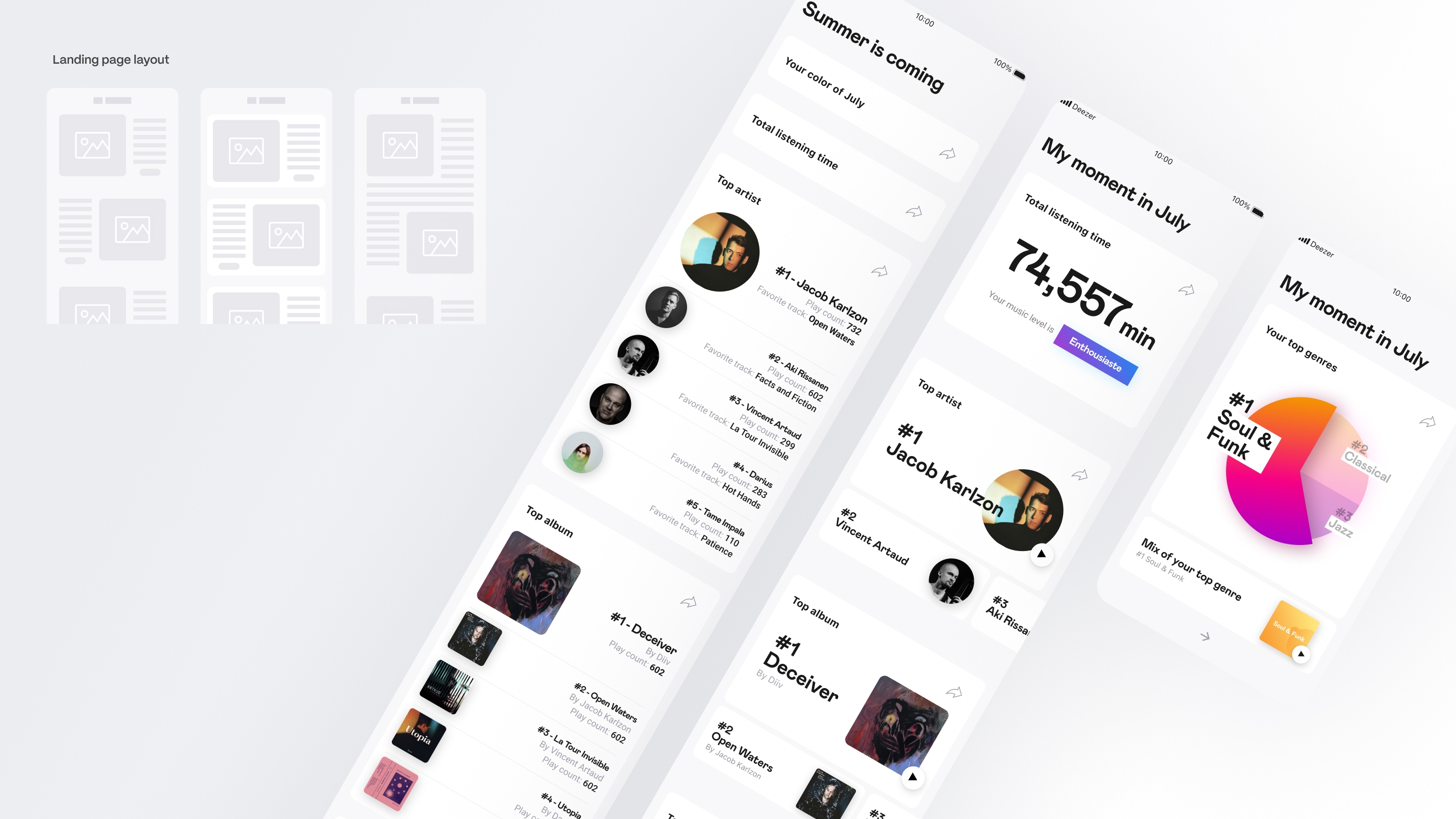
Landing page (Long scroll)
Last year, ‘My Deezer Year’ was launched as an external website in the form of a landing page with a long scroll of content. Each section displayed content differently, adding visual interest while introducing an element of unpredictability when shared on users’ social media.
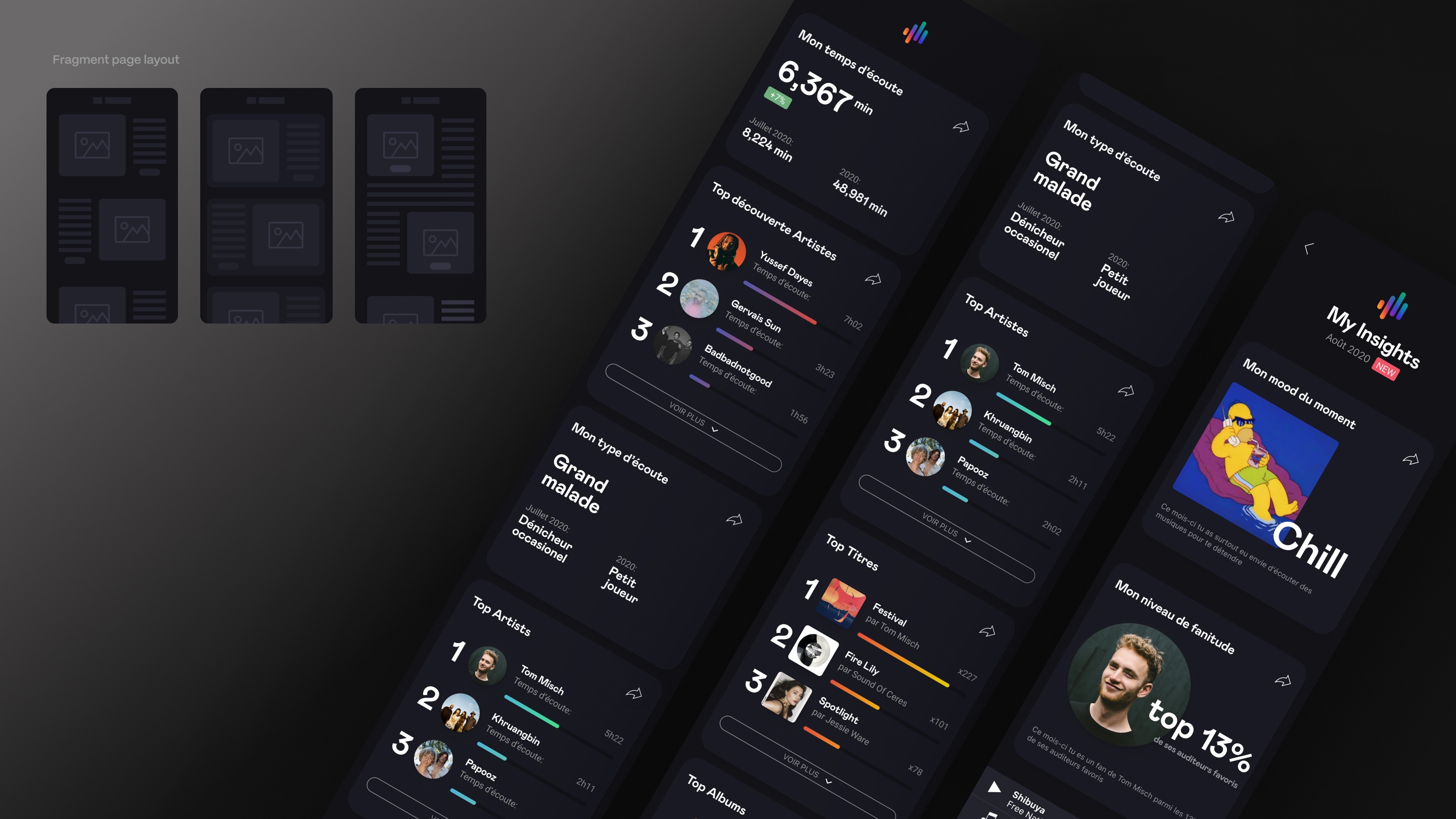
Fragment page (Short scroll)
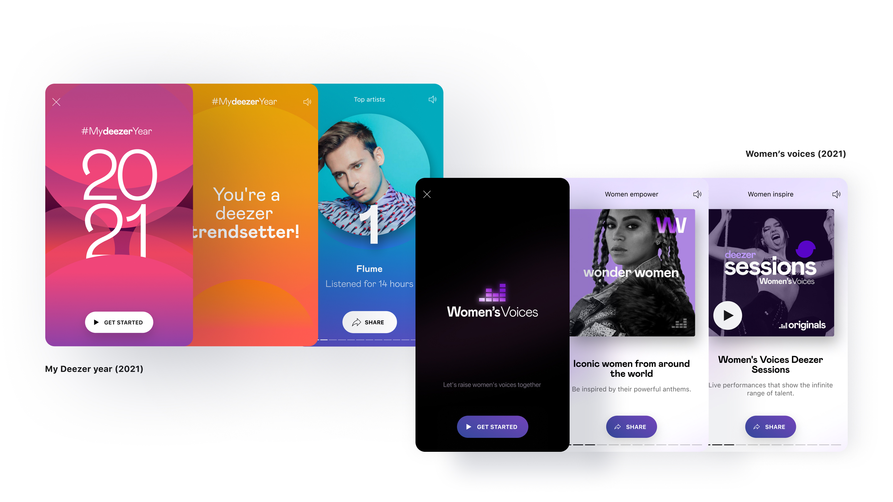
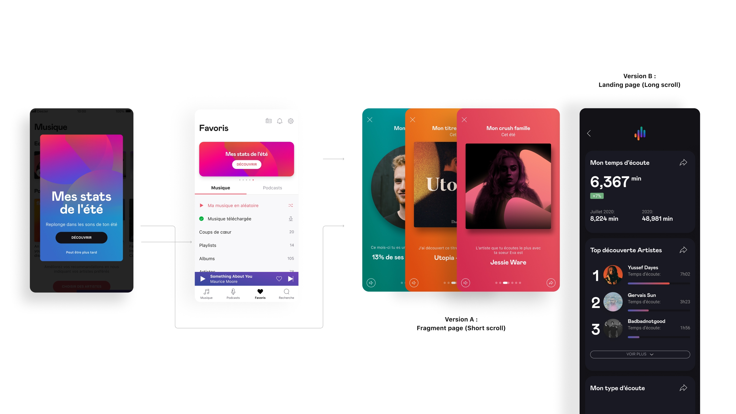
The abundance of information in the long scroll version could overwhelm users, decreasing their engagement at the beginning. To address this issue, we decided to test a simplified framework that transformed statistical data into engaging stories, turning data into fun facts about users. The use of fragment paging also provided a structural advantage with its straightforward format, enabling a ‘what you see is what you share’ rendering for social media.
Process
First prototype
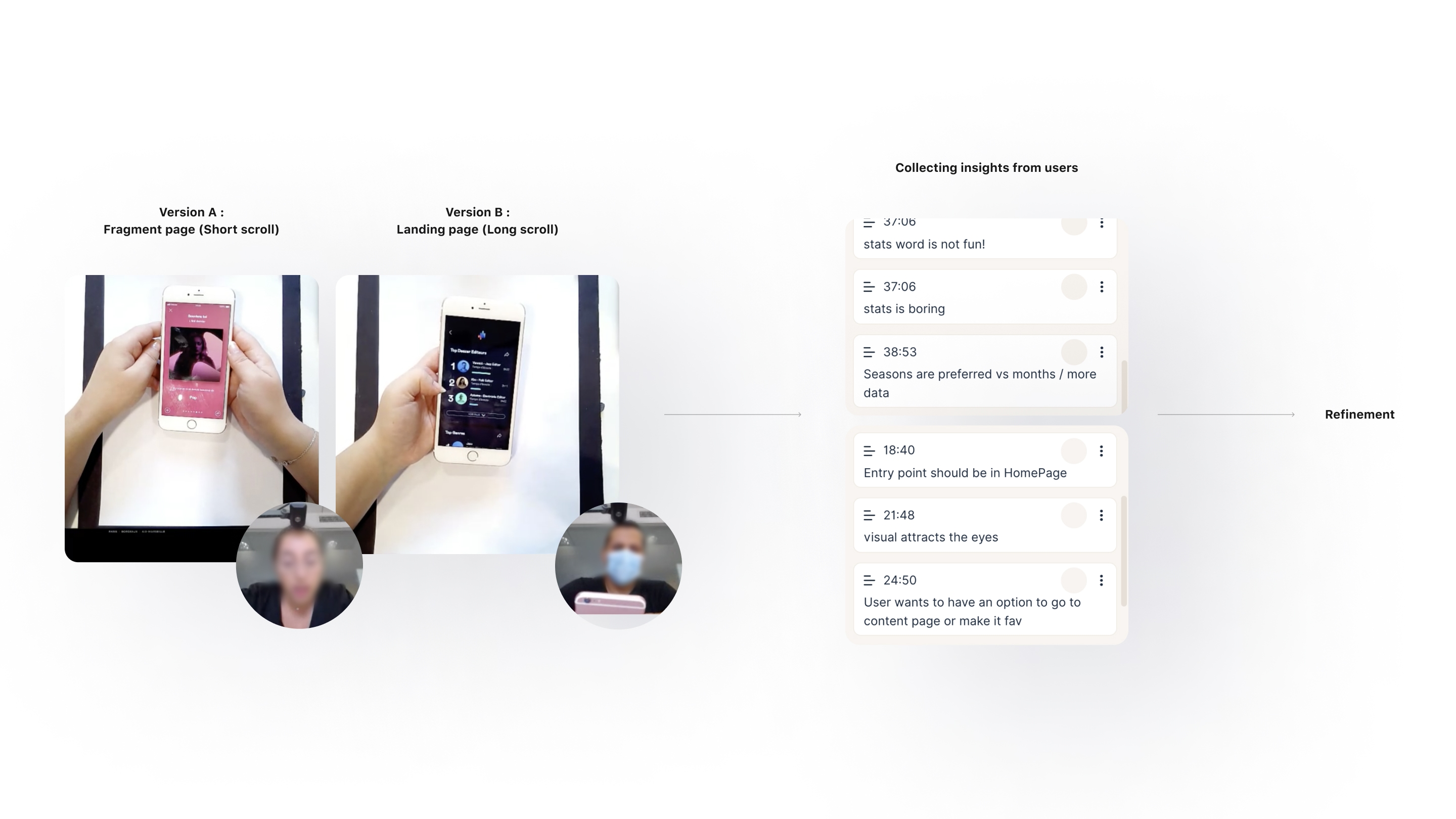
In terms of the framework, we decided to conduct a user test comparing two different layouts: long scroll versus fragment paging. This test aimed to determine which type of framework works best. Users started from the same entry point and experienced both a short scroll type (version A) and a long scroll type (version B) in mixed order. They then shared their feelings and preferences.
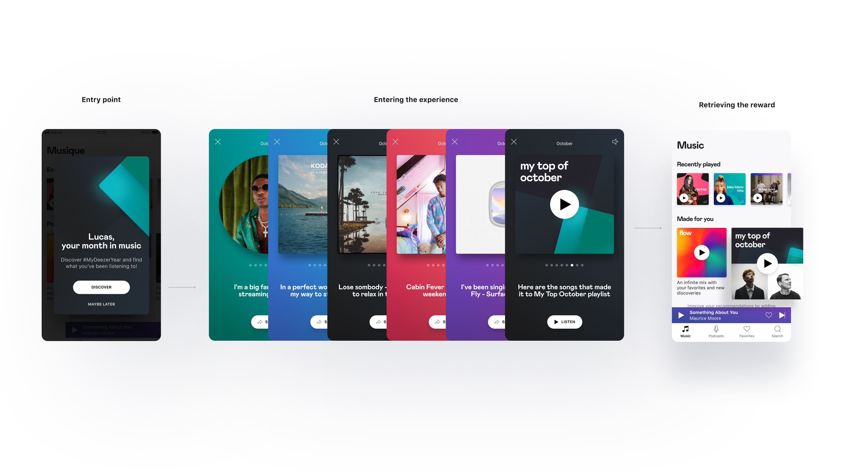
Regarding the content, in order to create an effective hooking system as mentioned above, we displayed the user’s favourite artist to pique their curiosity with familiar content and provided a reward in the form of ‘the top of the month/year playlist’.
Context
We conducted in-depth user tests in the French market with five users aged from 22 to 44 years old. Each test lasted 60 minutes, allowing us to collect information on what users think about different versions of statistics and their preference for each stat.
Result
Most users preferred the fragment paging because it was more interactive and visually easy to read. Focusing on one piece of information per card gave them an experience with higher legibility. The gamification with the swiping gesture and the other interactive elements, such as graphics and the background music, made them want to continue to see the next pages.
Most users enjoy reading about their top artists, songs, or genres. They appreciated the cards that go straight to the point such as favourite track, artist, or total listening time that show users’ taste at a glance.
Launch
Structure
With the insights we received from users, we applied them to the design to enhance the experience. We opted to eliminate unnecessary actions, retaining only the main action—‘share’—which aligns with our business needs.
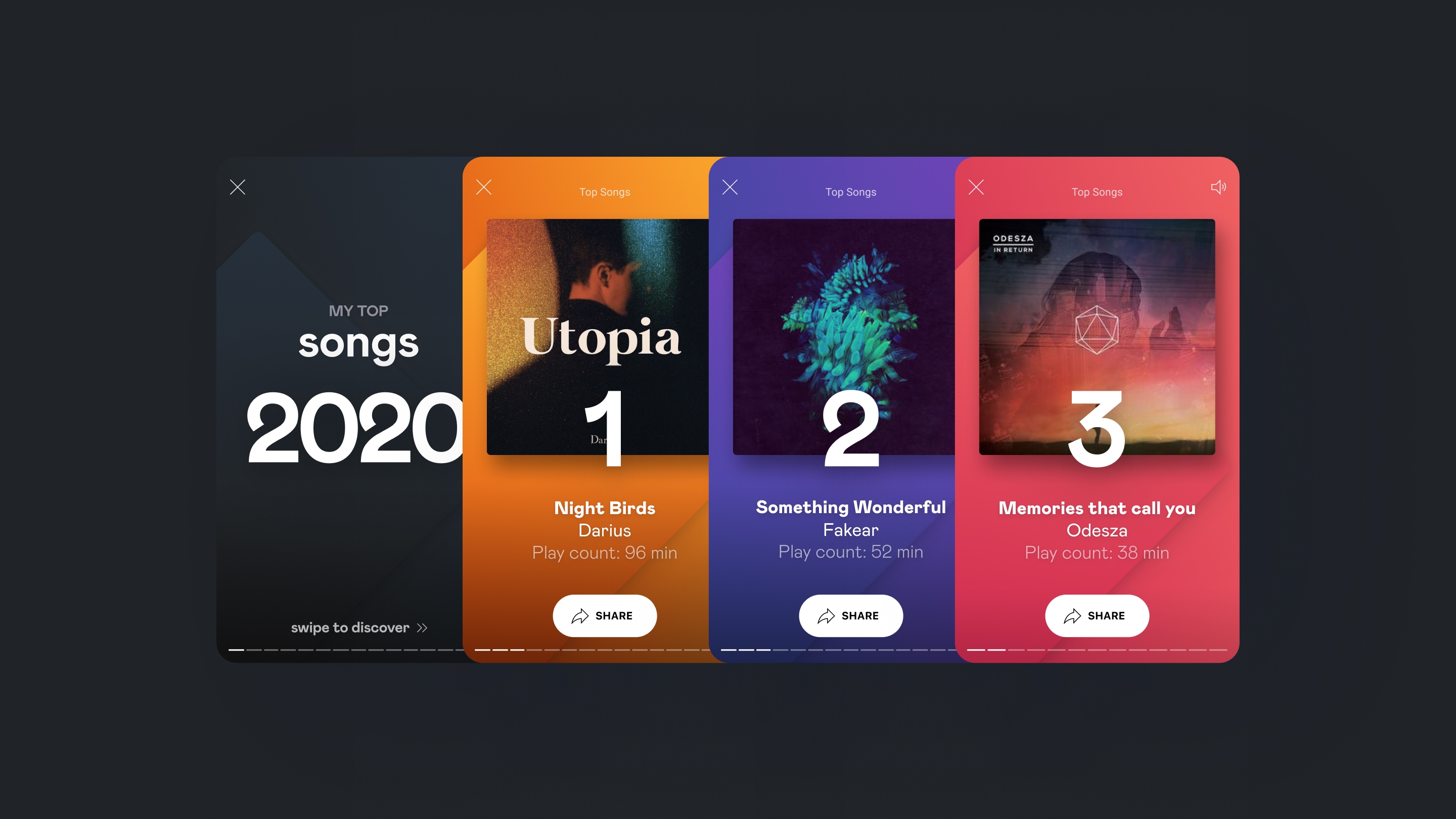
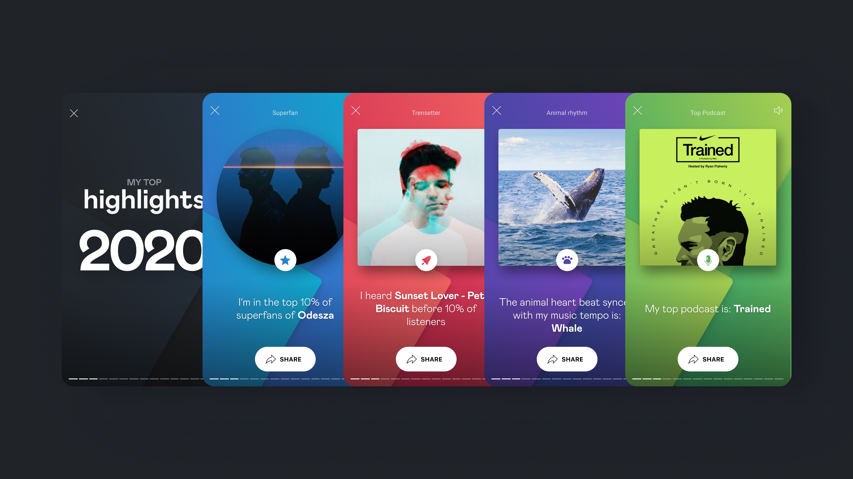
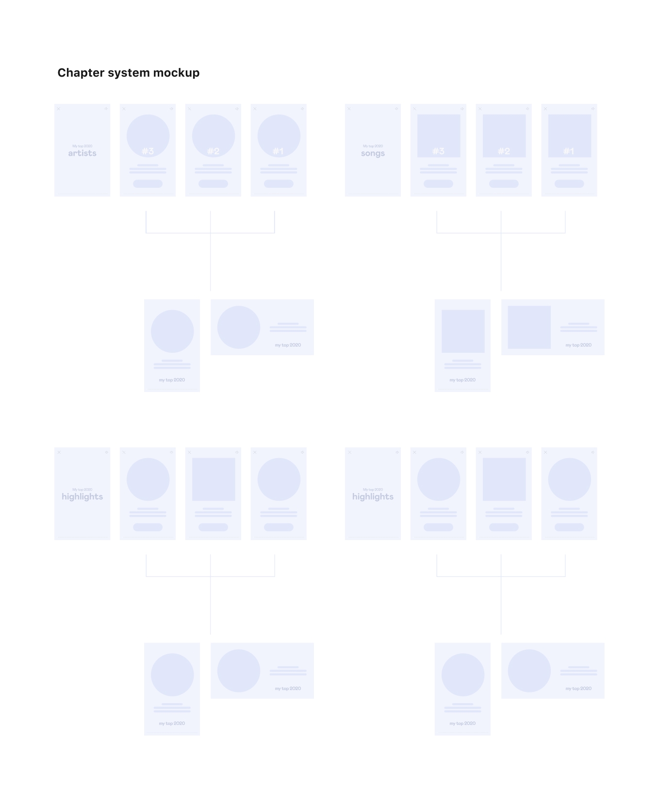
In terms of storytelling, we chose to begin with the most impactful information, such as top tracks and artists, before delving into retrospective details, like the most-listened track on the weekend or the most sing-along track. As users appreciated reading about their tops, we applied a chapter system, a way to keep 1 content per card and gather cards under the same category.
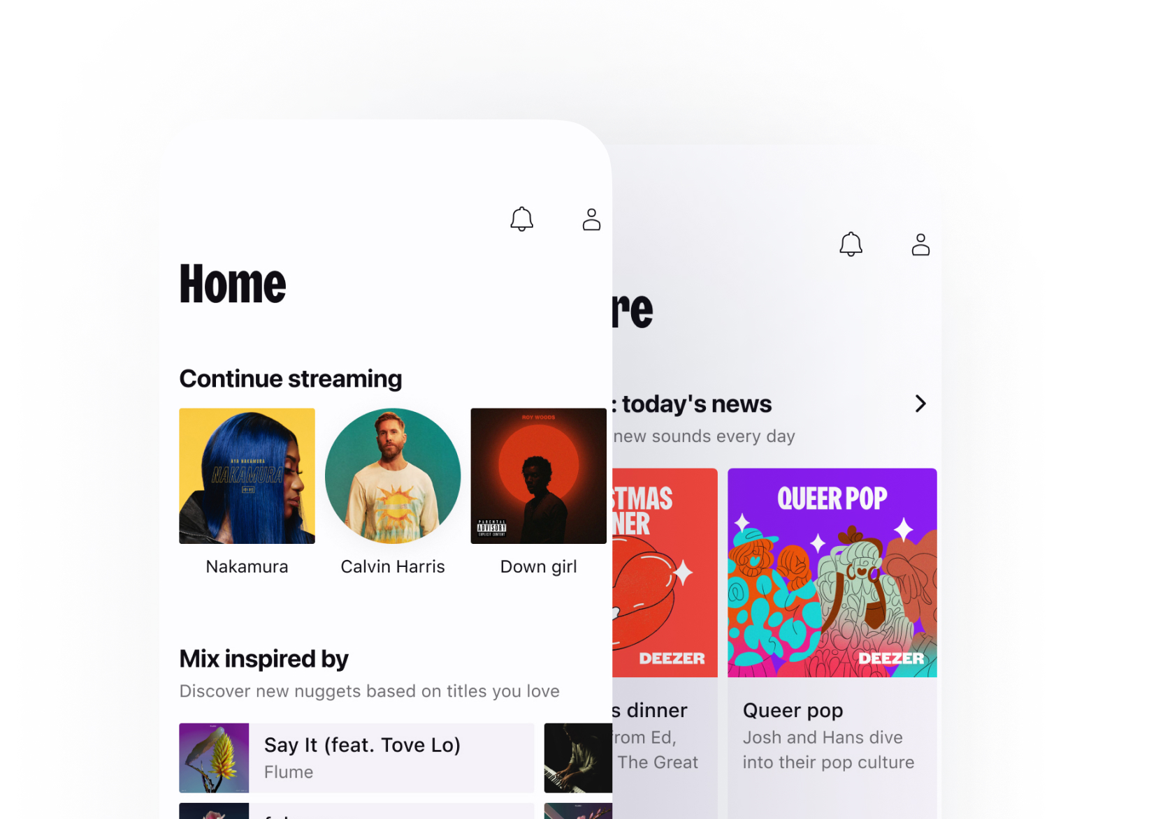
The reward system, a playlist of their top songs, was highly appreciated. Therefore, we decided to retain it. Additionally, we enabled users to find the reward on the homepage once they unlocked it.
Interactivity
Eye focusing element
Especially since we were considering a chapter system, we decided to display the ranking as an element to draw users’ attention and create a link from one card to another. The prominent ranking numbers or badges that pop up in the center enable users to keep their focus.
Graphical continuity
Each time a user swipes, the background form moves from its previous position on the card. This graphical setting is intended to visually connect the interface from one card to another, harmonizing with the chapter system.
Sharing
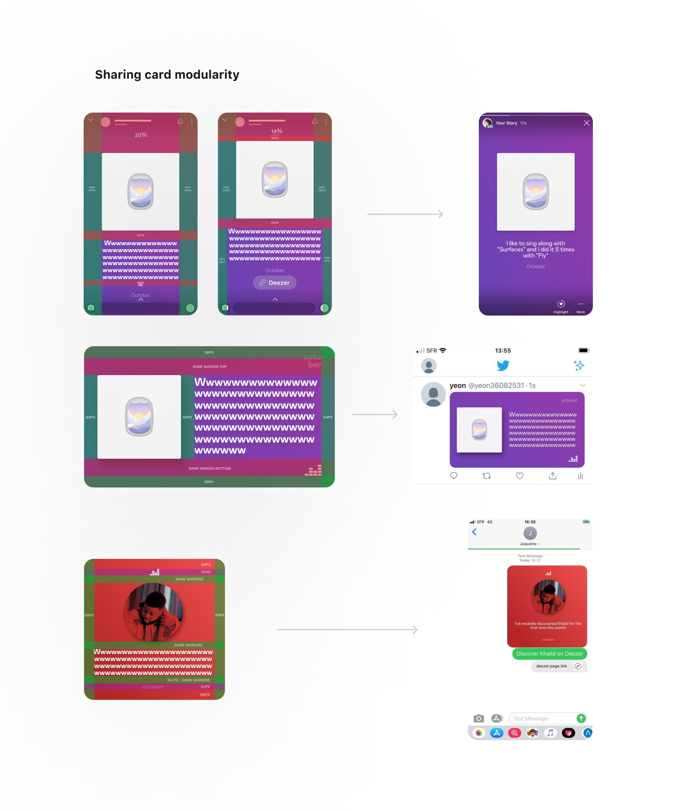
We had to consider the shareability in three stages: before, during, and after sharing. Before sharing, it’s the content that encourages users to share. During the moment of sharing, it’s a well-guided structure that allows them to share easily. After sharing, the closer the render is to the initial look before sharing, the more appreciation we receive from users throughout the experience. To achieve this, we played with the modularity of the framework, readapting the content into three different ratios for social media posts (portrait, landscape, square). This way, users can easily recognize the original state of the content.
Success metrics
Appreciation from users
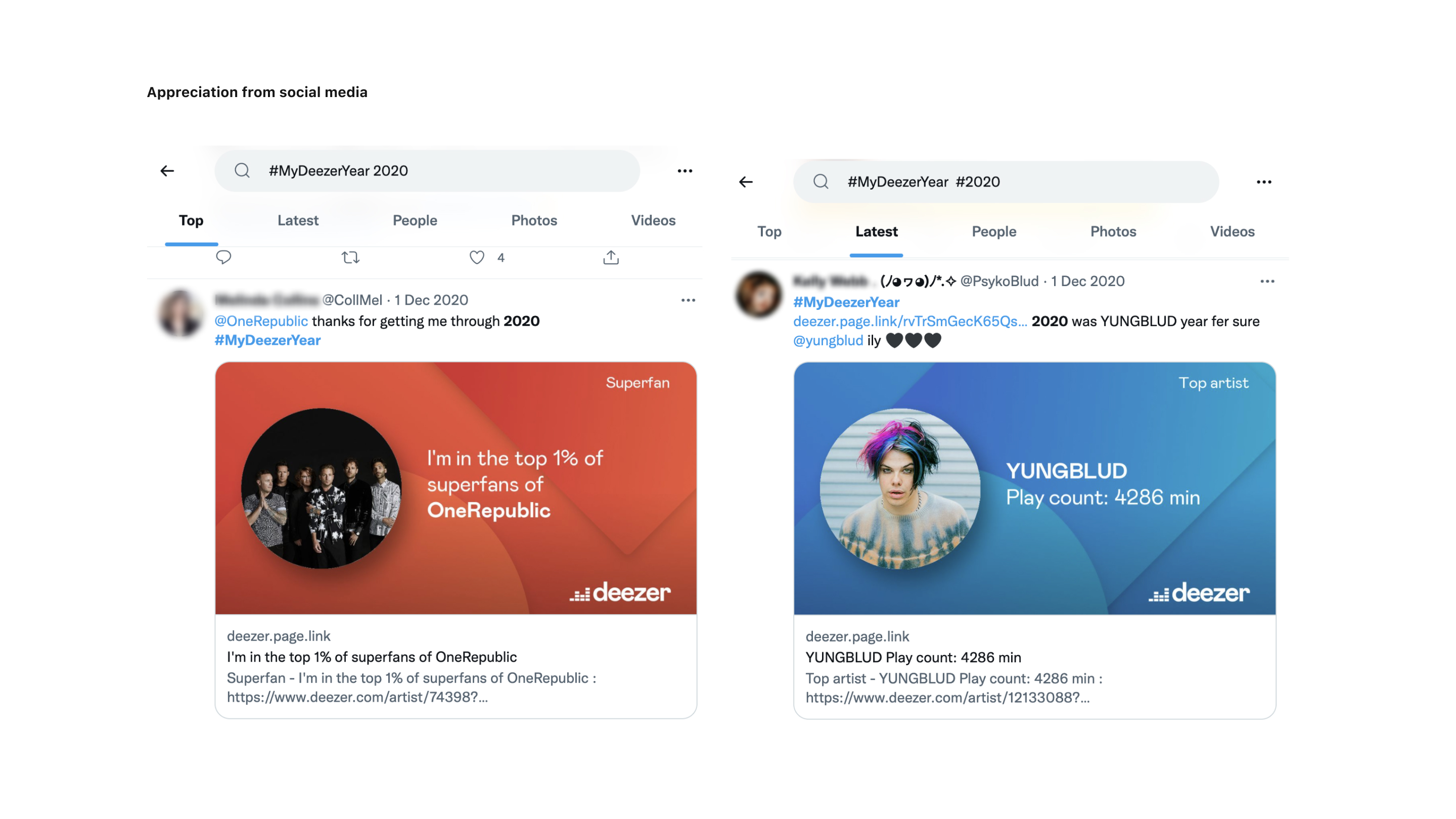
After the qualitative survey and the data collected from social media, the majority of users enjoyed the content and appreciated the simplicity of the interface.
Increase of sharing rate
The percentage of visits with sharing of the yearly recap increased from 13.56% to 15% between 2019 and 2020. Additionally, the share rate rose from 15% to 20% between the monthly recap and the yearly recap in 2020. Not only did the sharing rate increase, but the content shared on social media was also widely appreciated.
Durable framework
During the design process, our goal was to create a durable template applicable to other projects requiring editorial storytelling. With a template that has been tested and guaranteed successful, the company could effectively execute the next project related to data storytelling.