Deezer Revamp
✕
Overview
Impact
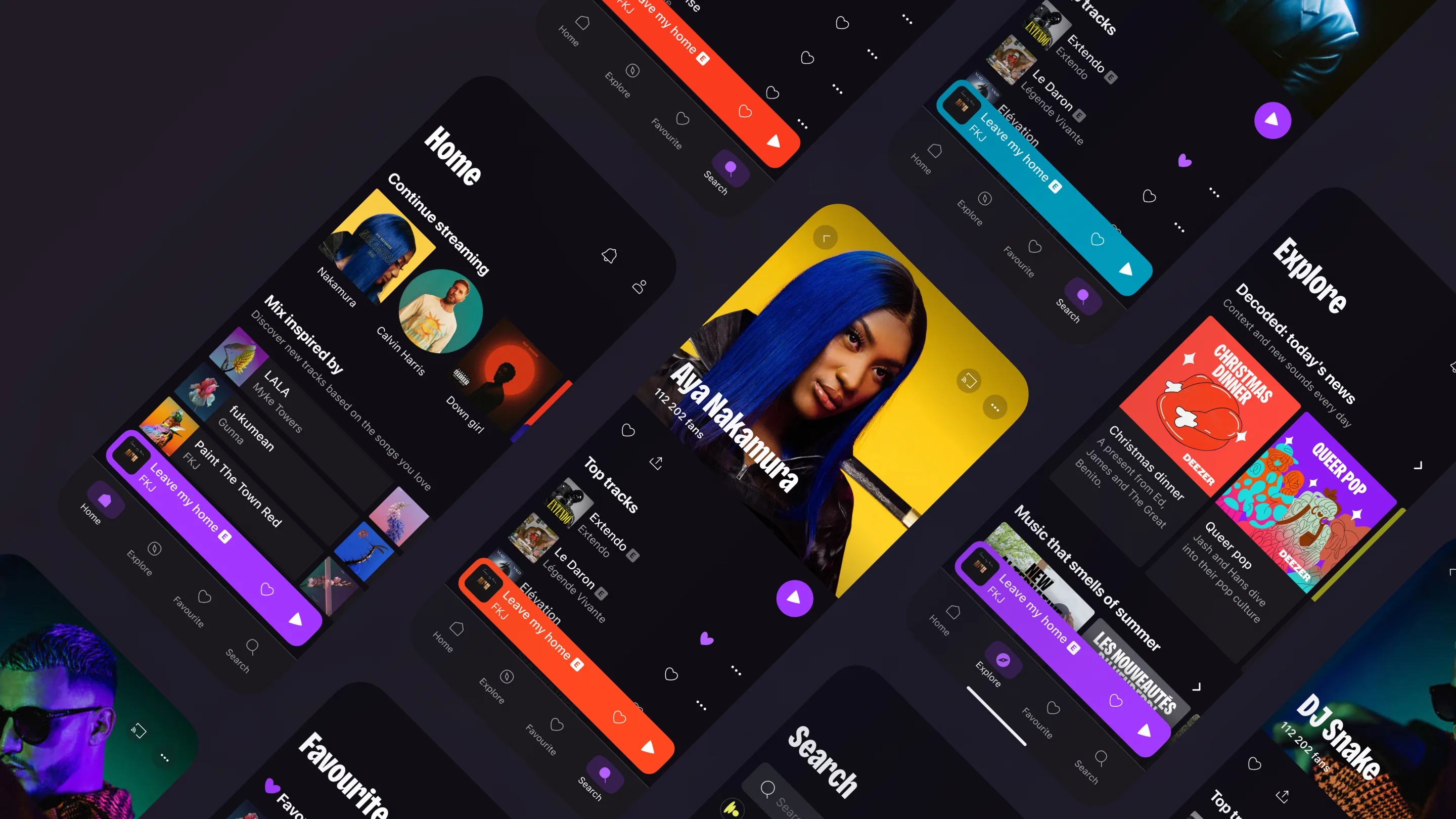
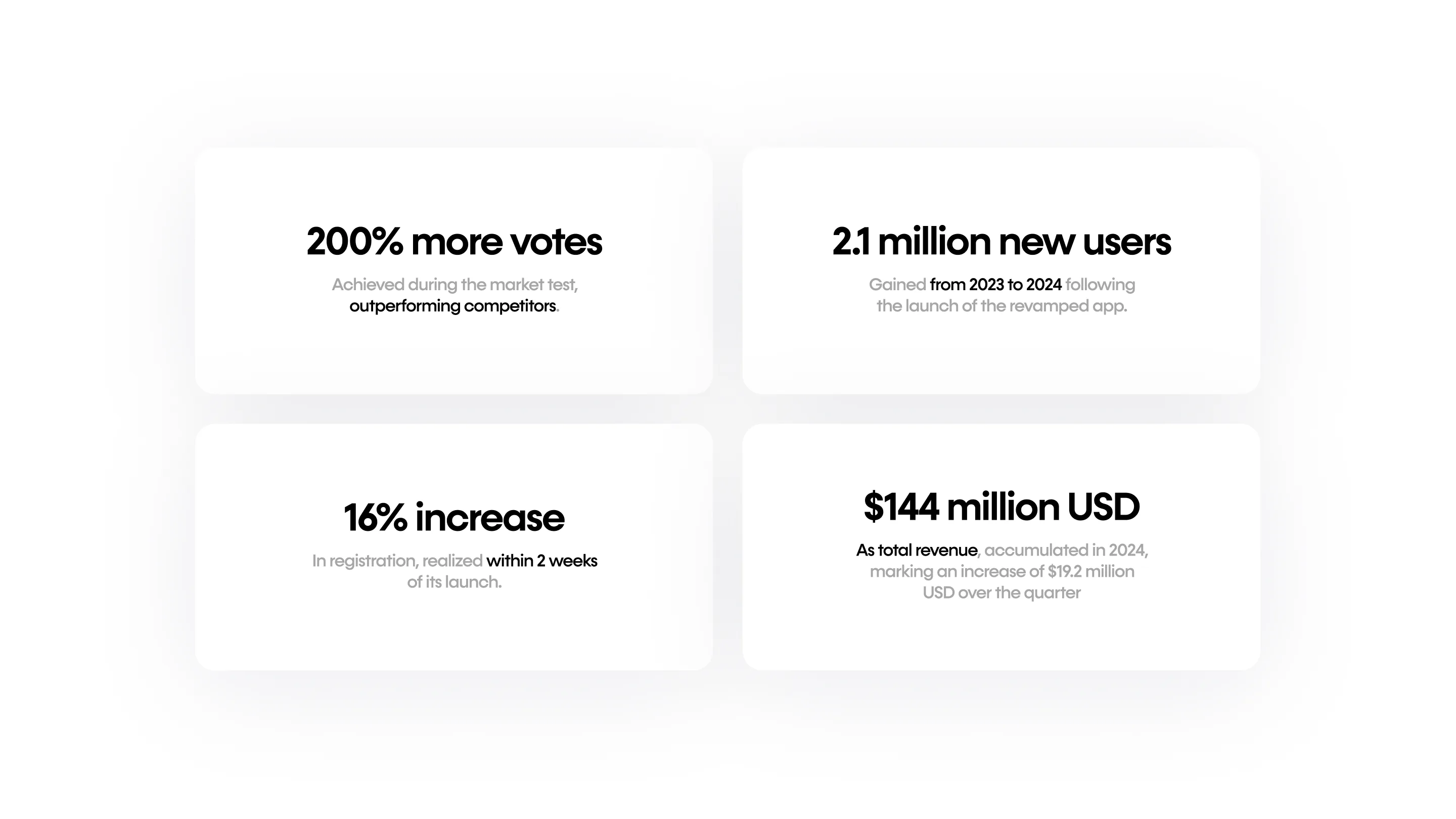
This project showcases my design process for the company’s global overhaul of the app interface, encompassing both UX and UI. The redesign led to a 200% increase in votes during testing and demonstrated a rapid increase in new registrations, up to 16% within two weeks following its launch. This revamp contributed to a 14.2% growth in the user base, and the total revenue reached €132.5 million (USD $144 million), reflecting an increase of €17.3 million over the quarter.
Contribution
My initial role in this project involved developing a new look and feel for the interface aligned with the branding direction. I proposed enhancements to the UX of the core structure, created new layouts and components that established the foundation of the new design system, and delivered high-quality screens.
Analysis
Context
With the emergence of Generation Z as the new primary customer base, Deezer aimed to dispel the stereotypes associated with its previous image and reposition itself as a refreshed and improved brand. The entire product required a comprehensive overhaul.
Target Audience
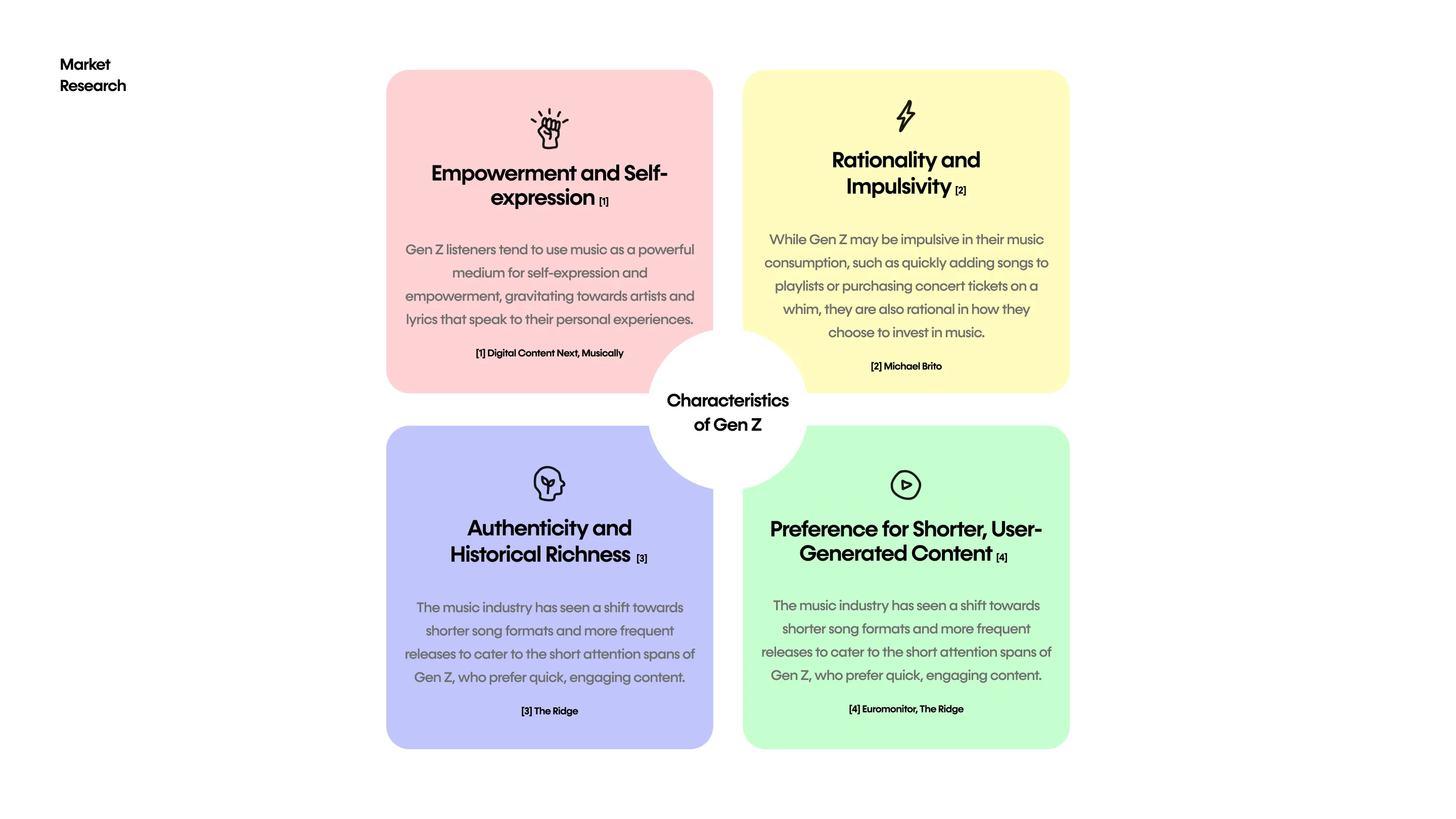
The company’s new target audience, individuals aged 18–25 (Gen Z), has distinct characteristics that differ from our previous focus on Millennials. Given Gen Z’s strong emphasis on authenticity and uniqueness, our brand strategy needed to embrace these values more fully. The key traits of ‘unrefined’, ‘honest’, and ‘bold’ emerged as central to our approach. These elements were crucial in guiding the branding and the revamp of our new user interface, ensuring that our offerings resonate deeply with this demographic.
Analysis
The past branding
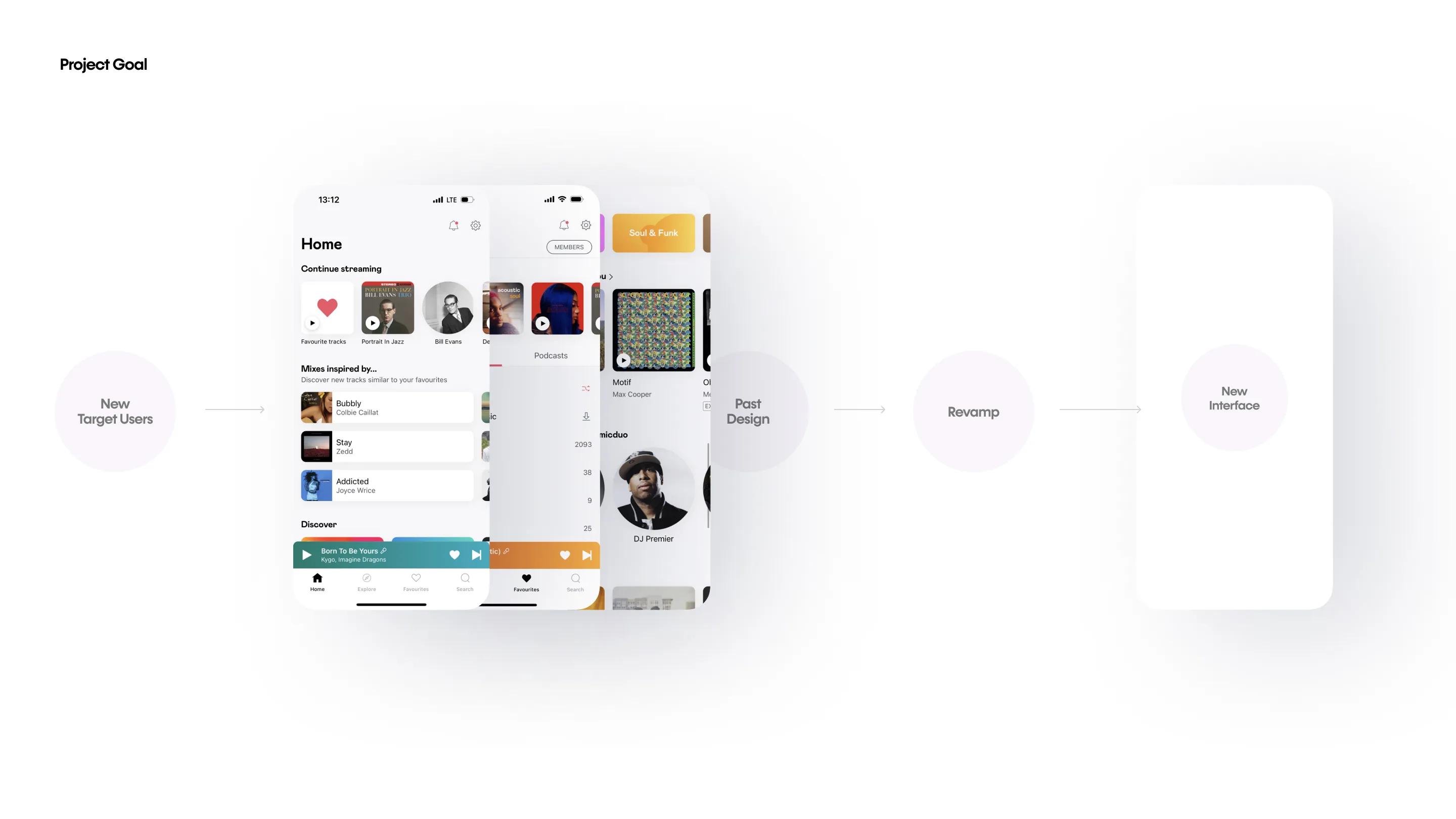
The previous product had maintained its brand for over five years. While the former brand and interface were clean and neutral, they lacked a strong identity. As users were familiar with the brand’s existing style, this project required a delicate approach to avoid creating any sense of alienation or confusion.
The new brand guideline
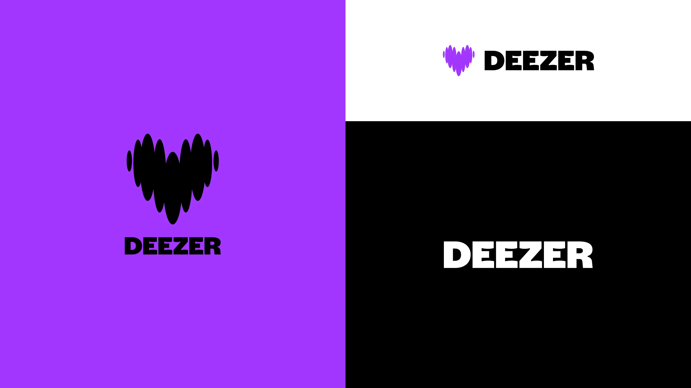
The company wanted to achieve three aspects through their new brand: Bold, Fresh, and Quirky. The new visual identity in the interface had to embody boldness, trendiness, and a touch of swiftness. The goal of this revamp was to attract the company’s new target, Gen Z, while accommodating the comfort of current users, Millennials.


Goal
Problem to solve
How can we revamp our interface to align with our new brand identity while enhancing its usability and user engagement?
Exploring interface style
Incorporating the brand’s bold and quirky identity, I had to find a way to design interfaces that strike a balance between boldness and simplicity. The main concepts I focused on were youthfulness, casualness, ease while maintaining organization and functionality.
To capture the essence of the sleek yet brutal visual identity, I used prominent, bold texts and brand colors to emphasize key features and catalogs. Integrating graphical elements inspired by the brand identity added a functional touch, enhancing simplicity while immersing users in the new brand. I also infused playful scribbles, sharp-edged graphical forms, and vibrant colours to shape a distinctive and engaging visual identity.
Enhancing usability
The major improvements that could be made to the old version of the product included the absurd distinction of the structure and neglected affordances. I pondered on how to make the structure more clear, both informatively and visually, so that users could grasp the global screen structure at a glance. To address the malfunction of the affordances caused by weak signifiers, I paid extra attention to reinforcing them.
Process
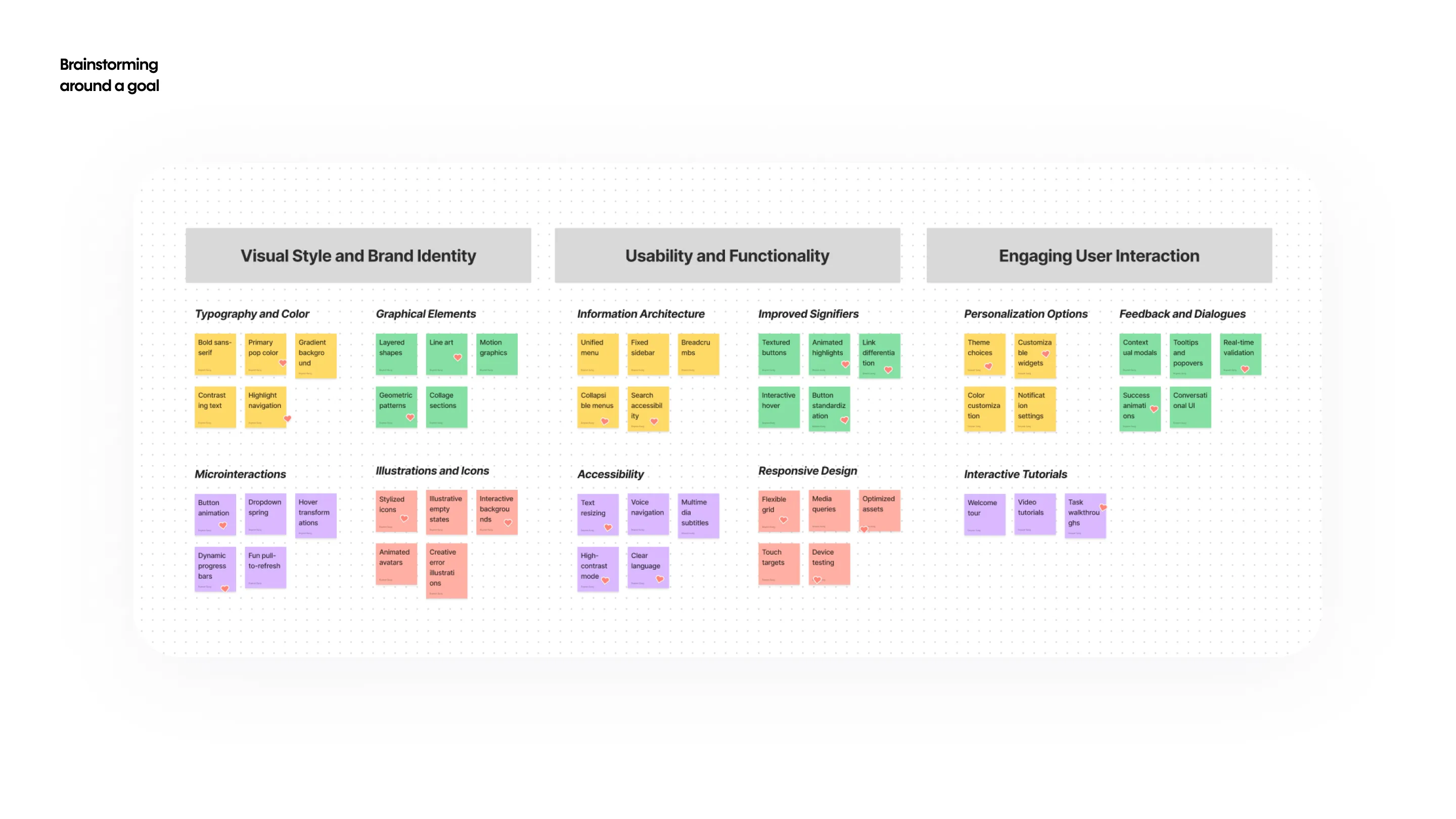
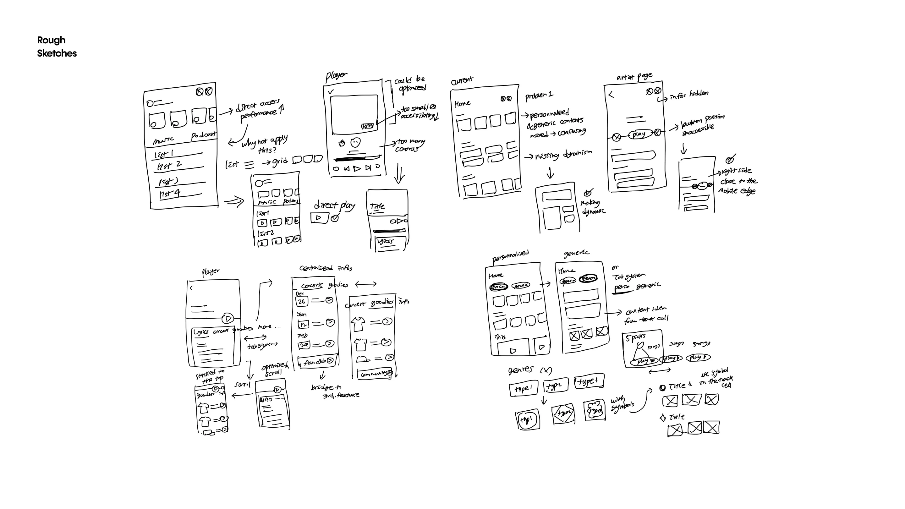
The first exploration involves unconstrained design exploration to find the UI direction that aligns with the new brand as well as to identify the current UX problems on the main screens.
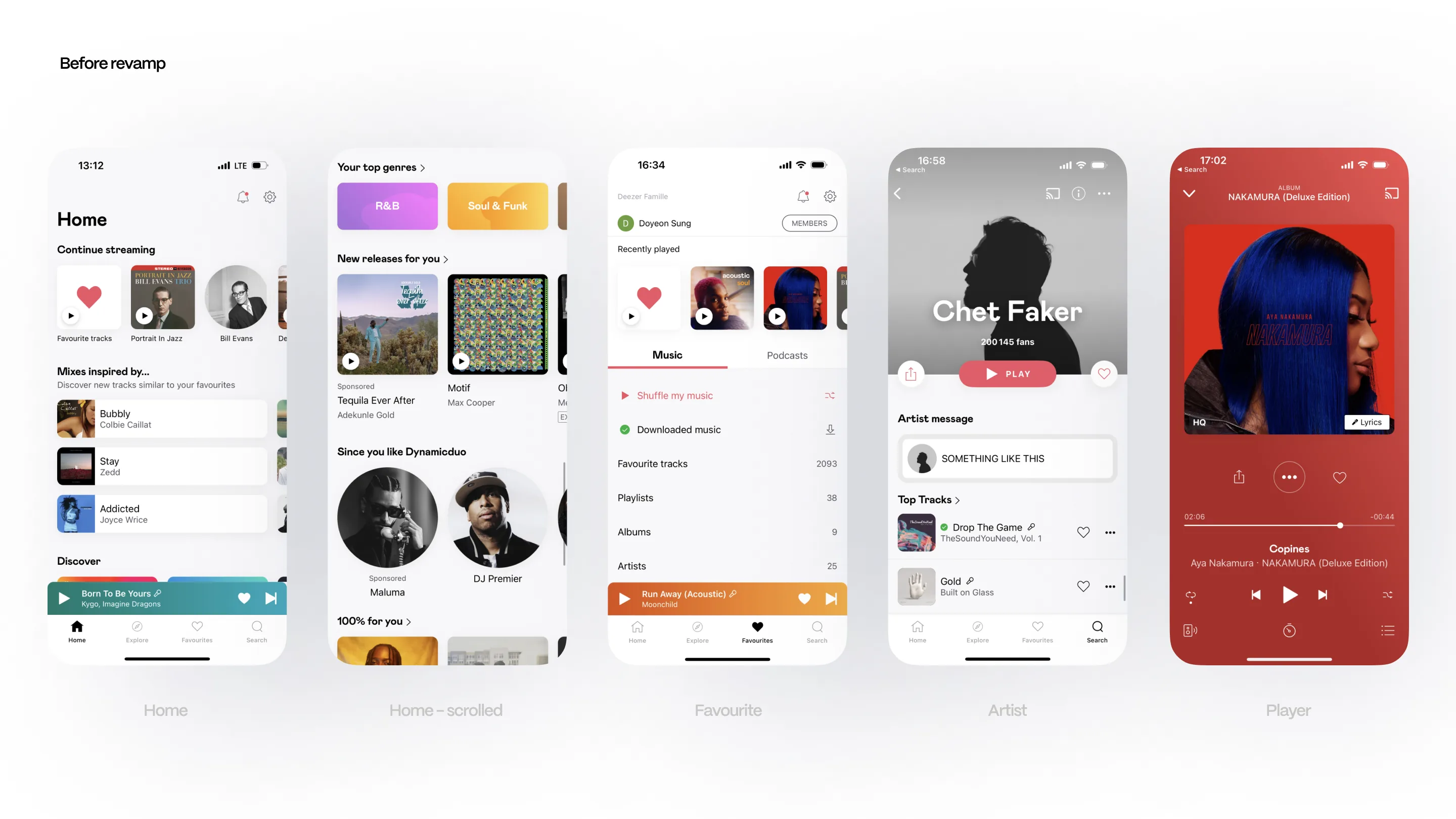
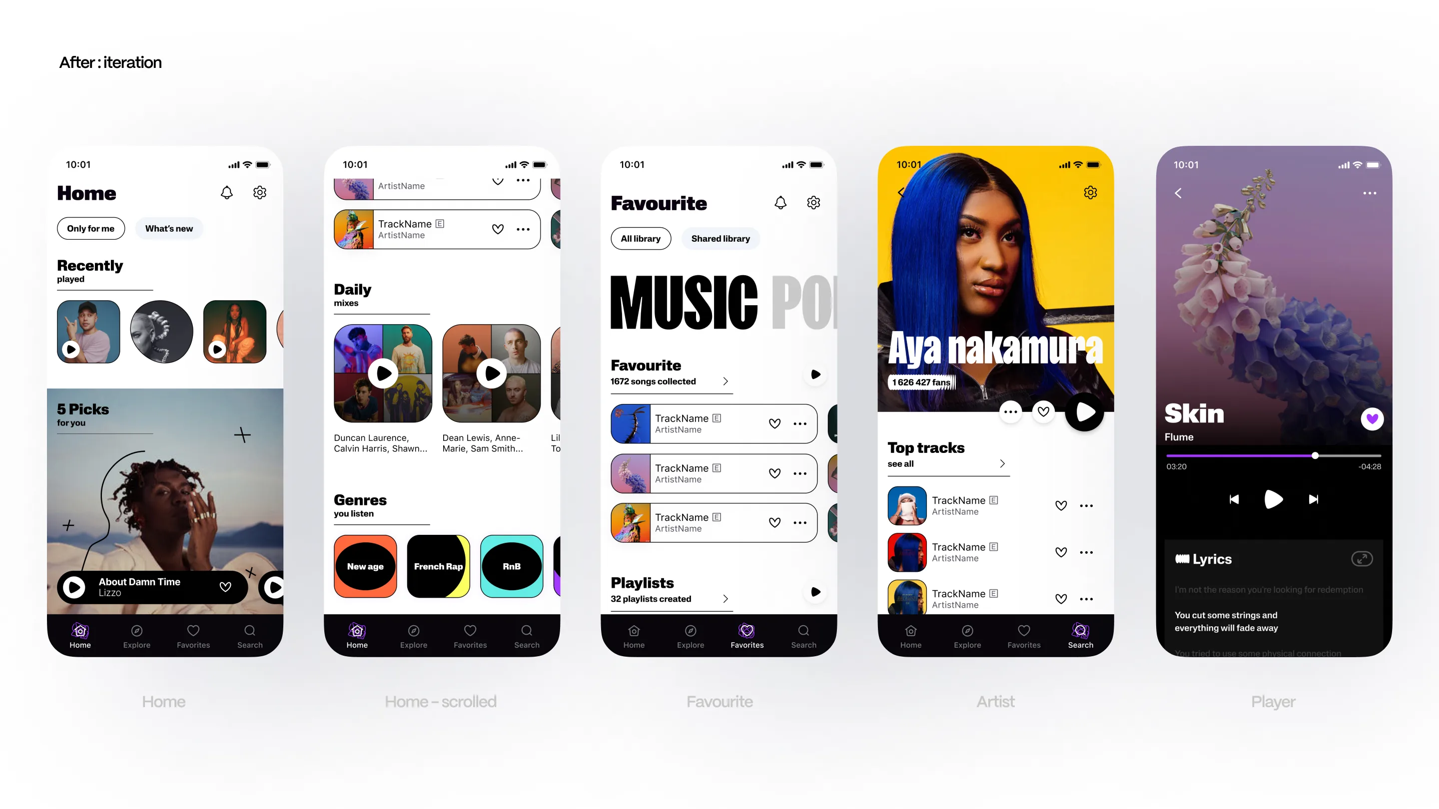
Process
Home page
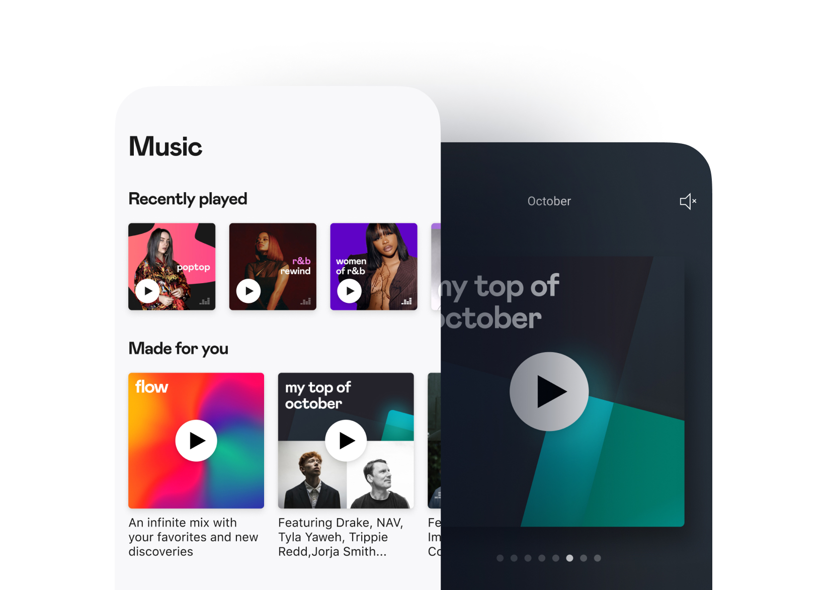
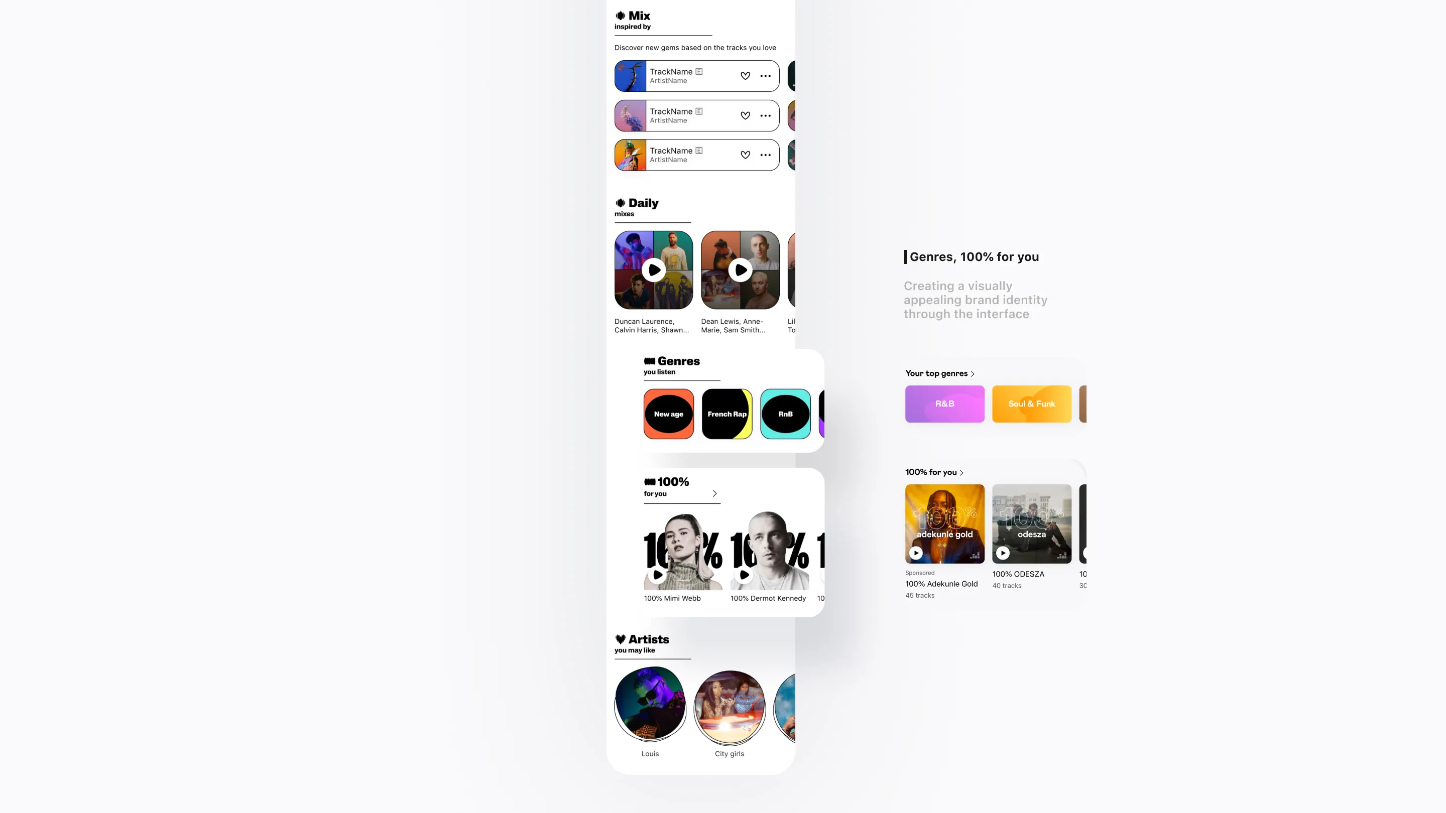
The homepage functions as a central hub, enabling users to explore and interact with personalized and editorial content. During the development process, my focus was on creating a structure that captures attention to enhance readability and provides an immersive brand identity on the interface. Additionally, I propose a couple of enhancements that could be implemented through features on the homepage.
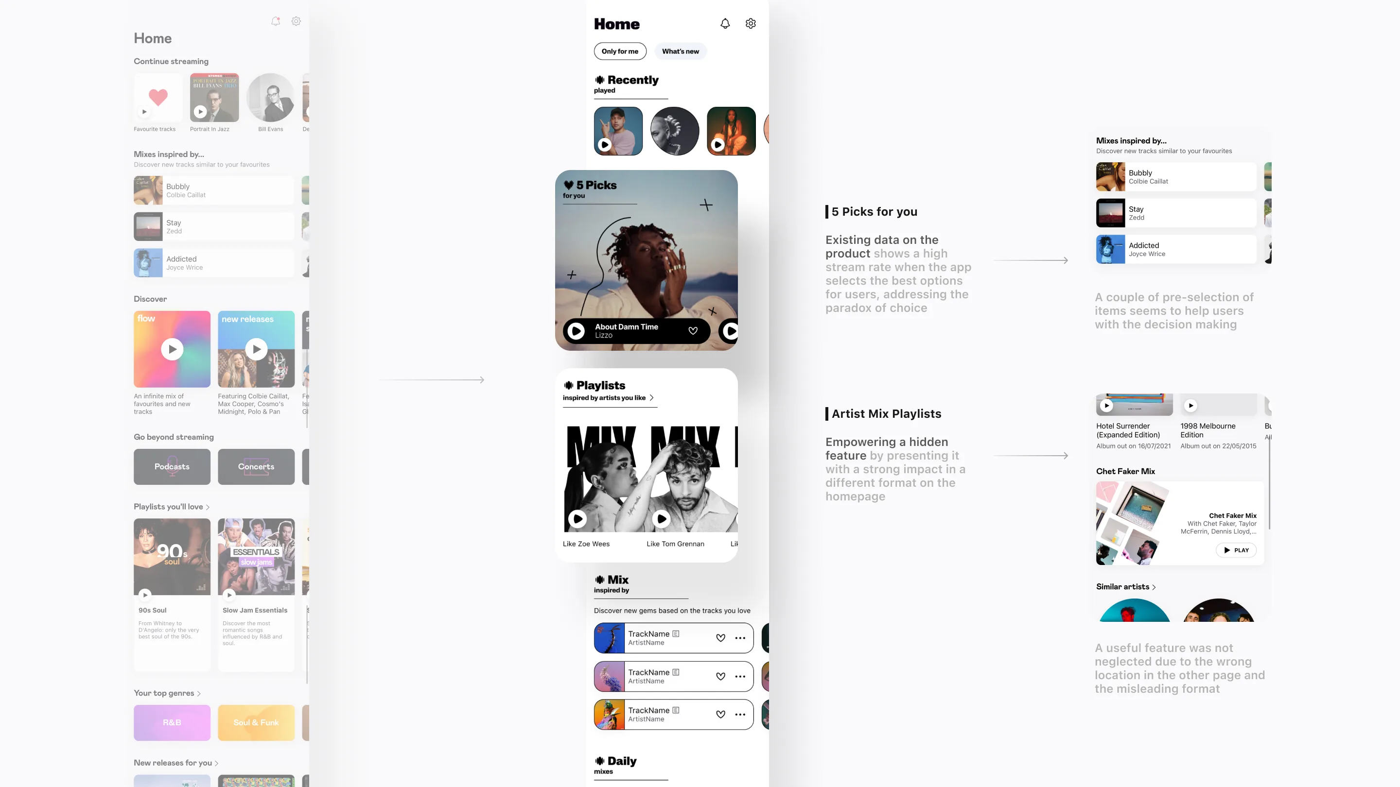
Using data that proves what’s effective as inspiration for a new feature
Existing data on the product indicates a higher stream rate when the app selects the best choices for users rather than presenting numerous items in a flat hierarchy, a well-known paradox of overwhelming choices that can lead to delayed decision-making. This was reaffirmed through the success of one of the Deezer app’s features, a track mix. The track mix is a selection of a user’s current favorite tracks that initiates a mix of other tracks inspired by these favorites. Given that the previous version suggested a multitude of items in a flat manner, I aimed to propose another feature using this proven strategy.
Empowering a hidden feature
Despite the app offering unique and compelling features compared to competitors, these attributes were not adequately highlighted to gain recognition from our users. The challenge lay in the placement of the feature within the artist page, a section that struggled to capture user attention unless they were specifically seeking information about the artist. Due to its reliance on lean-forward actions, this page experienced low visits, leading to overlooked tools like the artist mix, an unlimited mix inspired by the artist, proposing similar tracks.
The issue was further compounded by the format: a banner that resembled an advertisement and failed to attract user attention. To address this problem, I opted to relocate this feature to the most-streamed page, presenting users’ favorite artists in the form of a playlist rather than a banner. This strategic move aimed to enhance visibility and engagement with the valuable tools that were previously underappreciated.
Creating a visually appealing brand identity through the interface
Previous user feedback highlighted that the interface of the previous product gave the impression of being indistinguishable from our competitors. The absence of a distinctive brand identity on the interface failed to convey the immersive experience synonymous with our brand. Leveraging the opportunity for a rebrand, I aimed to introduce elements such as colors and typography that express our unique brand identity.
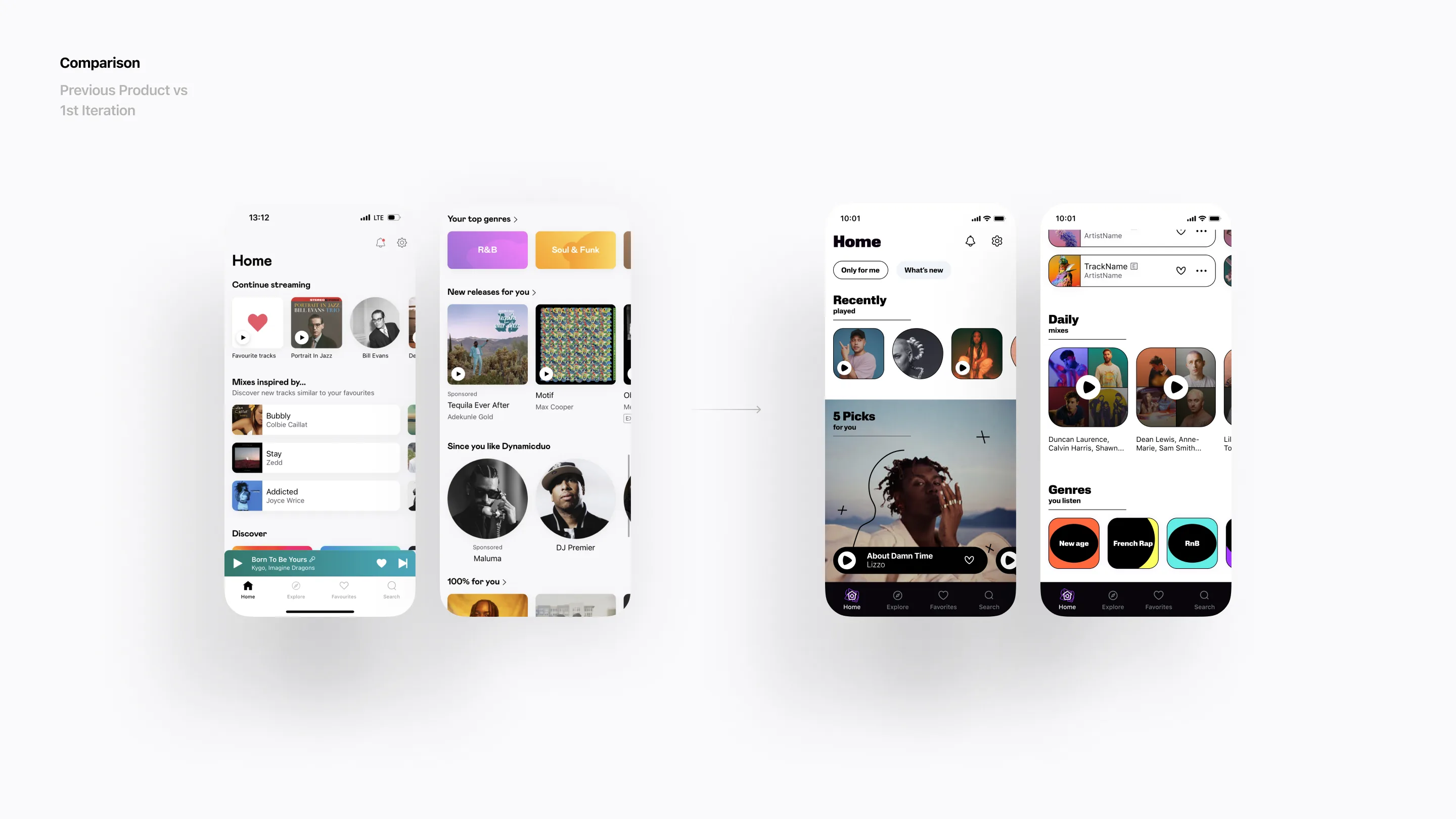
Process
Favourite page
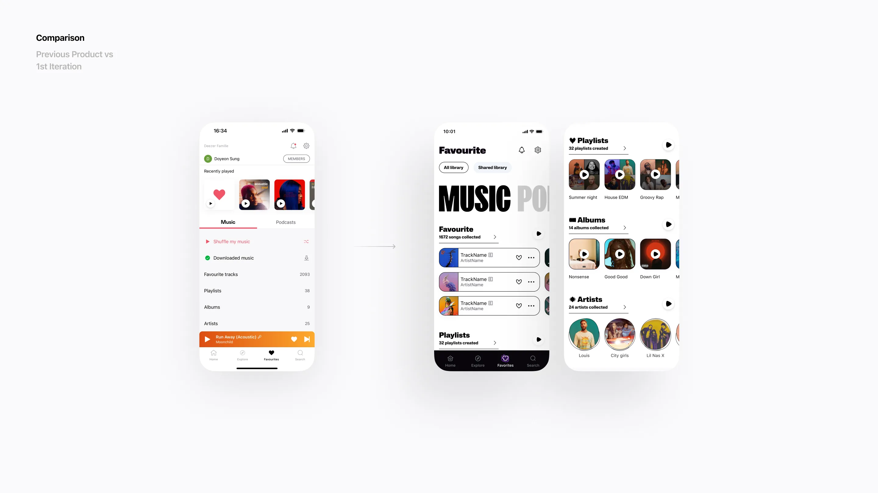
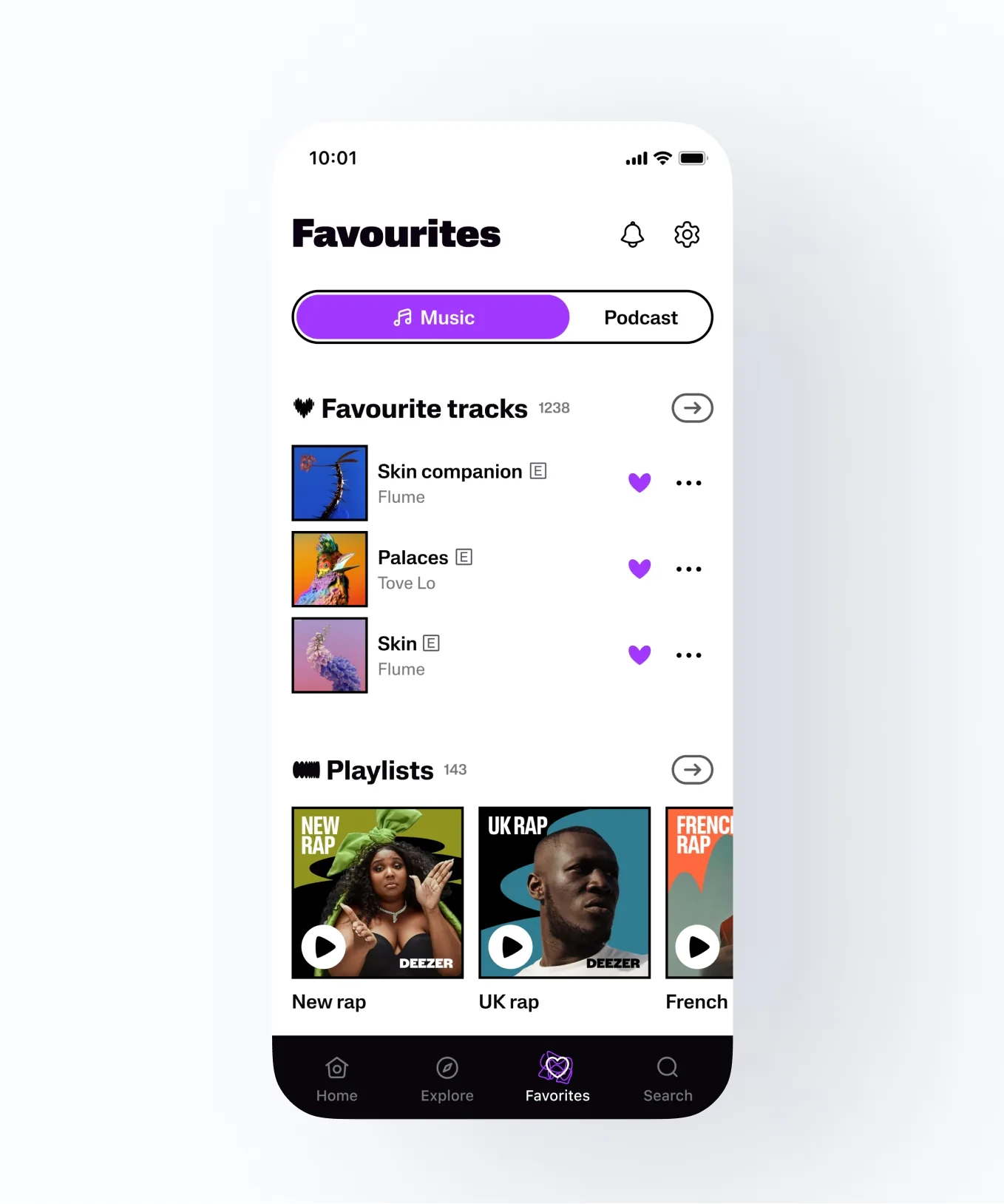
The favourite page is designed for users to view all their saved (liked) content, divided into two sections: music and podcasts. The music section includes entry points to various types of content, such as tracks, albums, and playlists, among others.
Playing with the brand identity
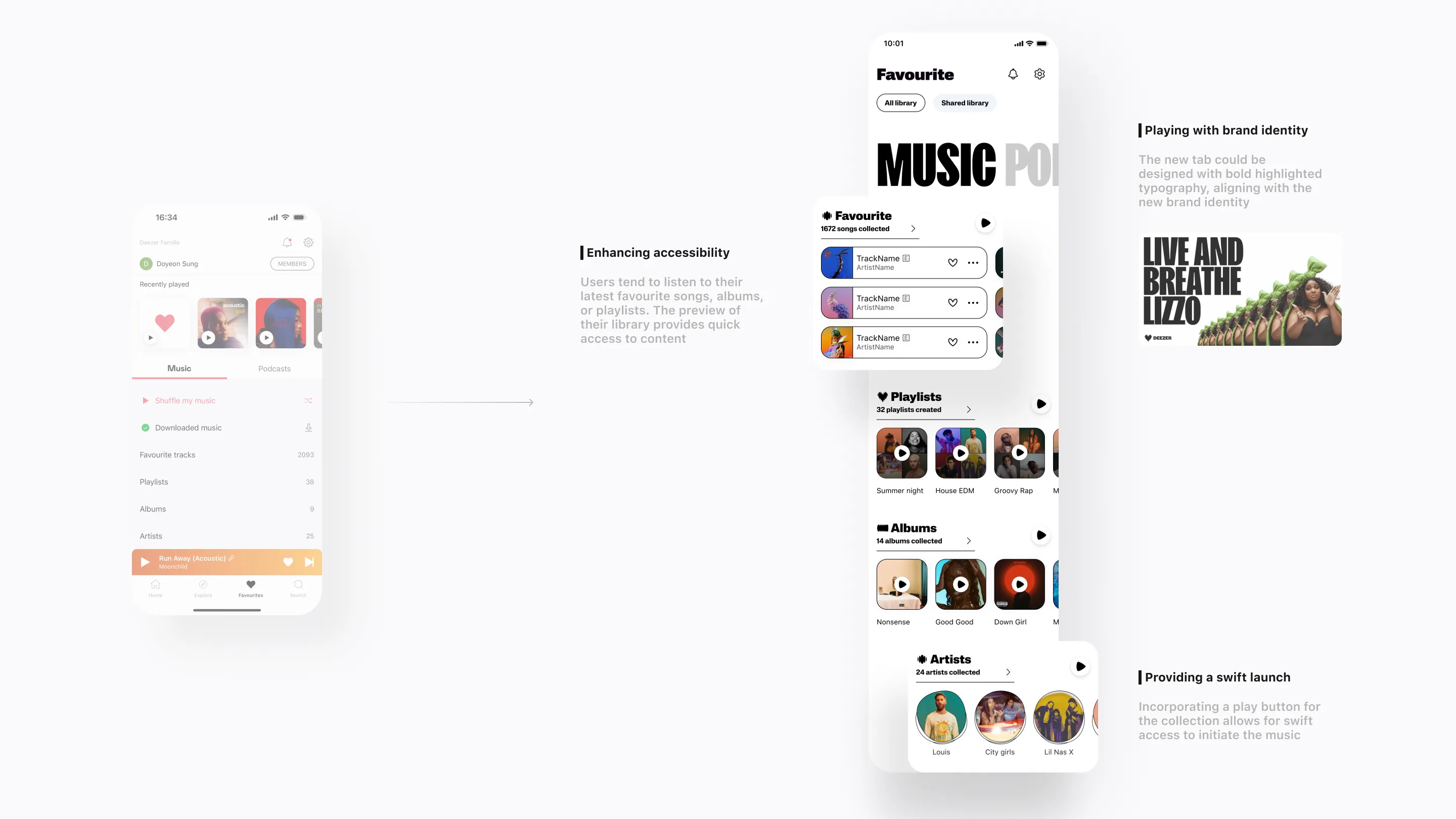
The new brand direction features a bold, punchy text background. The impact conveyed by the typographic images has inspired me to experiment with the interface. For instance, instead of a classic tab with lines, the new tab could be designed with bold highlighted typography.
Enhancing accessibility of user’s library
In the previous product, the library was organised in a list, necessitating users to navigate through each item individually. It was observed that users frequently enter sub-containers, such as the lists of favourite tracks, albums, playlists, etc., to access and consume their latest saved items. Recognising this user behaviour, I opted to enhance the accessibility of their library by showcasing their latest items in a scrollable grid. This visual representation aims to facilitate quick access to content, adding a personal touch to the favourite page.
Providing the benefits of collections
When users gather items like songs or artists, their intention is often to enjoy these collected items in a more relaxed, lean-back mode. In addition to the preview display of the collected items, incorporating a play button for the collection allows for swift access to initiate the music, providing a compelling reason to collect and build their library.
Process
Artist page
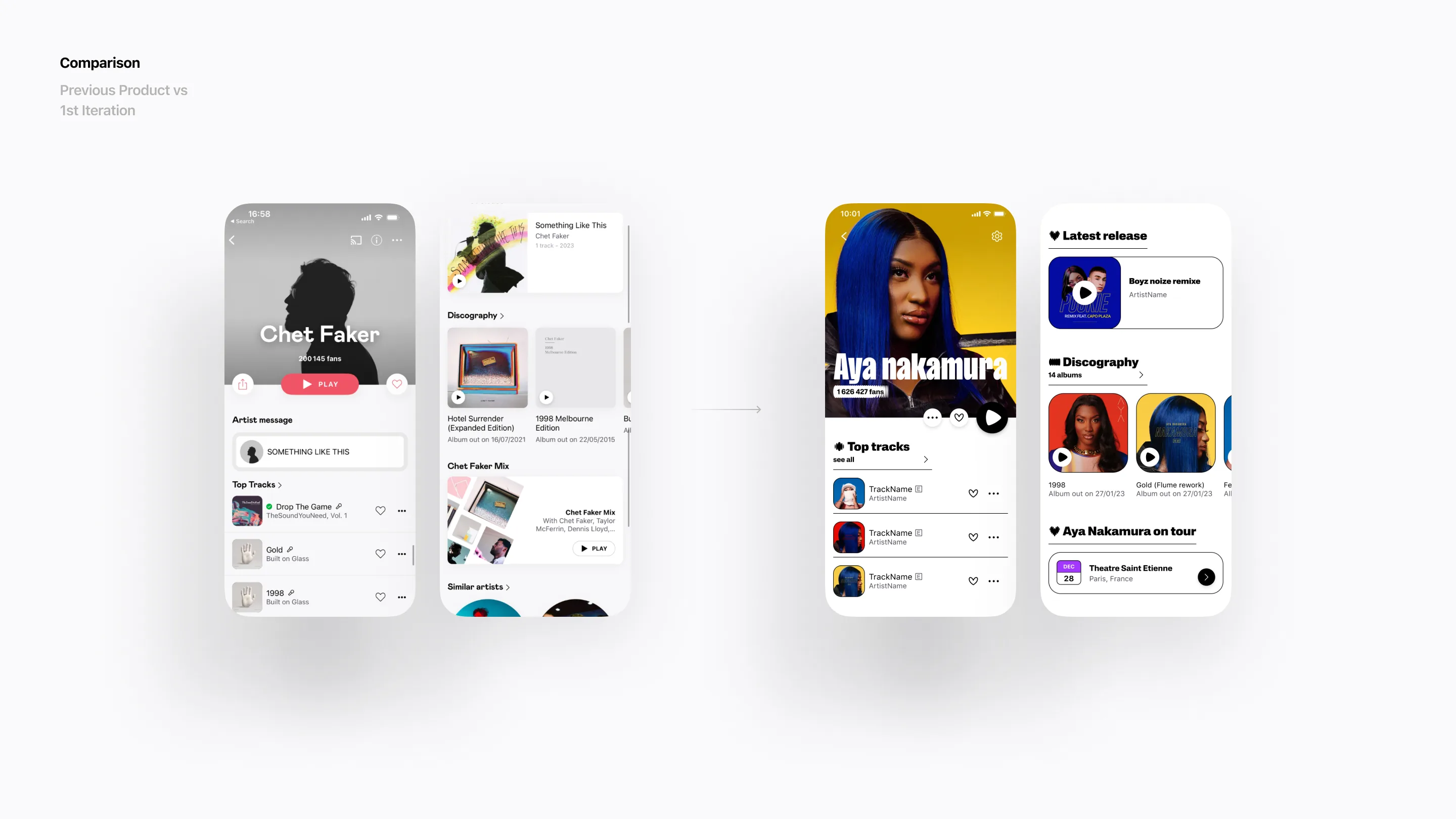
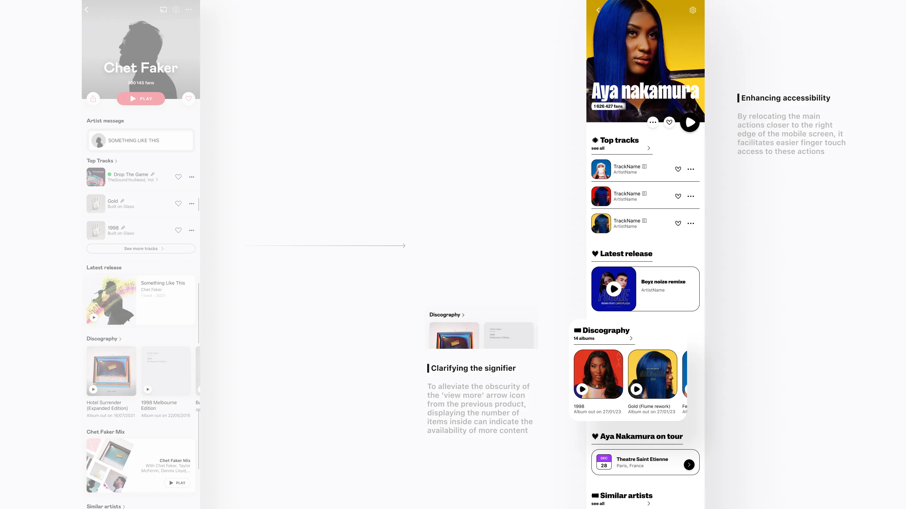
The artist page is where users can find all the information about an artist’s discography and news, including top tracks, latest releases, concerts, and more.
Enhancing accessibility
In the previous product, main actions such as play, like, or share were widely placed. By relocating them closer to the right edge of the mobile screen, I aimed to facilitate easier finger touch access to these actions.
Clarifying the signifier
In the previous product, users had to tap on the title with the arrow to view more content. This somewhat obscure signifier can be enhanced by displaying the number of items next to the arrow icon to clearly indicate the availability of more content.
Process
Player page
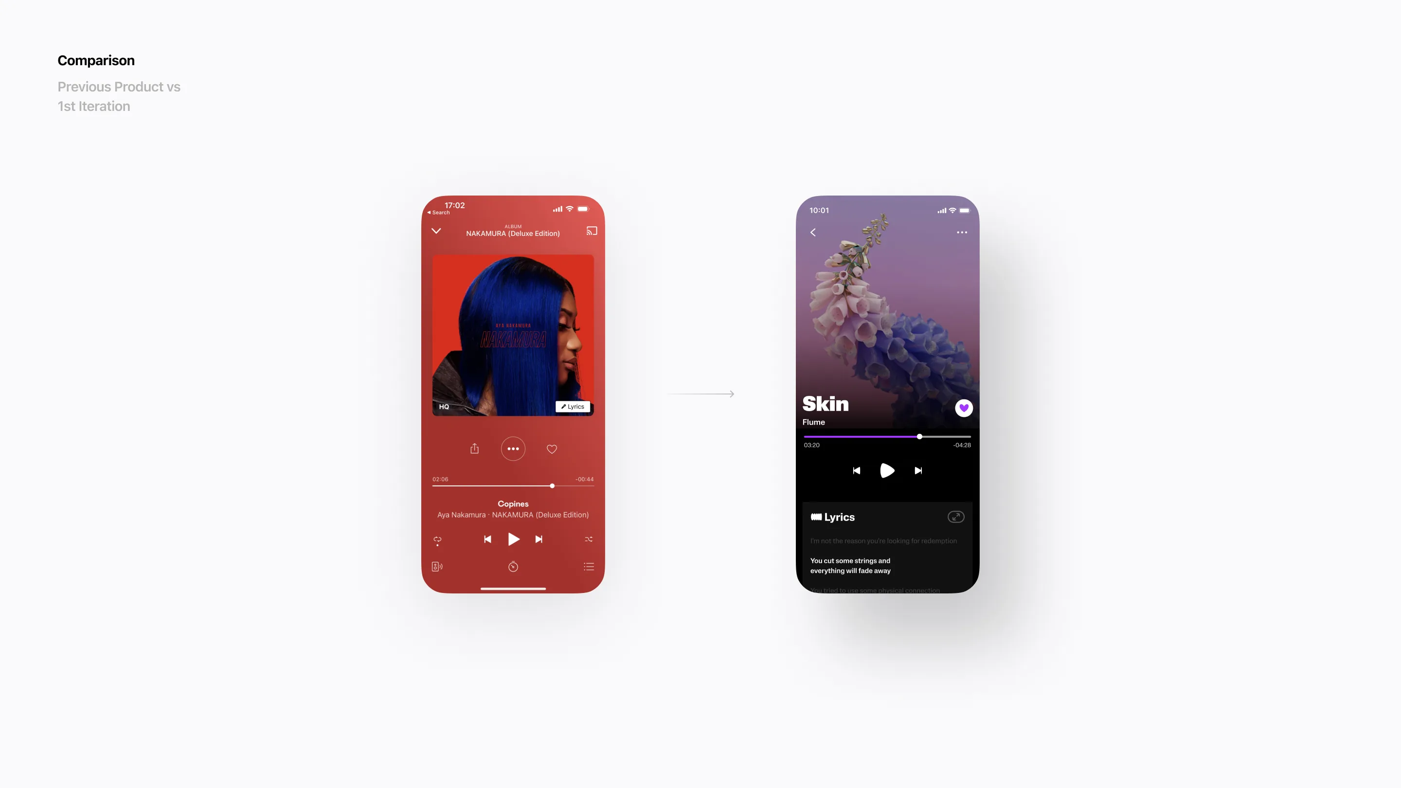
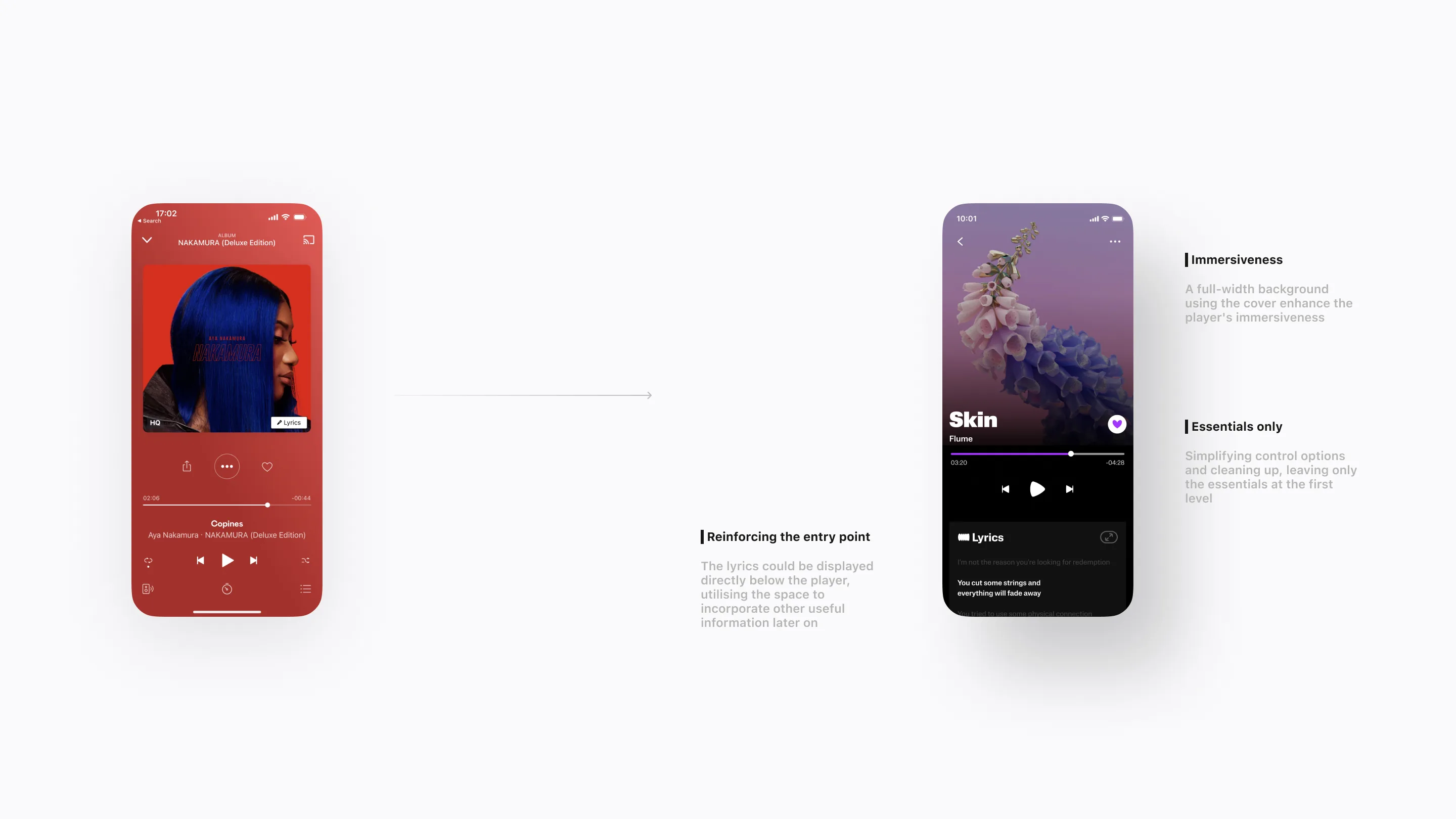
The player page is where users can control the content, such as music or podcasts, that they are consuming in real-time.
Immersiveness
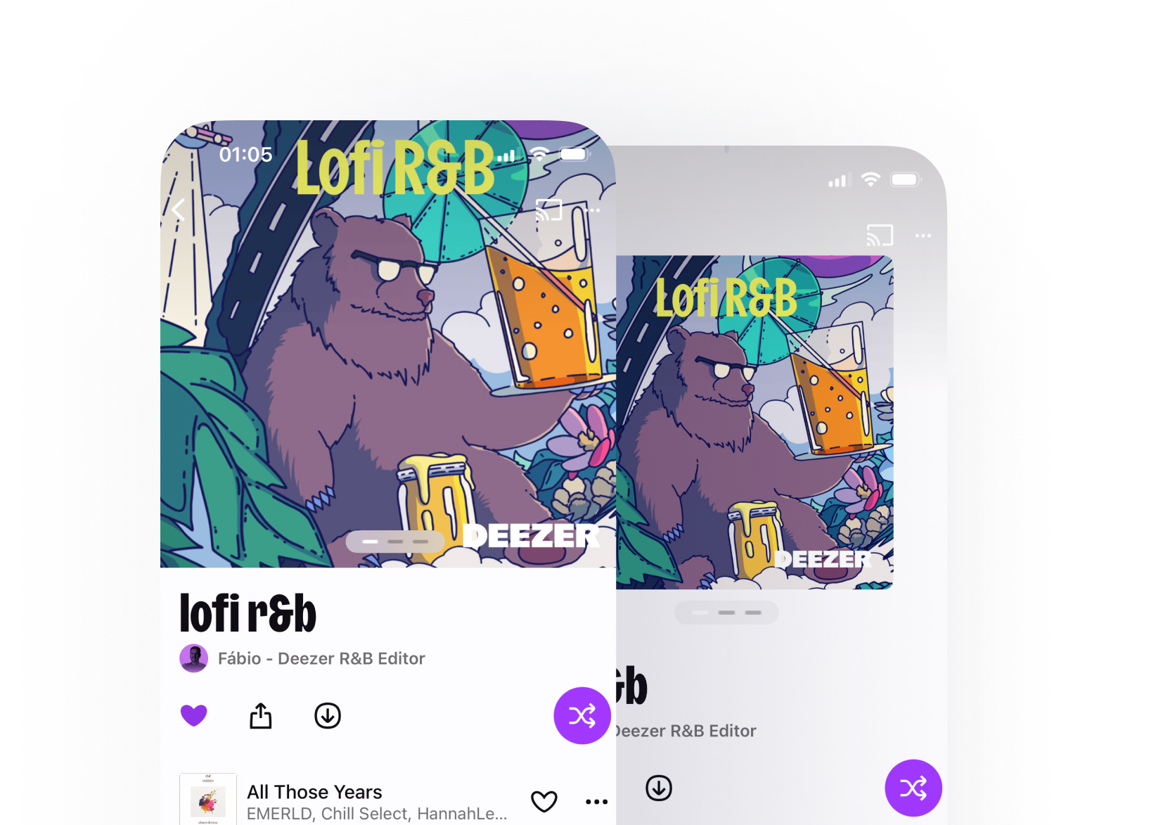
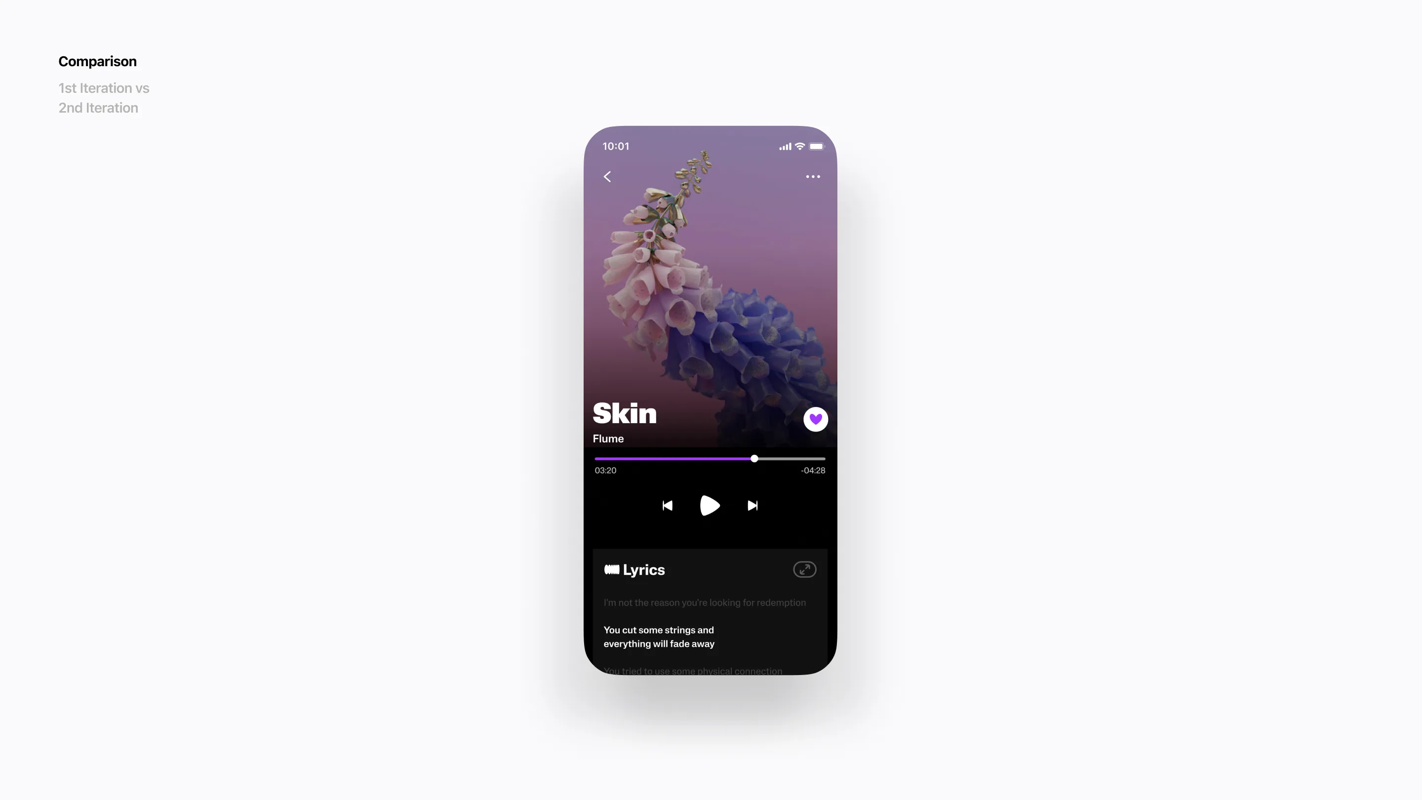
The cover image in the previous player served its purpose, but it didn’t deliver an immersive experience to the users. To enhance the player’s immersiveness with the content, I chose to design a full-width background using the cover.
Essentials only
One major issue with the previous player was congestion. Numerous controls were displayed at the first level without considering the frequency of user use. Consequently, the overall interface appeared disorganised. Simplifying control options and cleaning up were deemed necessary, leaving only the essentials at the first level.
Reinforcing the entry point
One of the most used features in the player is viewing the lyrics. However, the entry point, resembling a label on the cover, was not visible enough. Additionally, once the lyrics screen is opened, users no longer had access to the controls from the player, which was inconvenient. To address this, the lyrics could be displayed directly below the player, utilising the space to incorporate other useful information later on.
Process
Goal
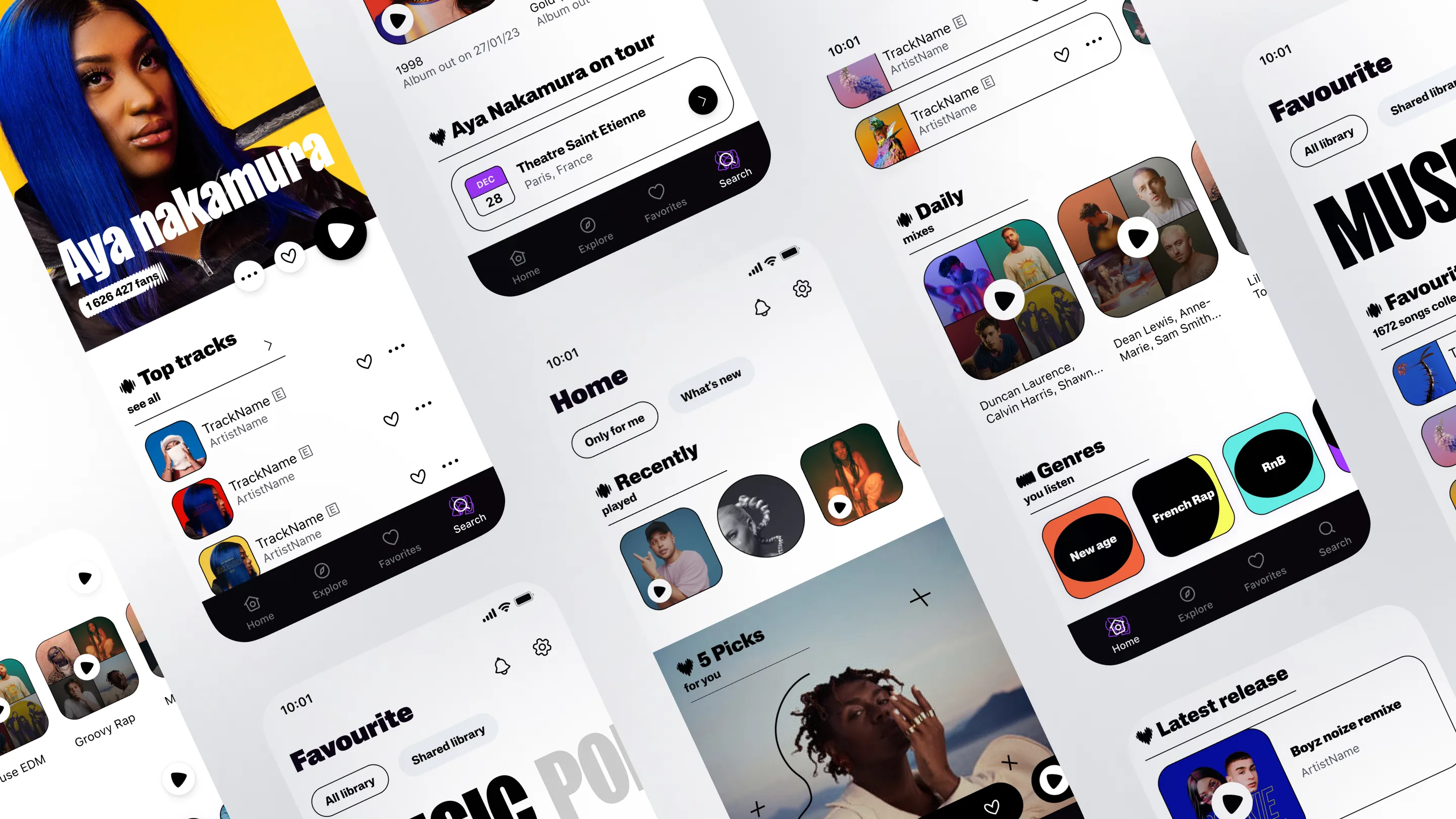
From the first exploration, I opted to enhance the overall interface for better optimization and tidiness. In addition to refining the appearance, I questioned the necessity of some functionalities proposed in the first exploration.
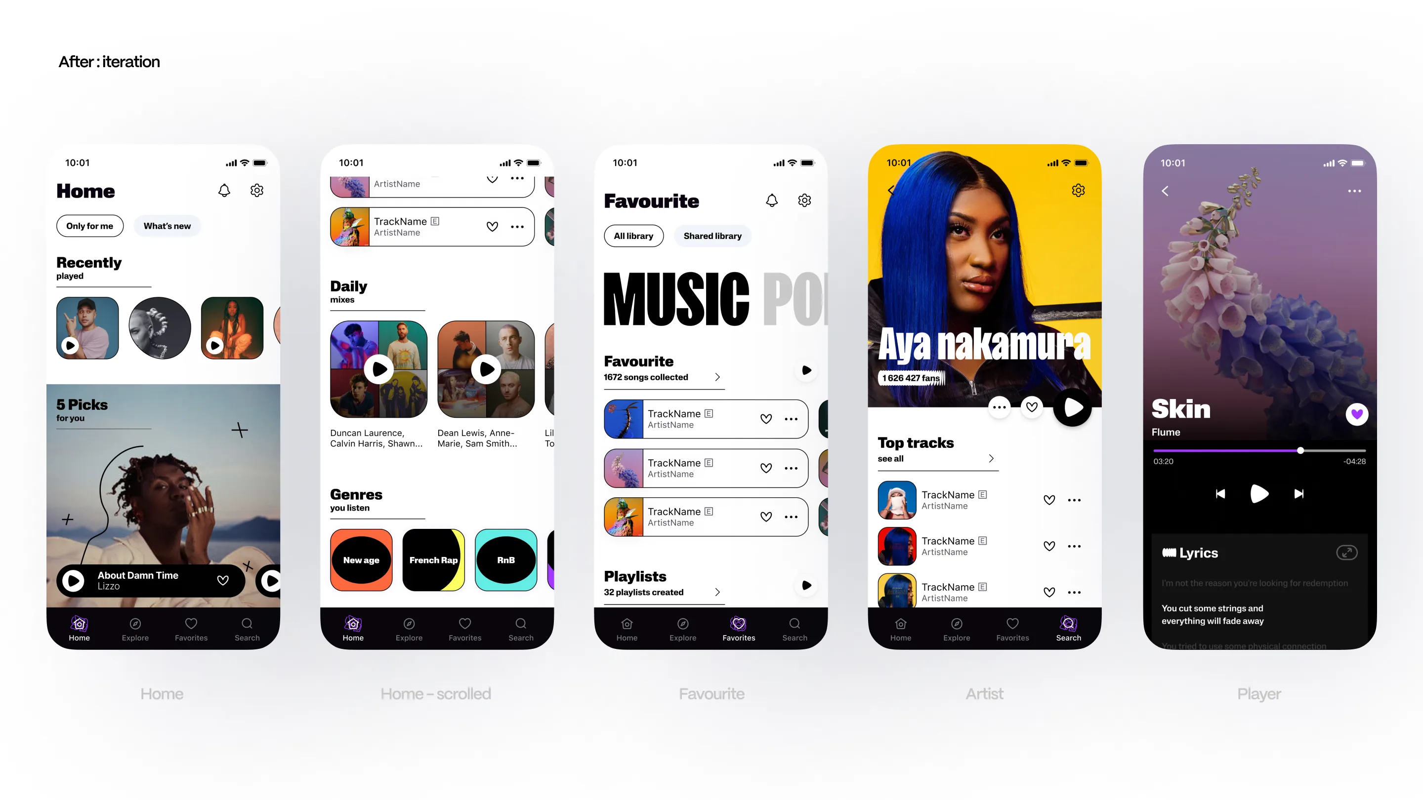
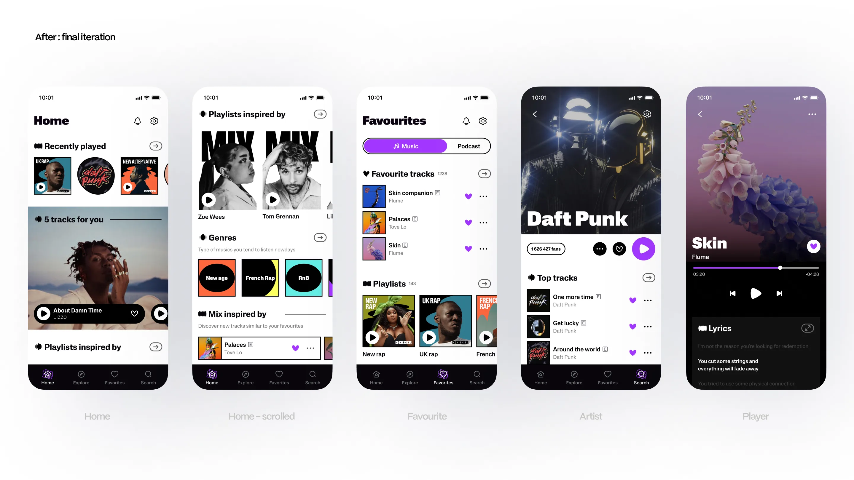
Process
Home page
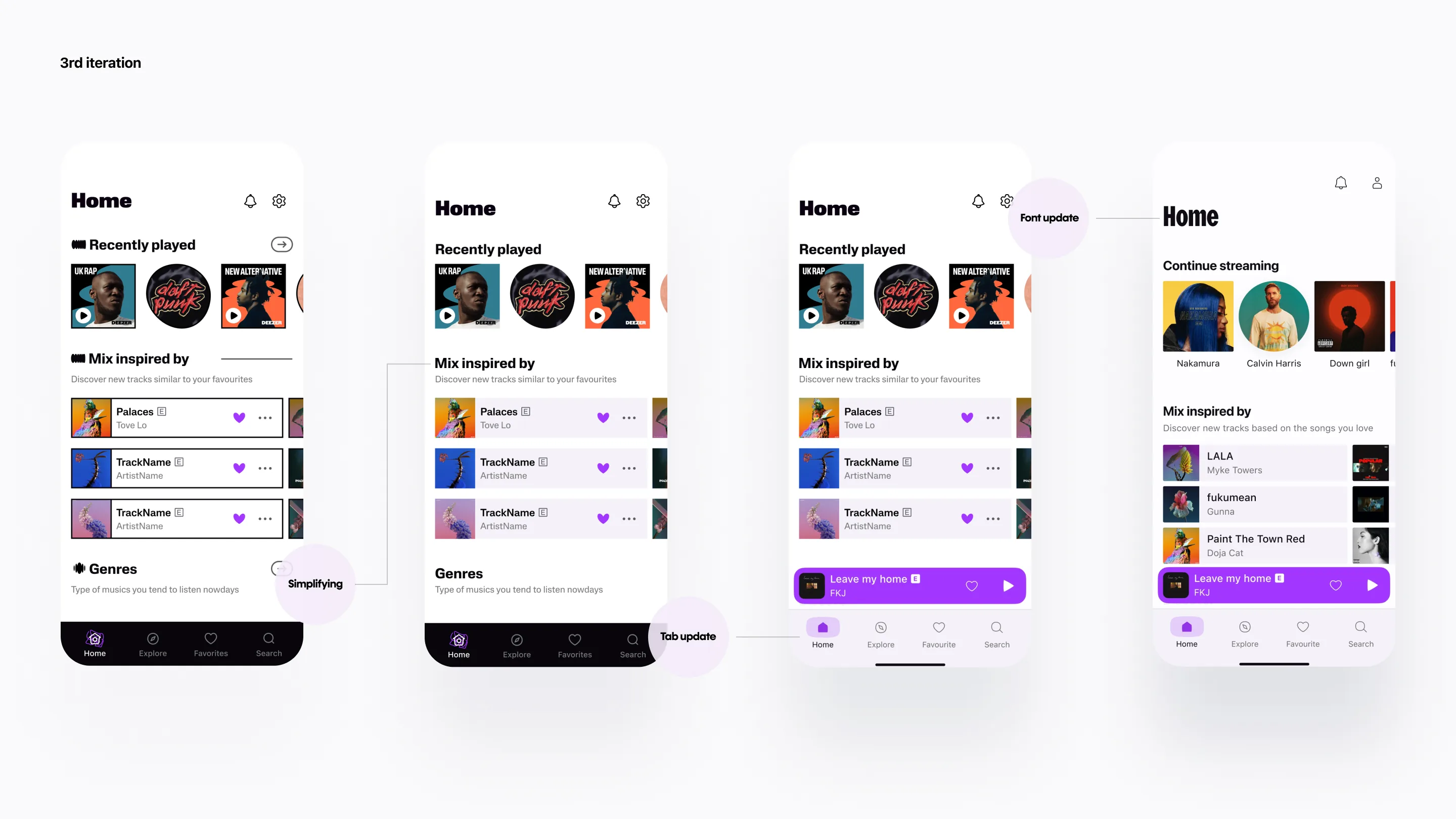
Improving title legibility
In the first exploration, my goal was to emphasize keywords in the title by dividing it into two parts: the highlighted keyword and sub-keywords. However, I received feedback that the overall title was challenging to read. Consequently, I opted to enhance title legibility by maintaining a single-line block and incorporating a small description field below.
Adding more uniqueness
While the “scribble” look and feel I attempted in the first exploration were refreshing and novel, it didn’t sufficiently convey the bold, strong, yet playful brand identity that the company aimed to rebuild. Consequently, I decided to enhance this aspect by experimenting with container strokes while also refining the overall interface appearance.
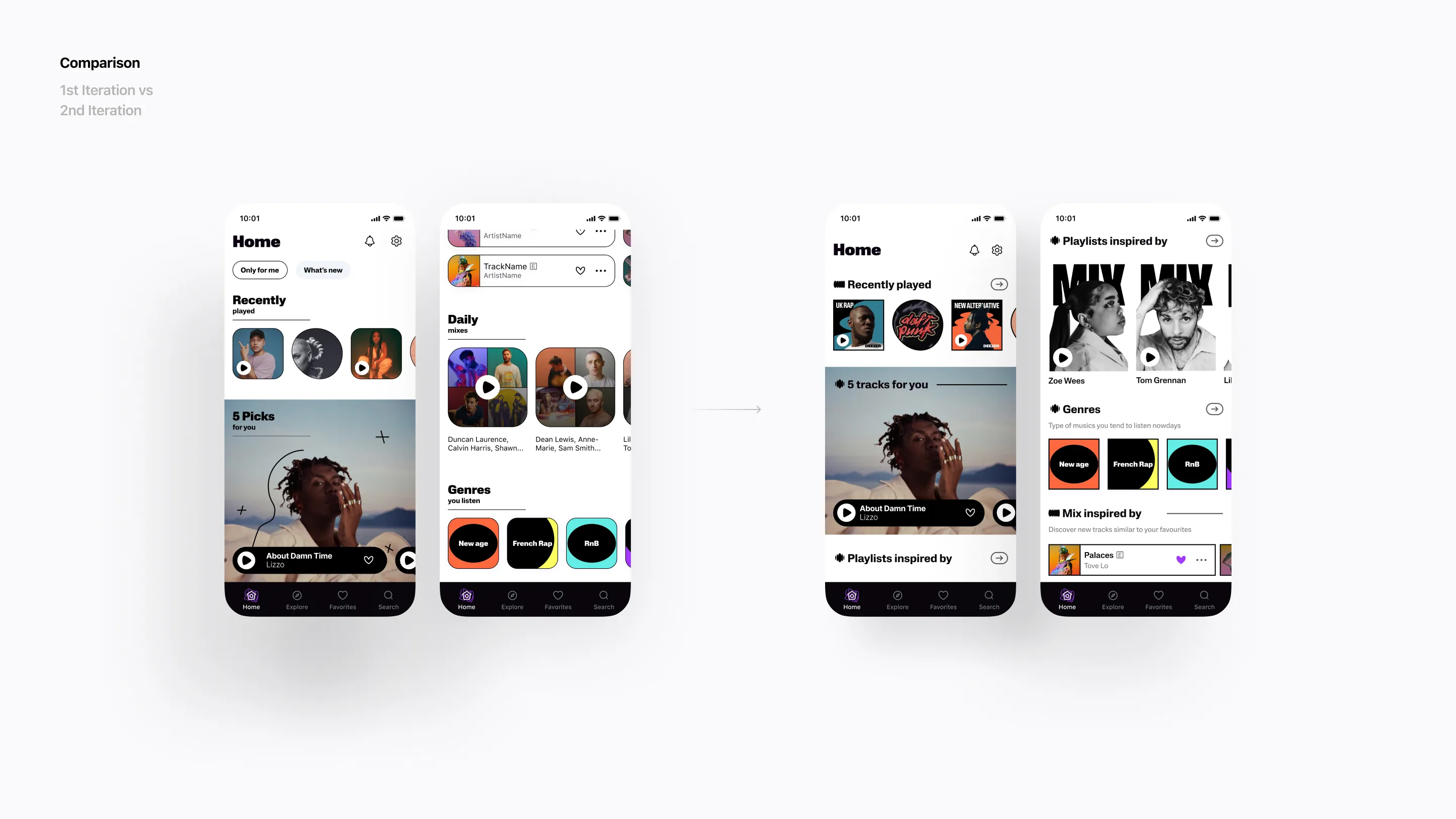
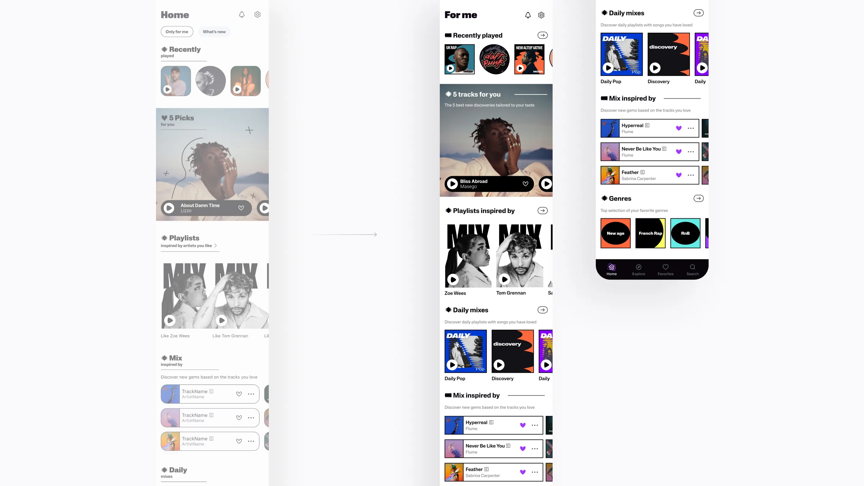
Process
Favourite page
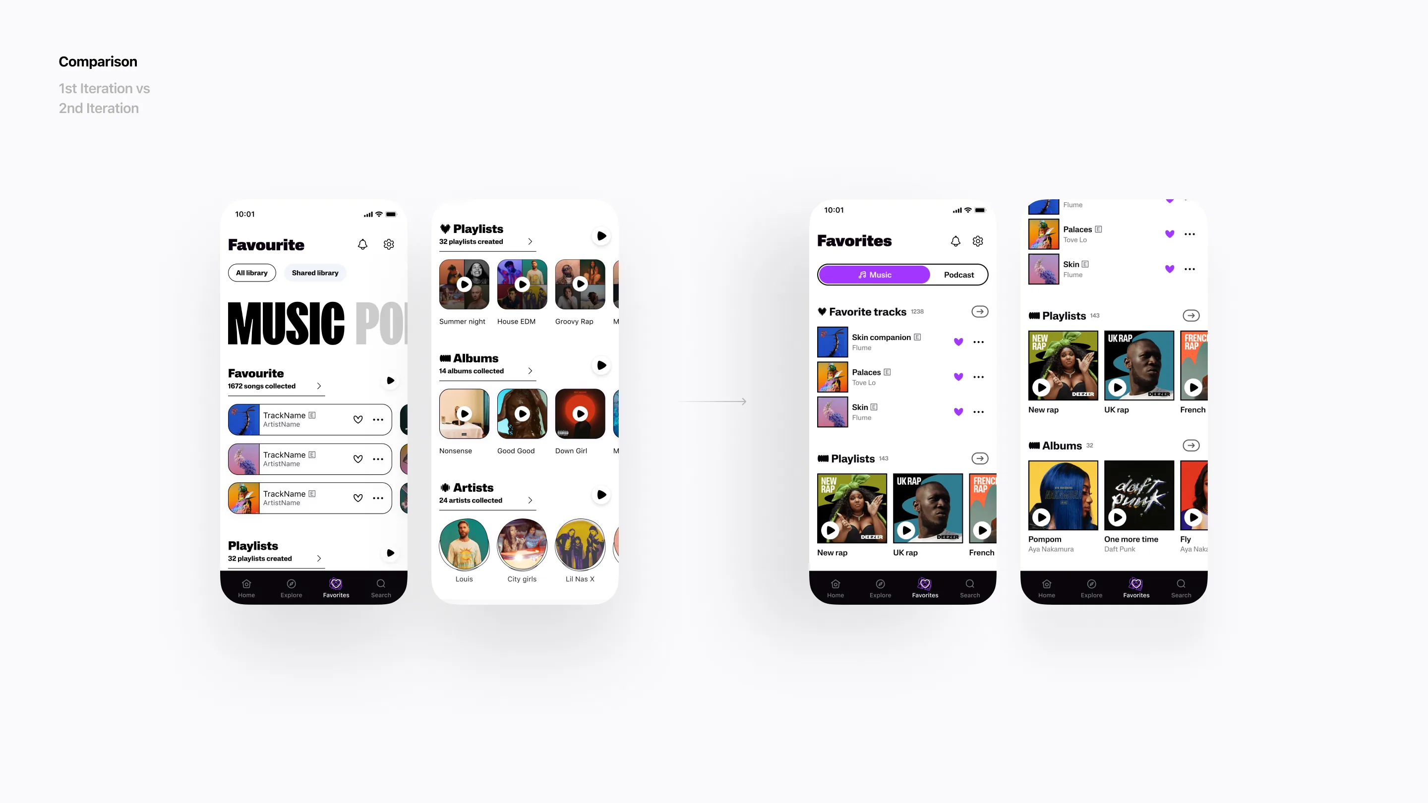
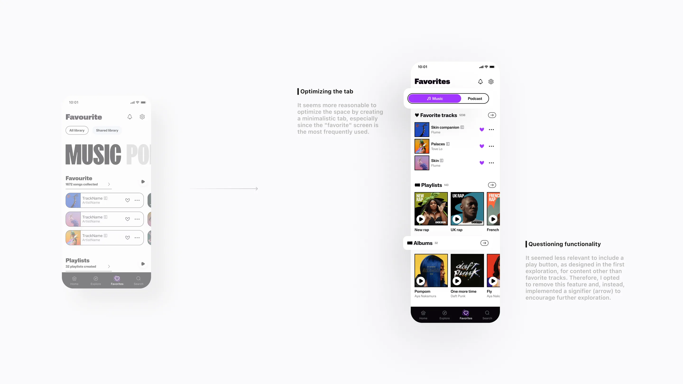
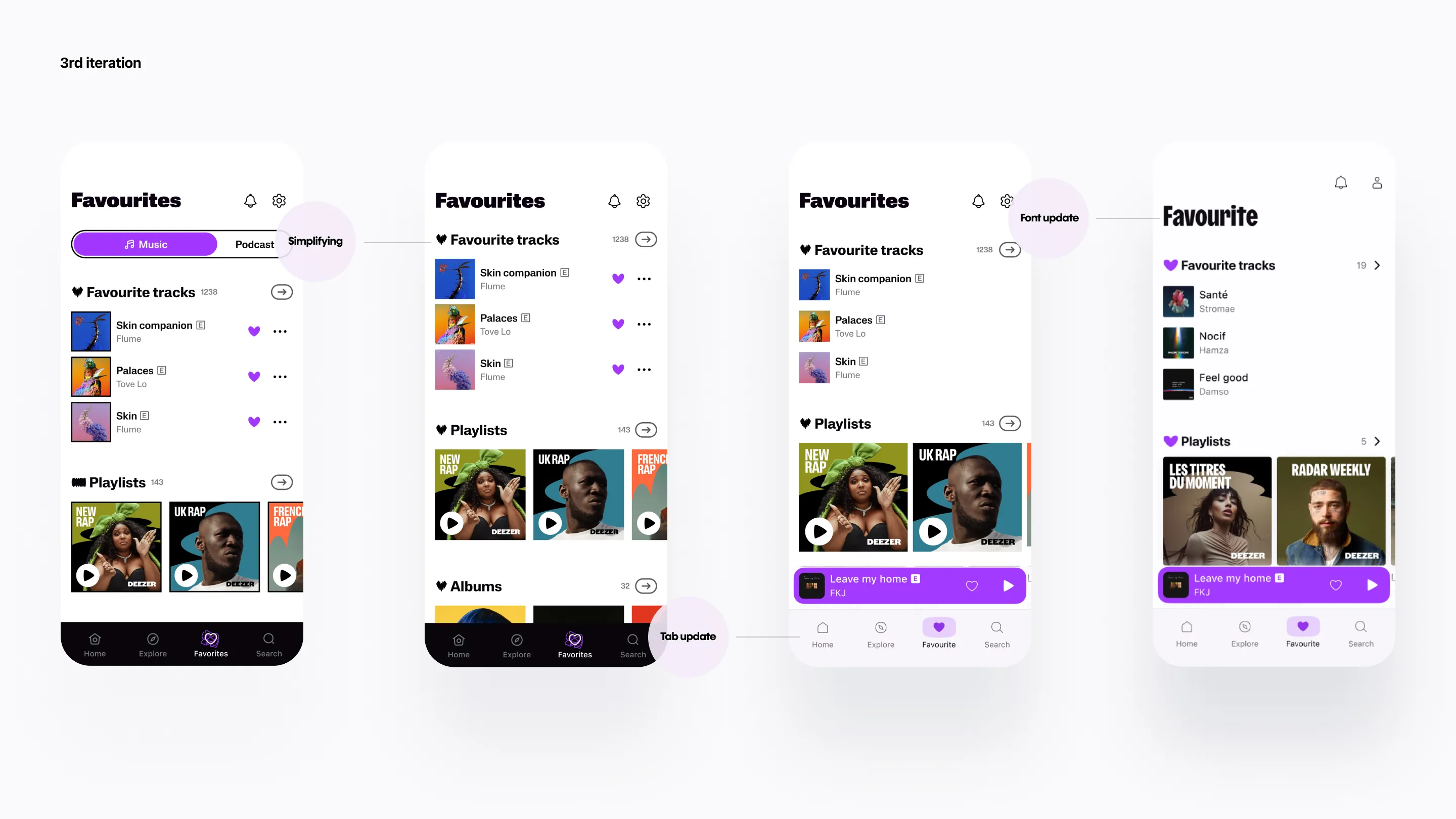
Optimizing the tab
While the prominent typographic tab in the first exploration effectively conveyed the brand identity, it appeared more practical to optimize space by transforming it into a minimalistic tab, especially since the “favorite” tab is the most frequently visited and utilized page. Users naturally seek quick access to their contents.
Evaluating each functionality
In the first exploration, I suggested a direct play button to preview the container (songs, albums, or playlists). While the functionality was intriguing for specific cases, such as the container of favorite tracks, it didn’t make sense for other types of content like albums or playlists, as users typically consume each item by type. Instead, I chose to replace the play button with an arrow as a signifier to guide users to explore more content. Additionally, I optimized the space in the title zone by displaying only the number of items in the container.
Process
Artist page
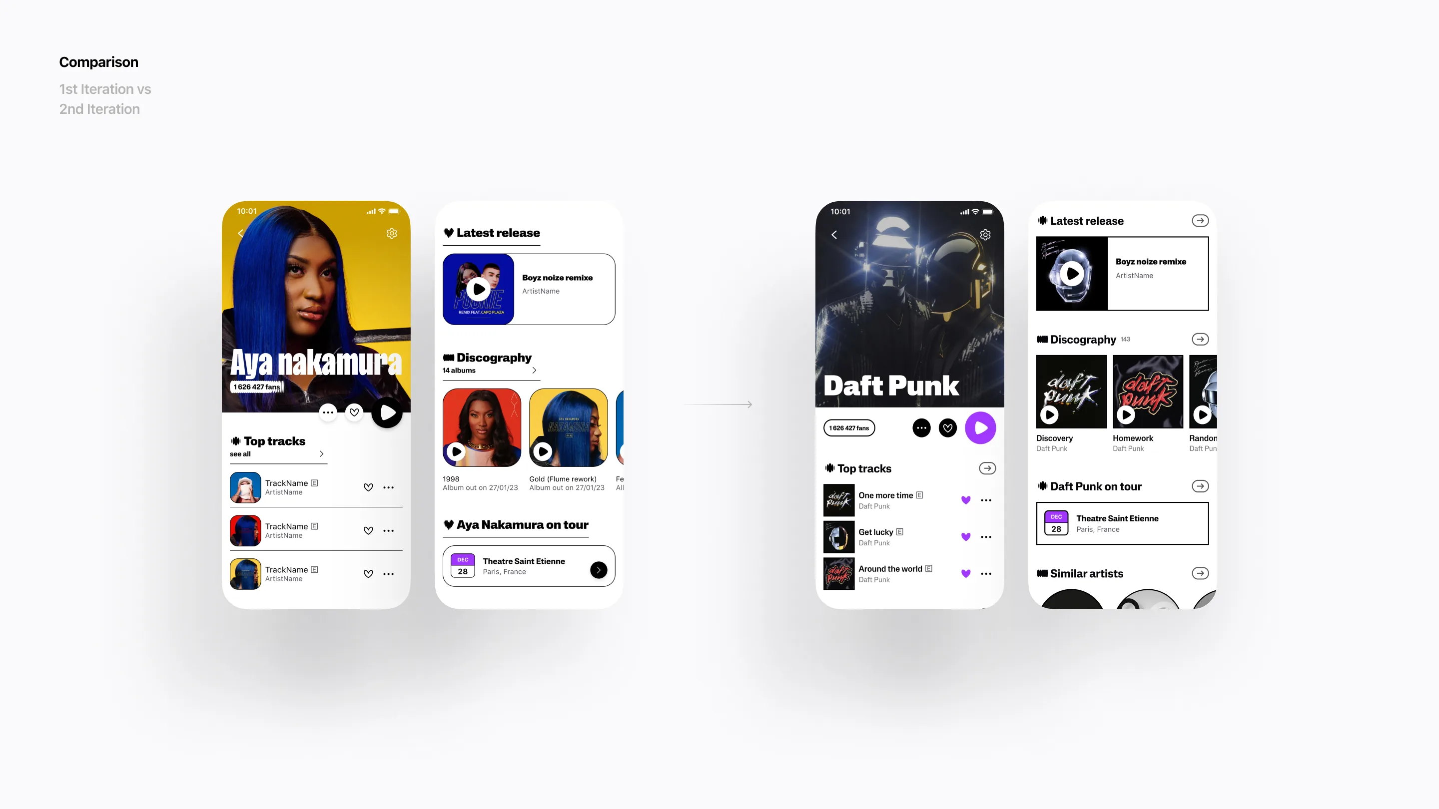
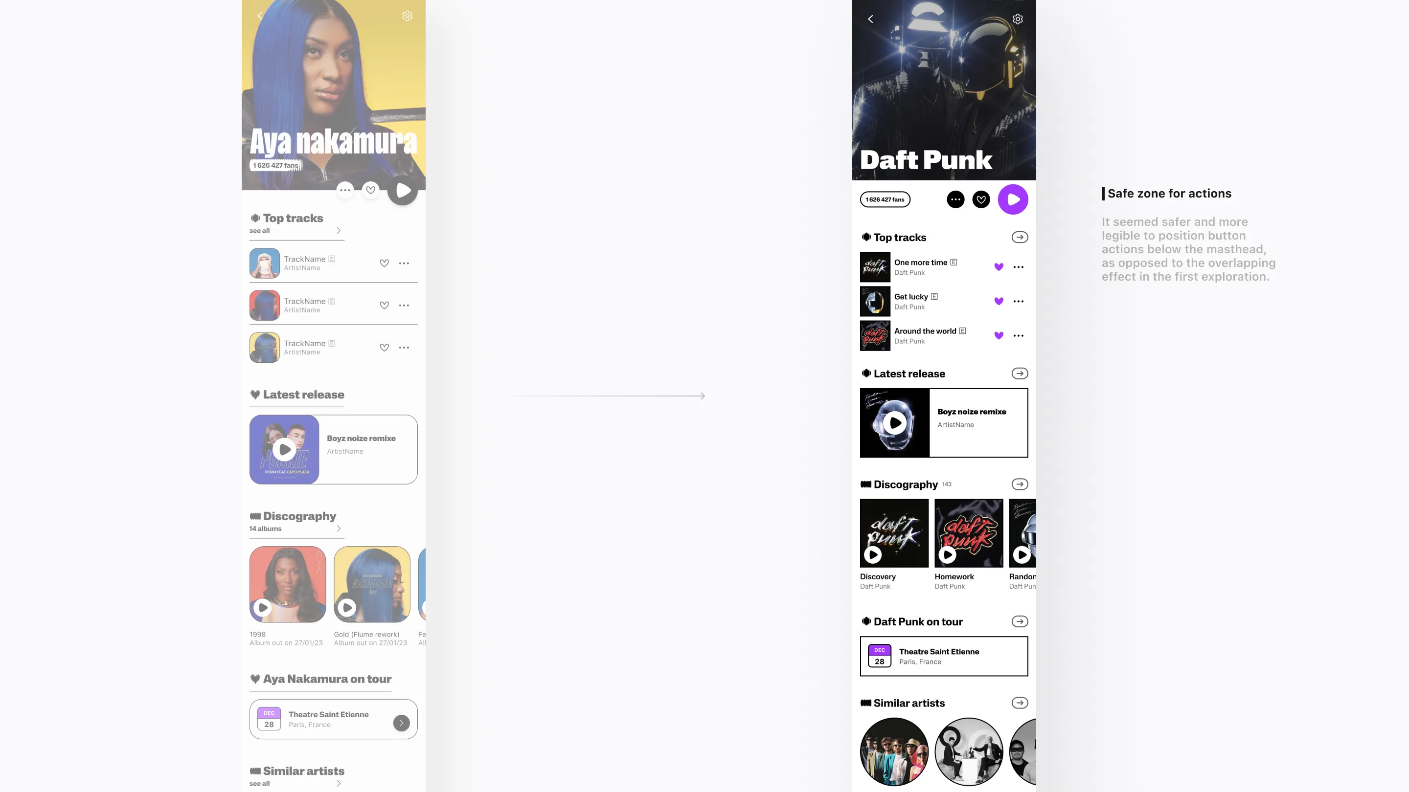
Safe zone for actions
It seemed safer and more legible to position button actions below the masthead, as opposed to the overlapping effect in the first exploration.
Improving title legibility
I optimized the space in the title zone by displaying only the number of items in the container.
Process
Player page
An immersive player with revealed lyrics seemed like a reasonable direction, and I decided to maintain it as it is.
Process
Goal
The goal of this test was to gauge perceptions of potential new UI design directions, aligning with the new rebranding values and ensuring the app’s ease of use by enhancing usability.
Result
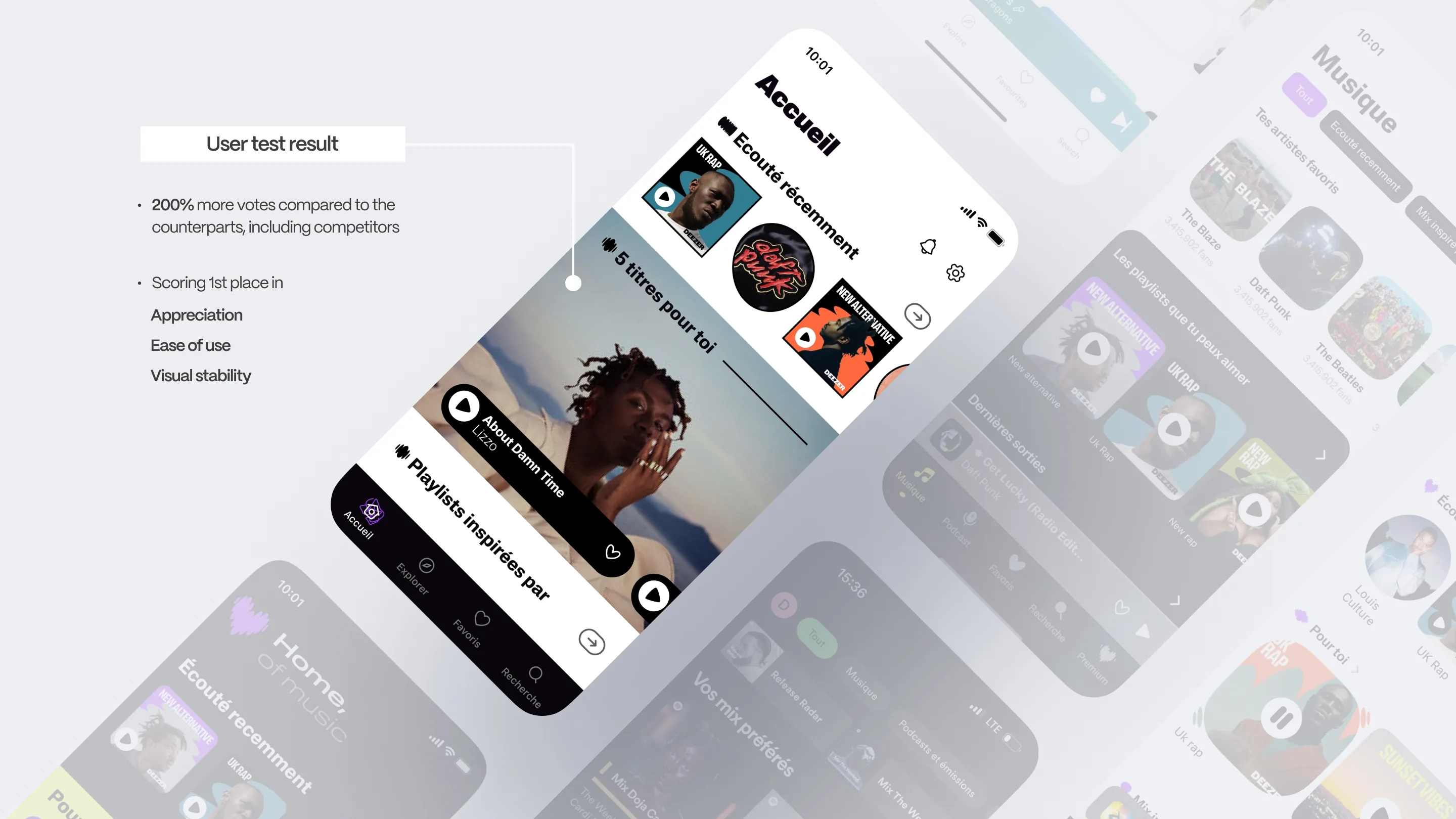
A total of 6 prototypes were tested, including 4 new designs created by both internal and external designers, the existing product, and a prototype from our main competitor. These prototypes were evaluated by 30 diverse users, ranging from ages 21 to 41, including our current users, non-users, and users of our competitors.
During the testing phase, this new prototype received the highest scores in various areas such as appreciation, ease of use, and visual stability. It not only outperformed other prototypes in individual sectors but also achieved the highest overall score, garnering 200% more votes than its counterparts. This overwhelming support allowed the company to confidently affirm the right direction for the new design.
This test has proven to be a valuable resource, providing essential insights for the global perspective and guiding the project towards its final product.
Final revamp
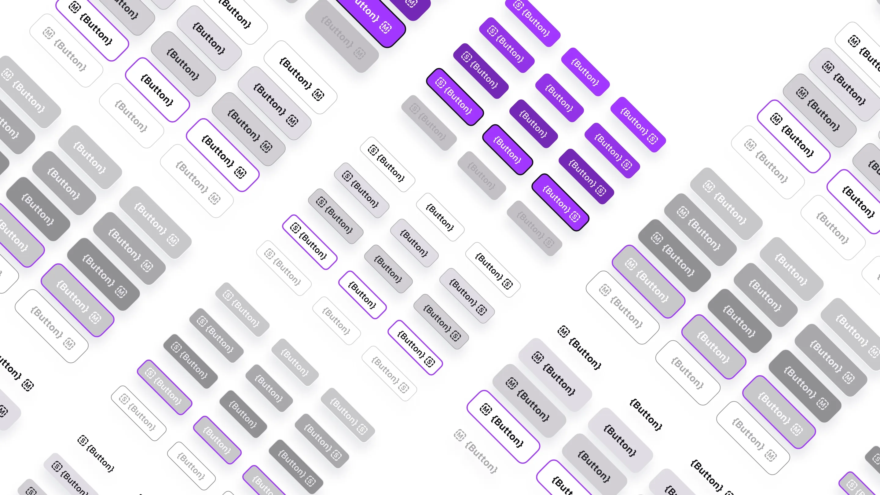
Design system
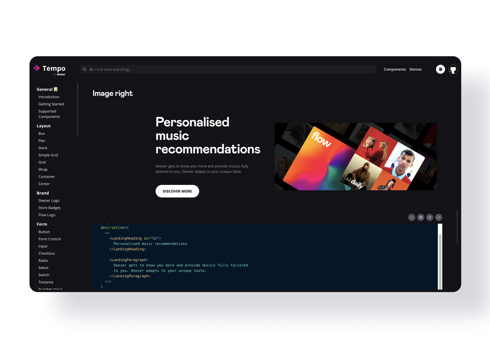
By refining the design and testing new components across various screens, we were able to explore different scenarios for each component and determine the most optimal approach. This method allowed us to organically establish the new design system, ensuring the revamp process remained effective.
Mobile App
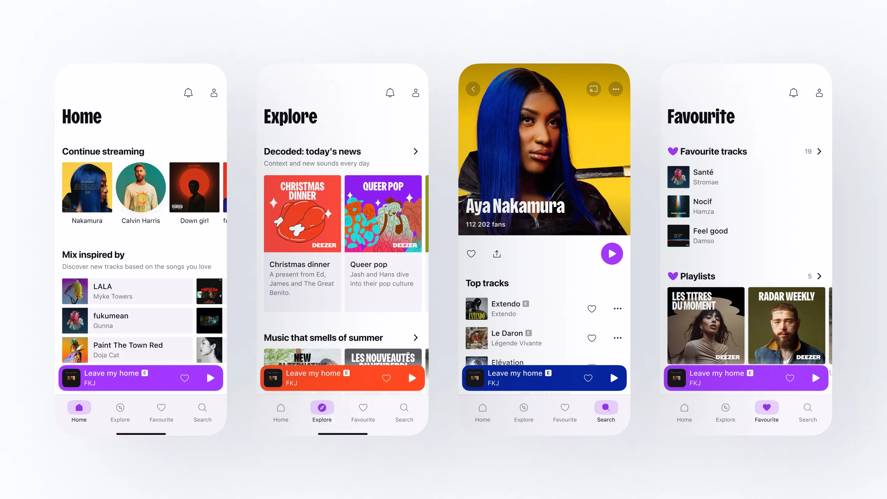
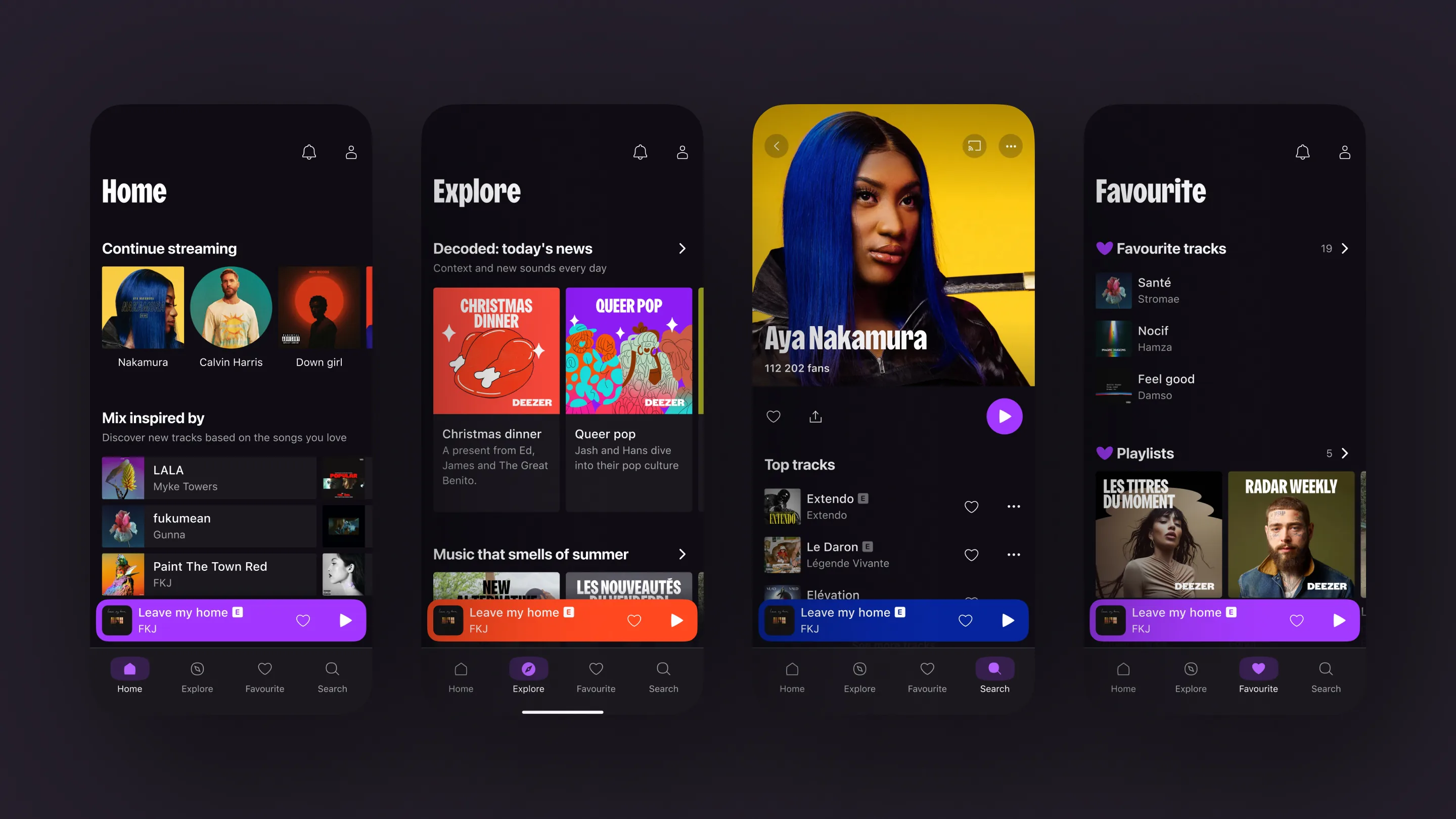
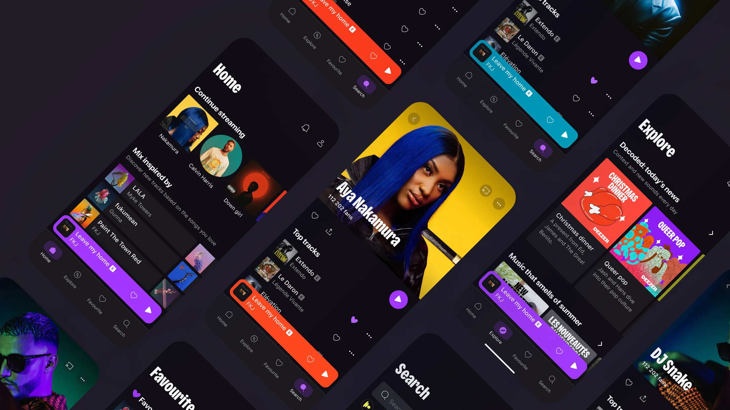
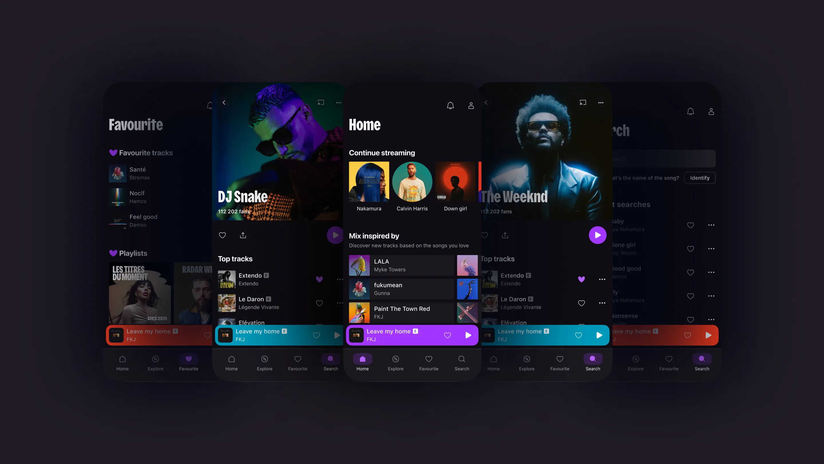
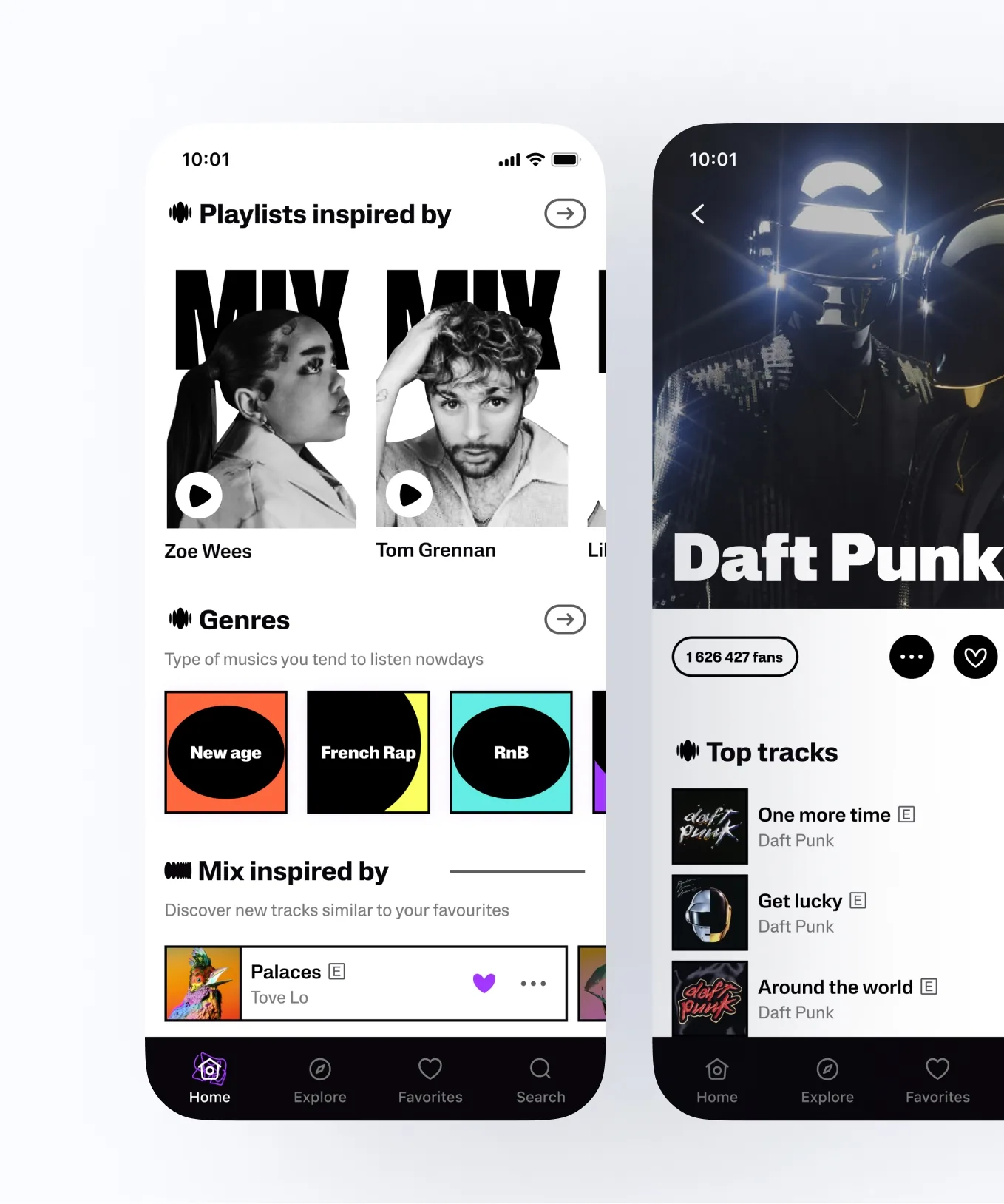
After the user test, we decided to explore a simple, functional style more deeply. It was evident that visual boldness should primarily be derived from the content, with the UI effectively supporting the content through functional display.
Preserving the brand’s identity was crucial, achieved through elements such as font styles and icons. Additionally, we seized this opportunity to remove any unnecessary elements and optimise the overall structure.
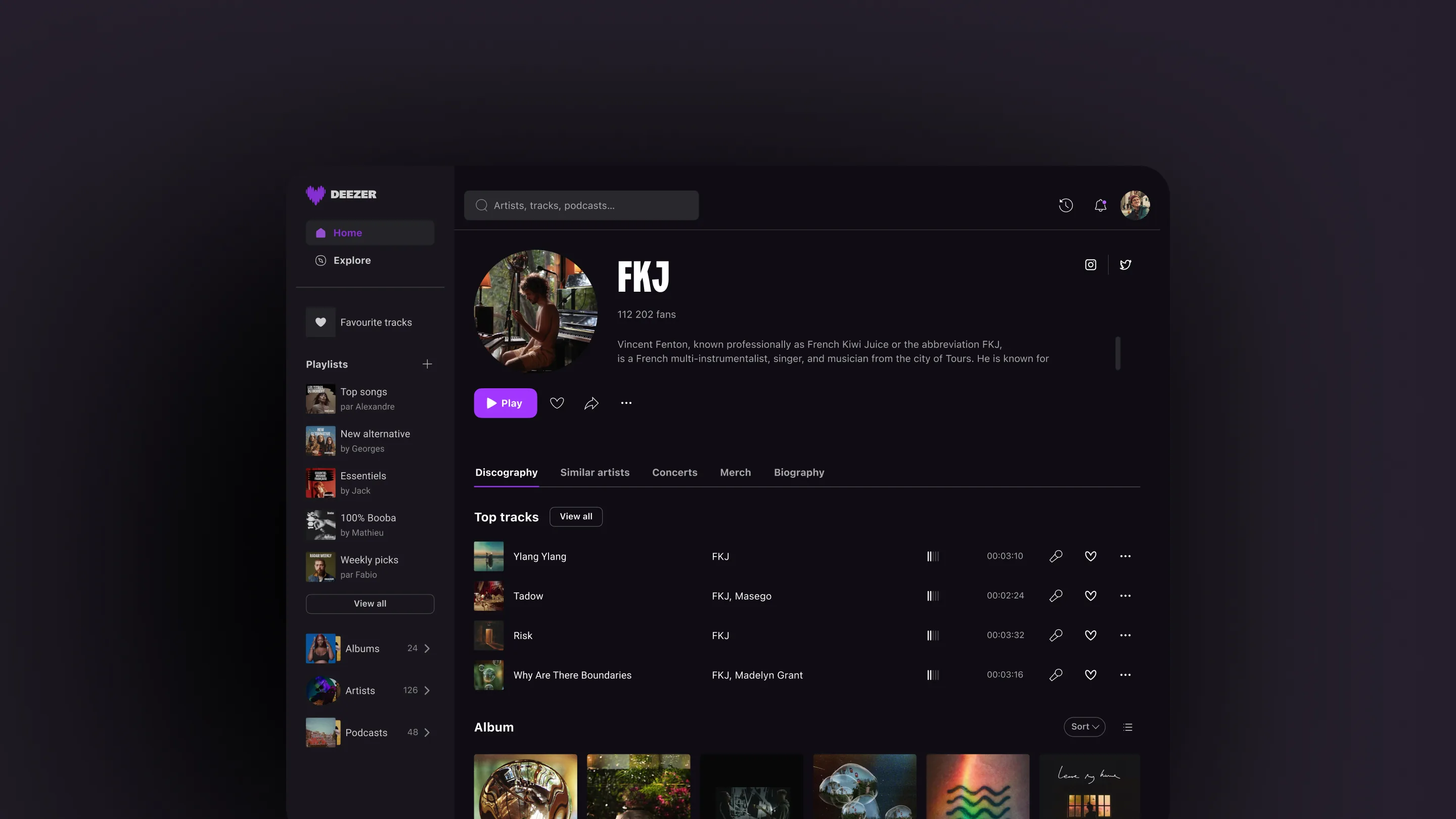
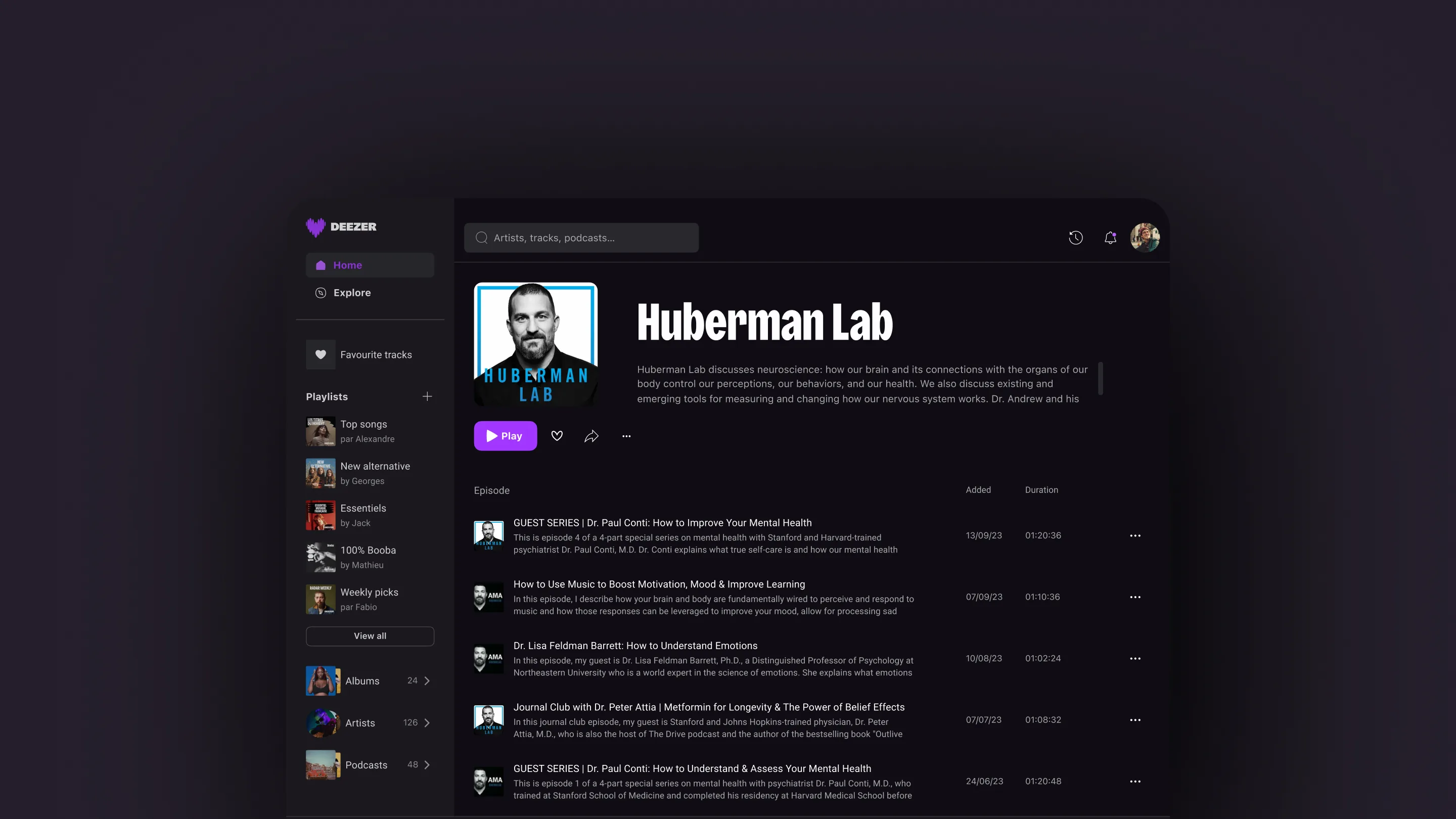
Desktop
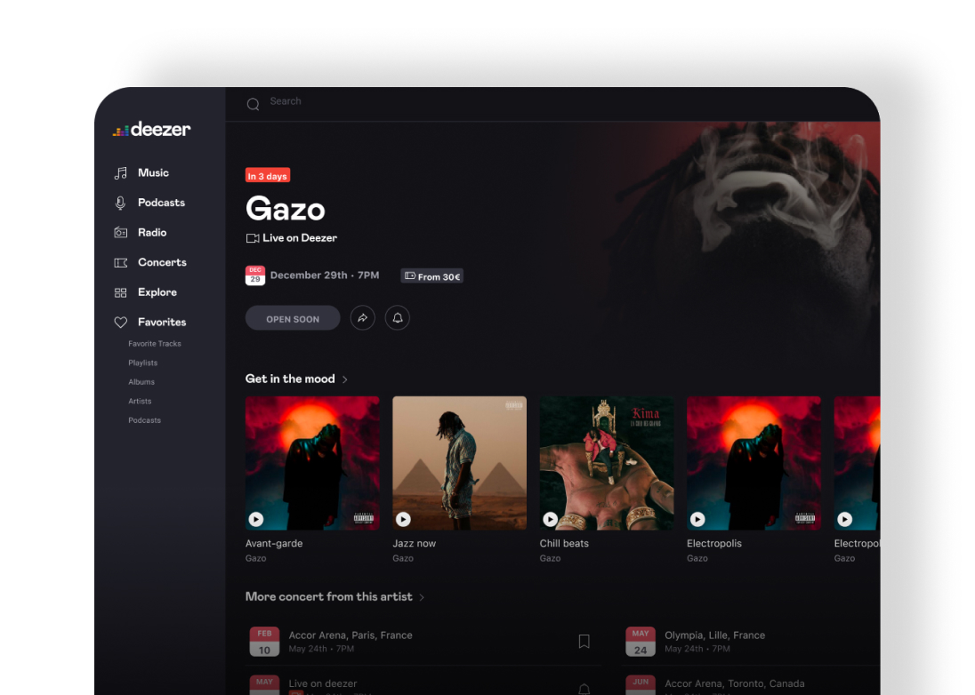
The mobile-centered design process enabled us to establish a foundation for the desktop web app. We maintained the principle of a functional UI with a touch of boldness. We utilised the same design system from the mobile platform wherever possible, adjusting only the responsiveness to provide users with a desktop-friendly environment, allowing seamless browsing on larger screens.
Outcome
Prospect
The revamp launch is planned for the end of 2023, involving the update of old components to the new design system on existing screens. The entire interface will be revamped to align with the new design. Through this overhaul, the company aims to transition away from the old brand image and attract new users from a broader spectrum.
Takeaways
• Testing and validating in the actual market provide undeniable data for the future, indicating what works and what may not work. This data gives us guidelines on how to direct our design work.
• In UI design, the functional aspect is emphasized as the foundation of all. This means that we should avoid overwhelming users with branded elements. We achieve an immersive interface when users feel comfortable using it while still noticing branded elements.