Lululemon PDP Experience
✕

Overview
Context
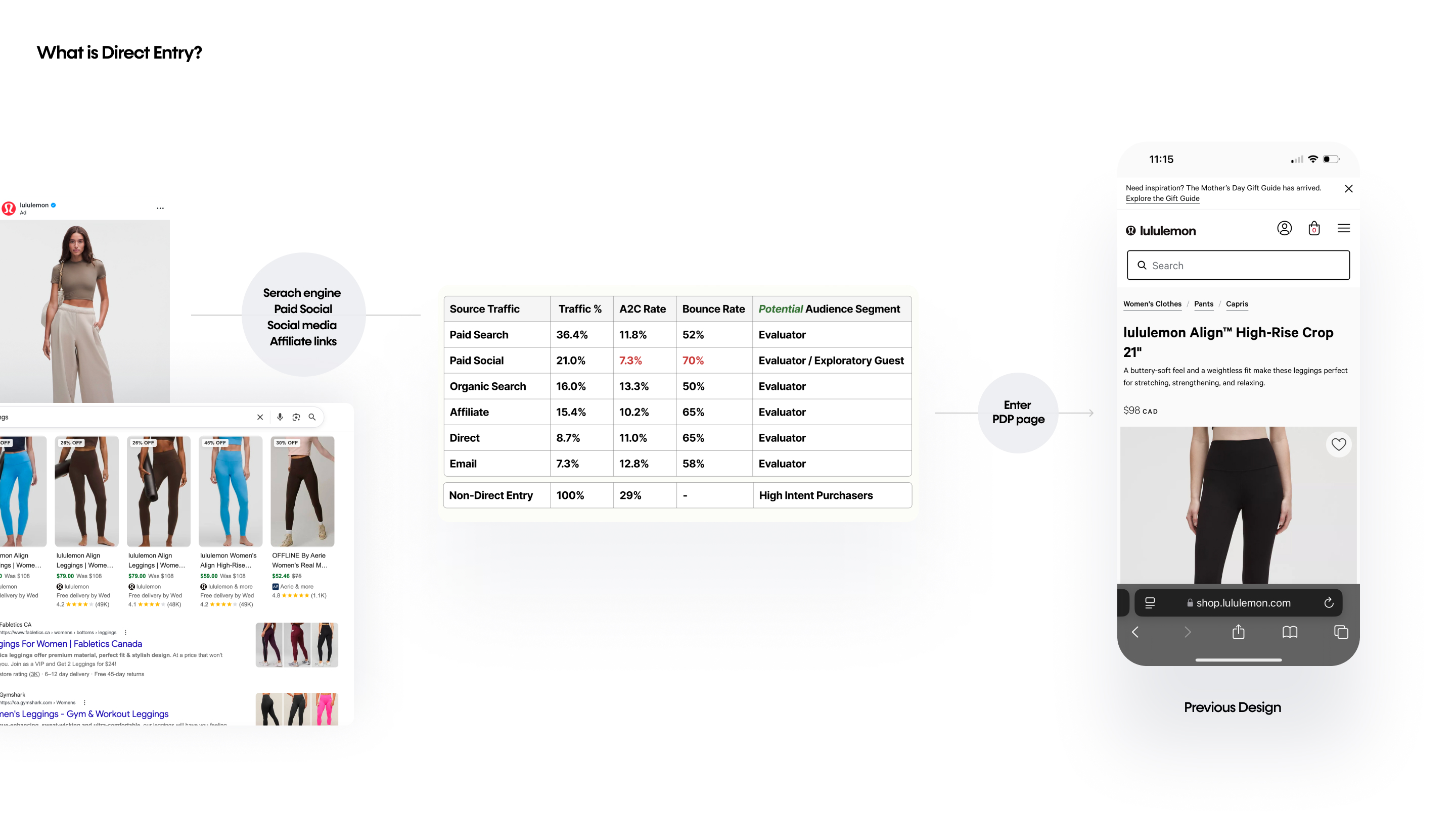
Lululemon invests heavily in paid social, which drives significant traffic to its product detail pages (PDPs). But a large share of that traffic bounces: direct entry customers – visitors who land straight on a PDP from a paid social ad, search, or affiliate link, without passing through the homepage or category pages – were leaving at a rate well above the industry standard for direct entry channels.
The product team set out to find where optimizing this experience could reduce that bounce. The underlying hypothesis was that the PDP simply presented too much at once for a visitor with no upstream context and little patience.
Impact
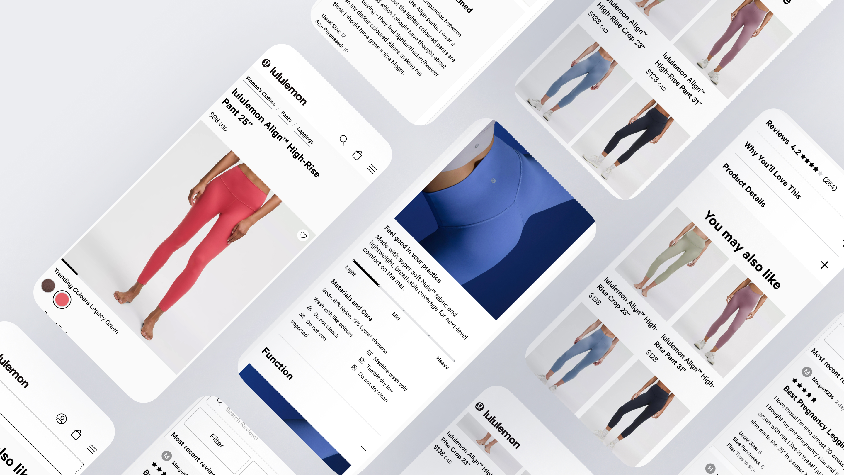
Across a sequence of A/B tests, the redesign made the PDP dramatically leaner – page length down ~65% without losing any core content and moved the metrics that matter for these customers:
- Higher conversion. Surfacing the average star rating upfront lifted Add to Cart, the project’s clearest win and its strongest signal that social proof, not detail, drives these customers.
- Lower bounce. Simplification consistently reduced bounce across tests and markets – customers stayed on the page longer and engaged more with product recommendations.
- Two revenue-positive wins. The reviews and recommendation changes together represented an estimated ~$10M+ in projected annual revenue impact.
- A sharper understanding of the customer. One test came back inconclusive and that was its own result: it showed simplification can retain customers while costing conversion if pushed too far, especially for mobile and returning customers who still need detail to feel confident.
Contribution
Product designer on the Landing Experience project, contributing across planning, research application, and design:
- Project planning and management: led jointly with the product manager as a two-person team lead, sharing responsibility for scope, sequencing, and driving the work forward.
- Research: collaborated with the UX research team to analyze the direct-entry findings in greater depth and translate them into design and experimentation decisions.
- Design: owned the full design execution independently, while facilitating design-team workshops to pressure-test direction and pull in perspectives from adjacent teams working in different scopes – SEO, Homepage, and Recommendations among them so the PDP changes held up against how those teams approached the same customers.
Goal
Problem to solve
How can we help direct entry customers confidently find the information they need without feeling overwhelmed?
User Need
Assess the product quickly with minimal scrolling. Get an immediate, trustworthy confidence signal (social proof). Browse related products without being pushed. Research support: unanimous reliance on reviews, strong preference for imagery, and a documented quick-scan pattern.
Business Need
Lower the direct-entry bounce rate (the north-star metric for the simplification test), and lift Add to Cart and order conversion while holding or improving performance for non-direct-entry customers, several of whom benefited from the same changes.
Analysis
Target Audience
Two customer types land on a PDP. Non direct entry customers arrive with intent, having browsed through the homepage or category pages. Direct entry customers land straight on the PDP from search, social, or affiliate links – no upstream context, more impatient, closer to window-shoppers.
To understand this second group specifically, the research recruited people who matched their exact behaviour: 20 participants aged 25 to 54, across the United States and Canada, all chosen because they had recently purchased through a paid social media ad on Meta, TikTok, or Snapchat.
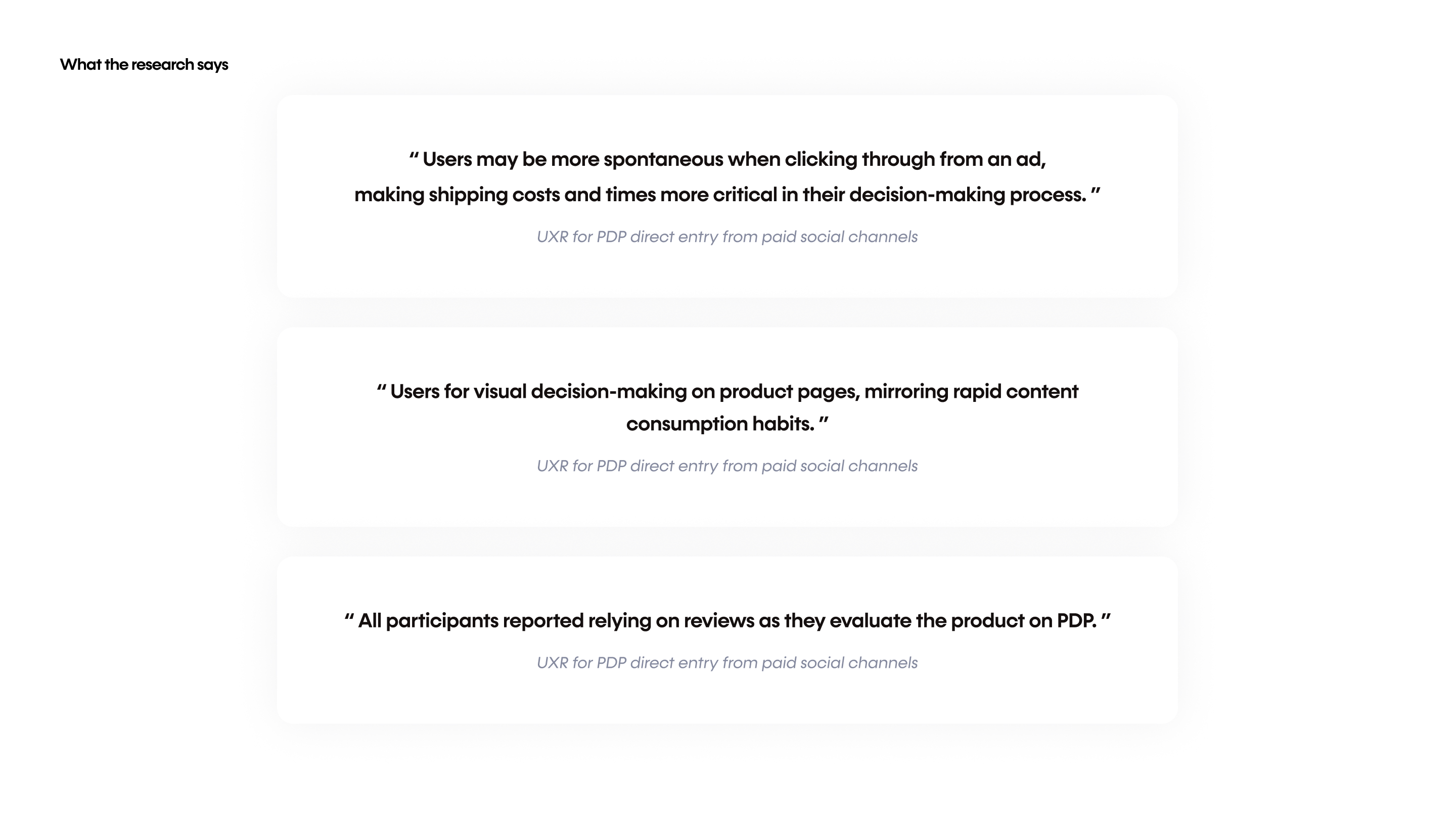
That made the sample a close mirror of the direct entry customer the project set out to serve. The research profiled them as quick-scanners who lean on social proof to decide. Every participant relied on reviews when evaluating a product: 14 of the 20 named product imagery as one of the most critical things they looked for and 12 of the 20 pointed to price, size, and shipping as key information once they landed on the page.
Previous Experience
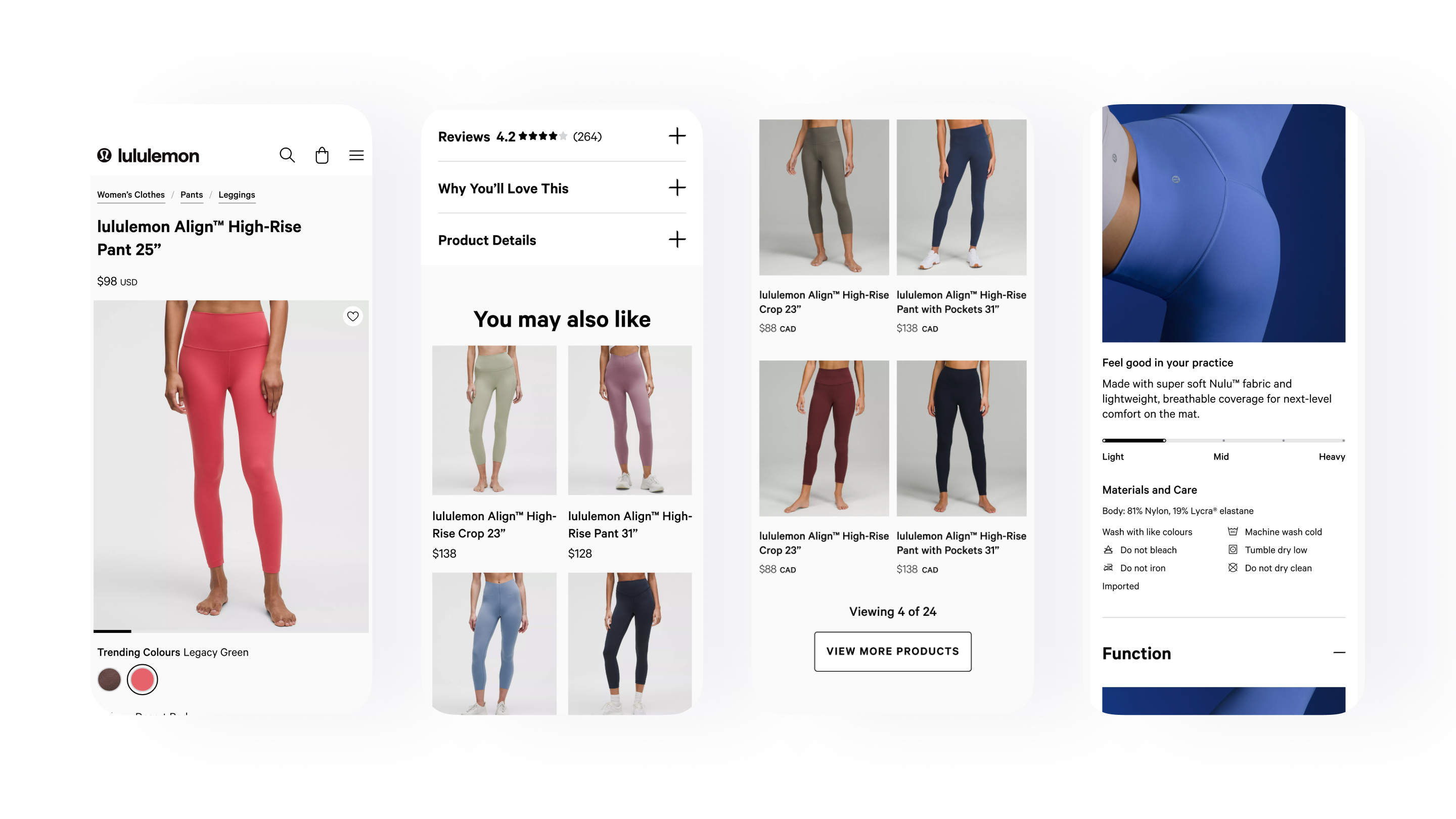
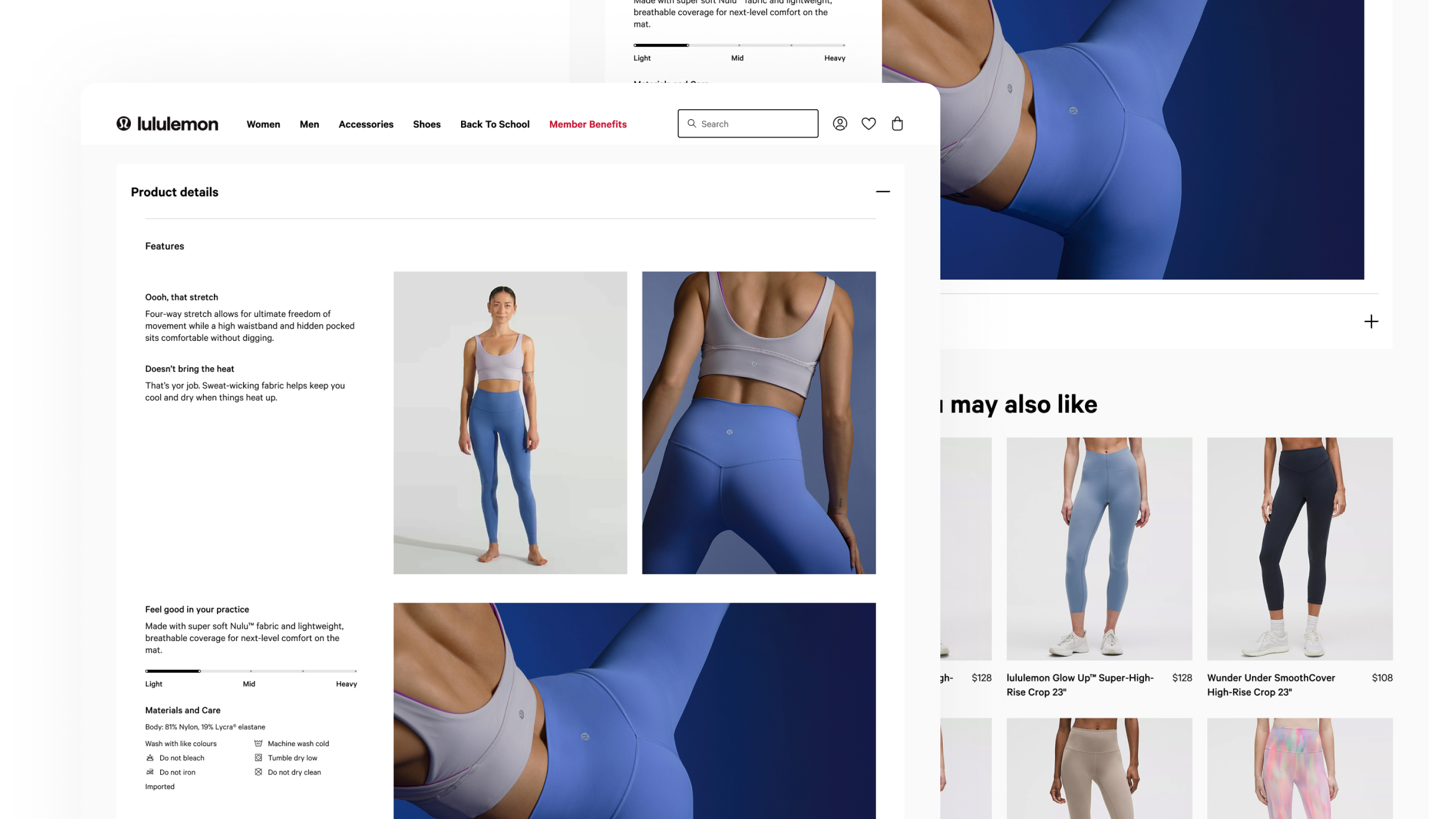
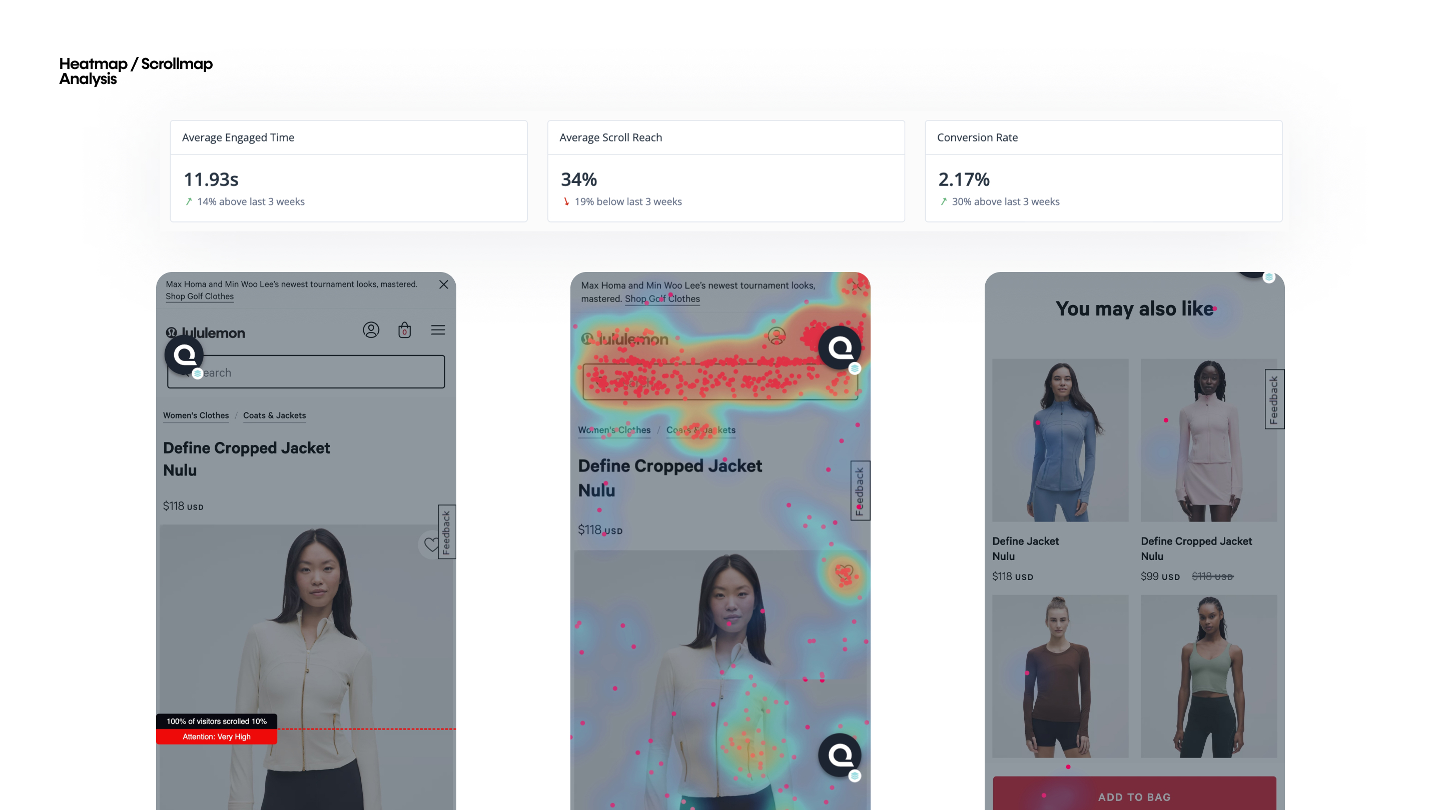
Behaviourally, the mismatch was clear: 55% of direct entry customers left without interacting at all and with only ~34% average scroll depth, many never even reached the full product gallery. These are quick-scanners – they assess a page fast and decide fast and the PDP wasn’t built for that. It was long, and it led with dense product detail, which pushed the things that could actually hold a scanner’s attention far down the page.
The research pinpointed why. Half the participants (10 of 20) didn’t scroll or only skimmed below the fold, meaning anything not immediately visible went unseen. This created a hierarchy problem on two fronts. First, social proof: although every participant relied on reviews to make a decision, 5 of 20 said the reviews sat too far down to reach easily. Second, discovery: the long detail sections also buried the product recommendations – the very content that helps a curious customer see what alternatives they might like, and the breadth of what lululemon offers. And the recommendations that customers did find felt heavy rather than helpful, with too many overlapping types reading as repetitive.
However, customers didn’t want fewer recommendations. They wanted them surfaced in a way that fit how fast they move. Together these pointed to a single root cause: a long, dense page that buried the very things – social proof and product discovery that these fast-moving customers needed most.
Process
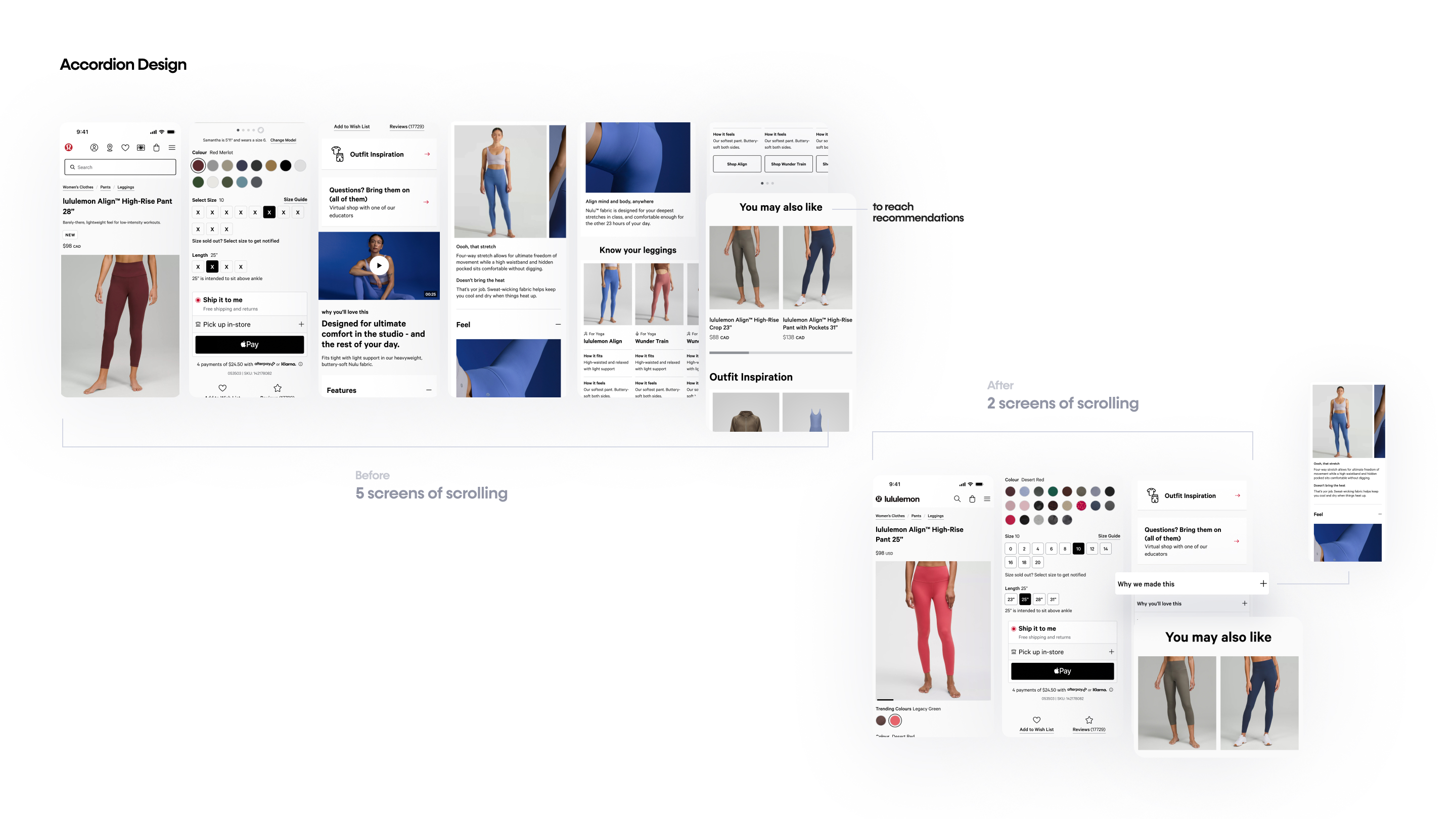
ABT 1 – Accordion
Product detail was collapsed into accordions instead of expanding below the fold and the Reviews and Wishlist links beneath Add to Cart were removed – opening an accordion showed content identical to control. Bounce dropped (US –0.64%, CA –0.90%) and recommendation engagement rose sharply (US +22.08%, CA +34.15%) but Add to Cart fell in the US (–0.68%) and order conversion was directionally negative driven by mobile and returning customers.
Simplification retained customers and pushed them into product exploration, but on its own it moved them to wander, not buy – a page stripped too far under-served returning and mobile customers who wanted more detail to feel confident.
Process
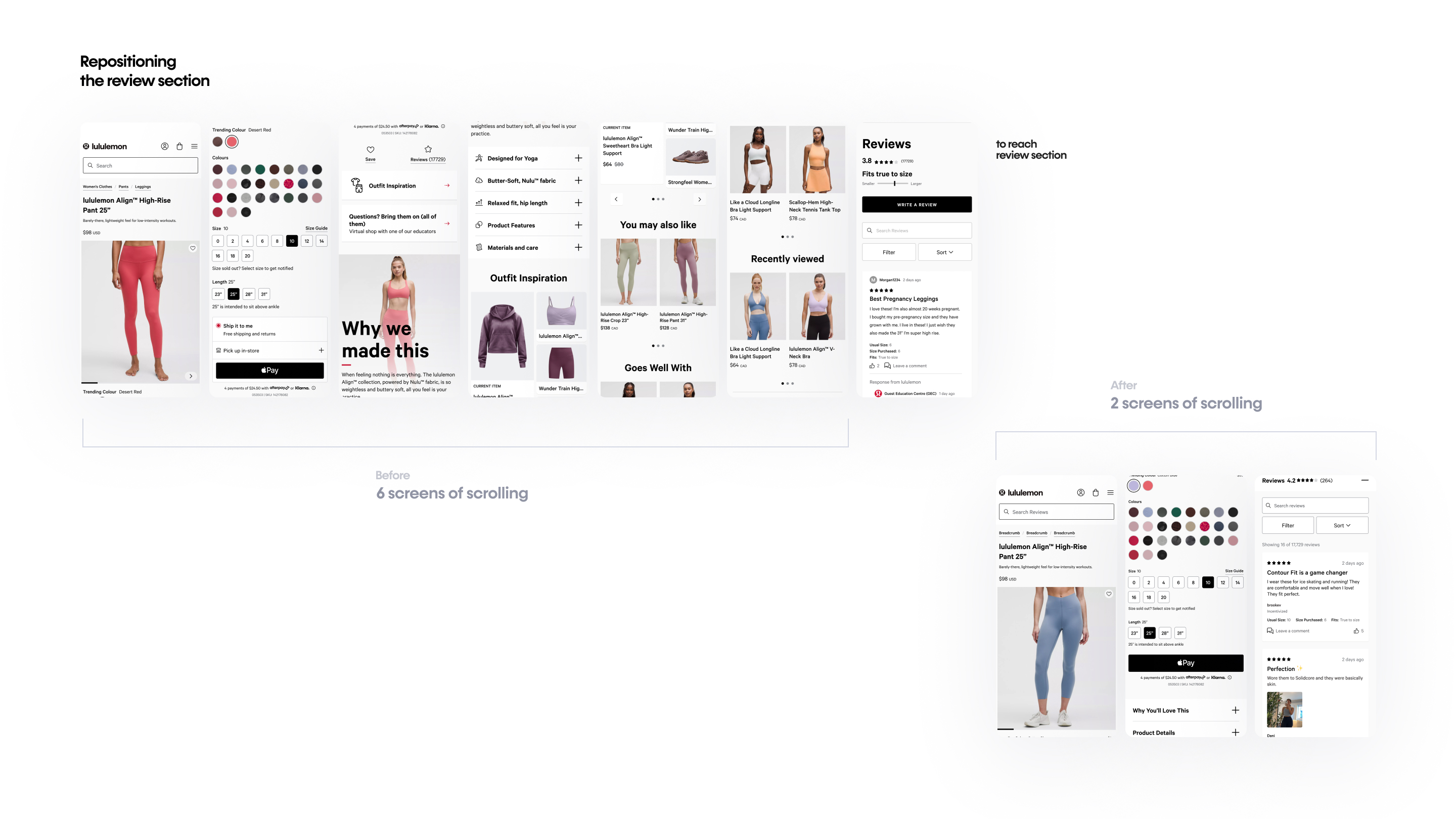
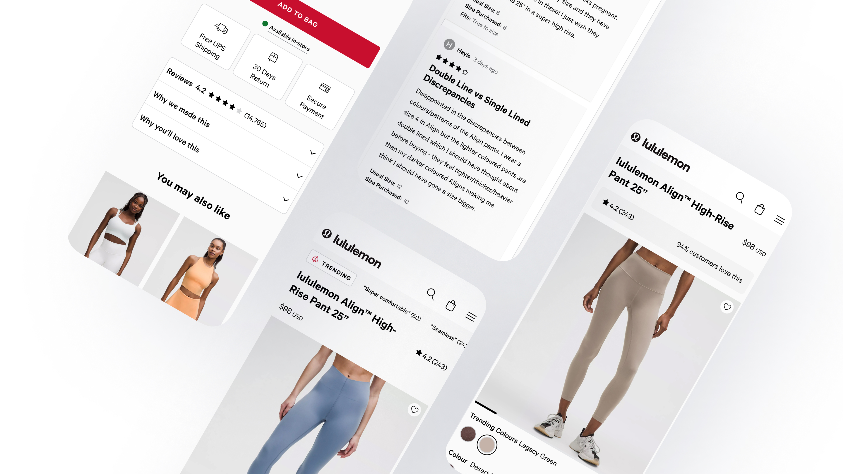
ABT 2 – Reviews in accordion
With detail collapsed, the average star rating was surfaced in the closed reviews accordion so customers could gauge product quality without opening the section. Result was a clear win. Add to Cart +0.46% (conclusive), bounce –0.38%, reviews engagers +2.84%, recommendations CTR +29.62%, ~$5.16M projected. The sharper insight: direct entry customers especially on mobile engaged less with individual reviews when the average was already visible, confirming a quick-scan mindset where the aggregate score does the work. Desktop customers were more likely to click in and read. Social proof functioned as the trigger that moved customers forward.
Process
ABT 3 – Expansive Recommendation
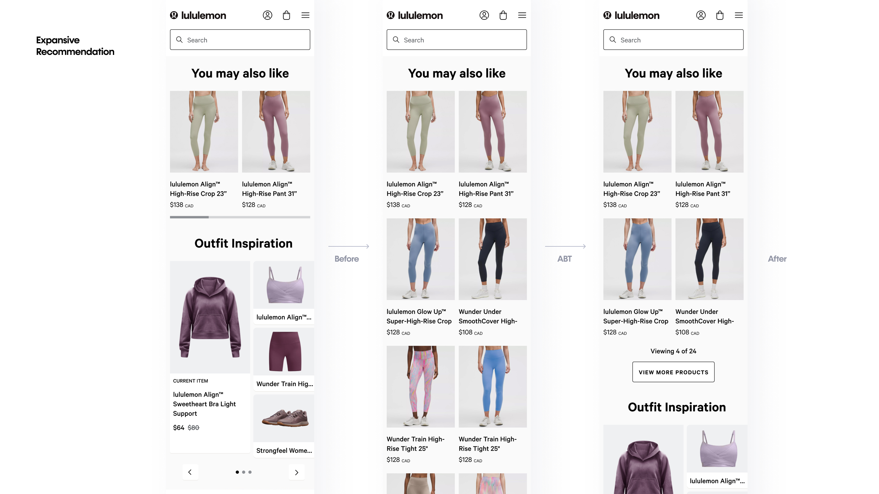
This ran in two parts. First, a recommendation section was expanded from a horizontal carousel to a grid to test whether showing more recommendations helped. Result: win, carried by Canada (CA order conversion +1.56%, US inconclusive but bounce –0.57% and recommendation engagement +30.21%) mobile time-to-first-tap dropped from ~33s to ~32s, i.e. customers engaged faster). More recommendations increased retention and engagement but grid view adds content, which reintroduces the cognitive-load problem simplification was solving. That tension defined the follow-on expansive / “View More” design: deliver the depth of a grid while keeping the initial view light, revealing more on demand. A critical guardrail came from the reviews test and a prior test: recommendations pushed too aggressively – directly below the buy stack (the fold) hurt Add to Cart for direct entry customers even as engagement rose. Placement and timing determine whether recommendations help or distract.
Process
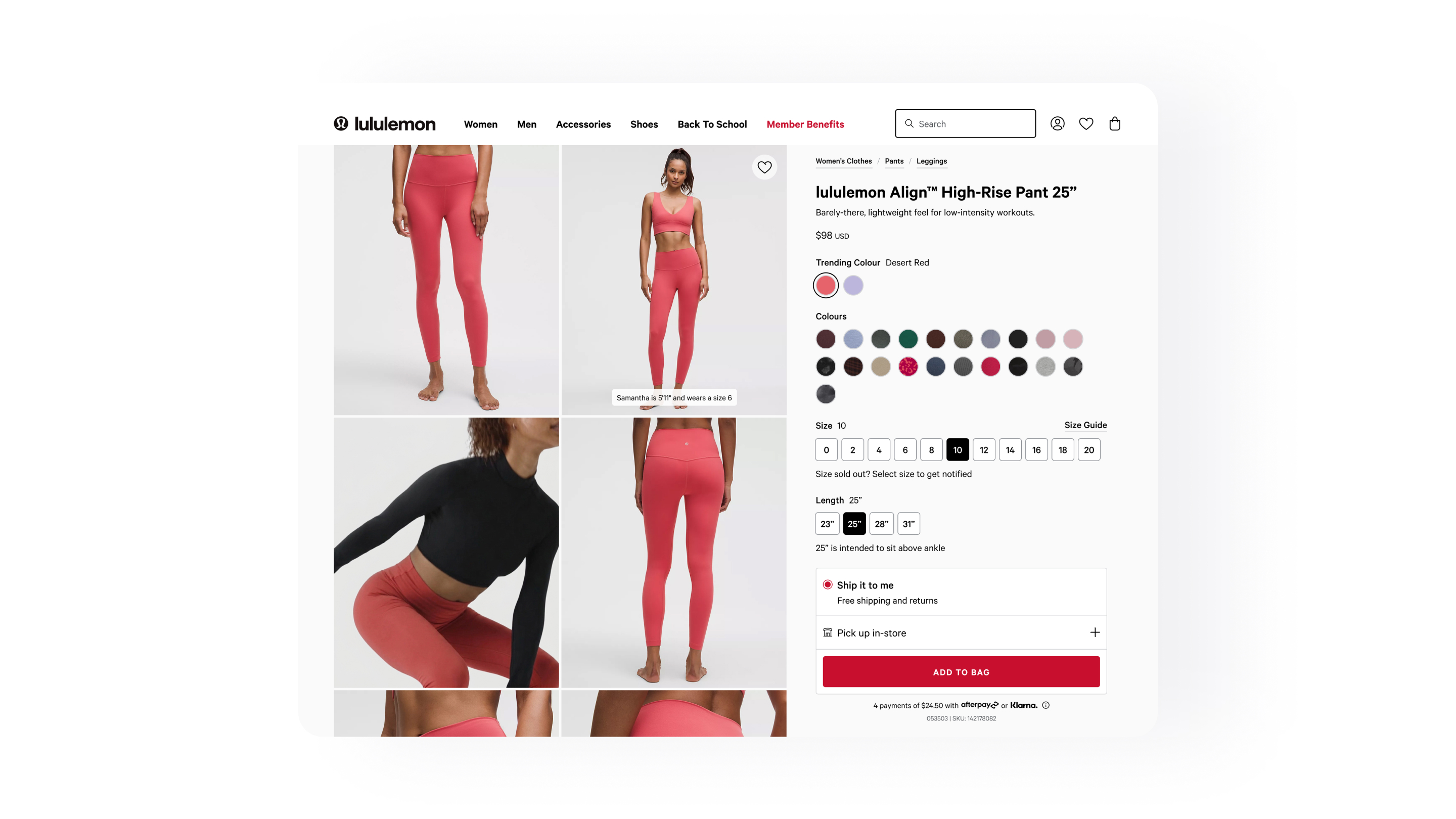
Refinement – Simplified CTA
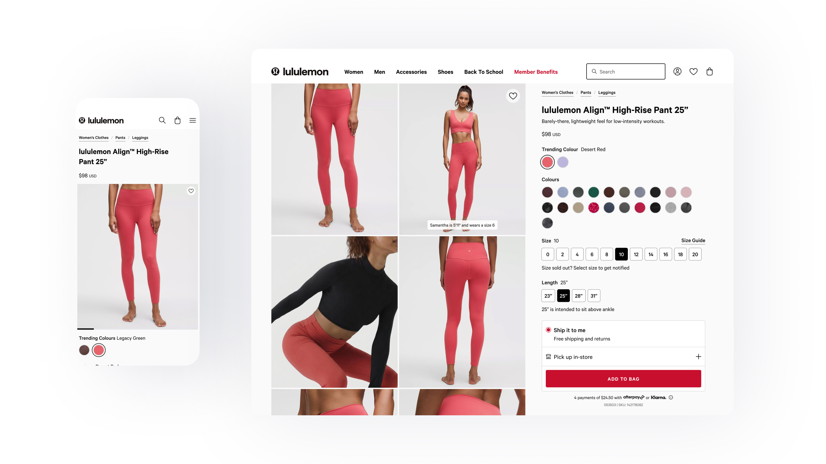
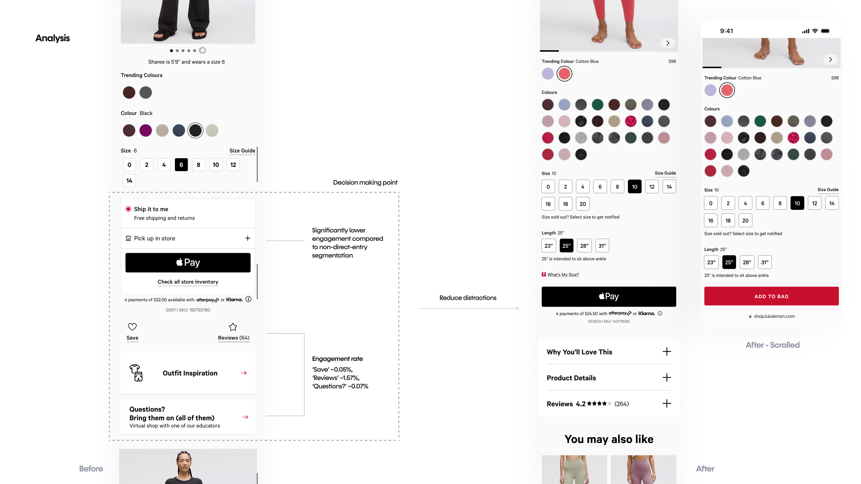
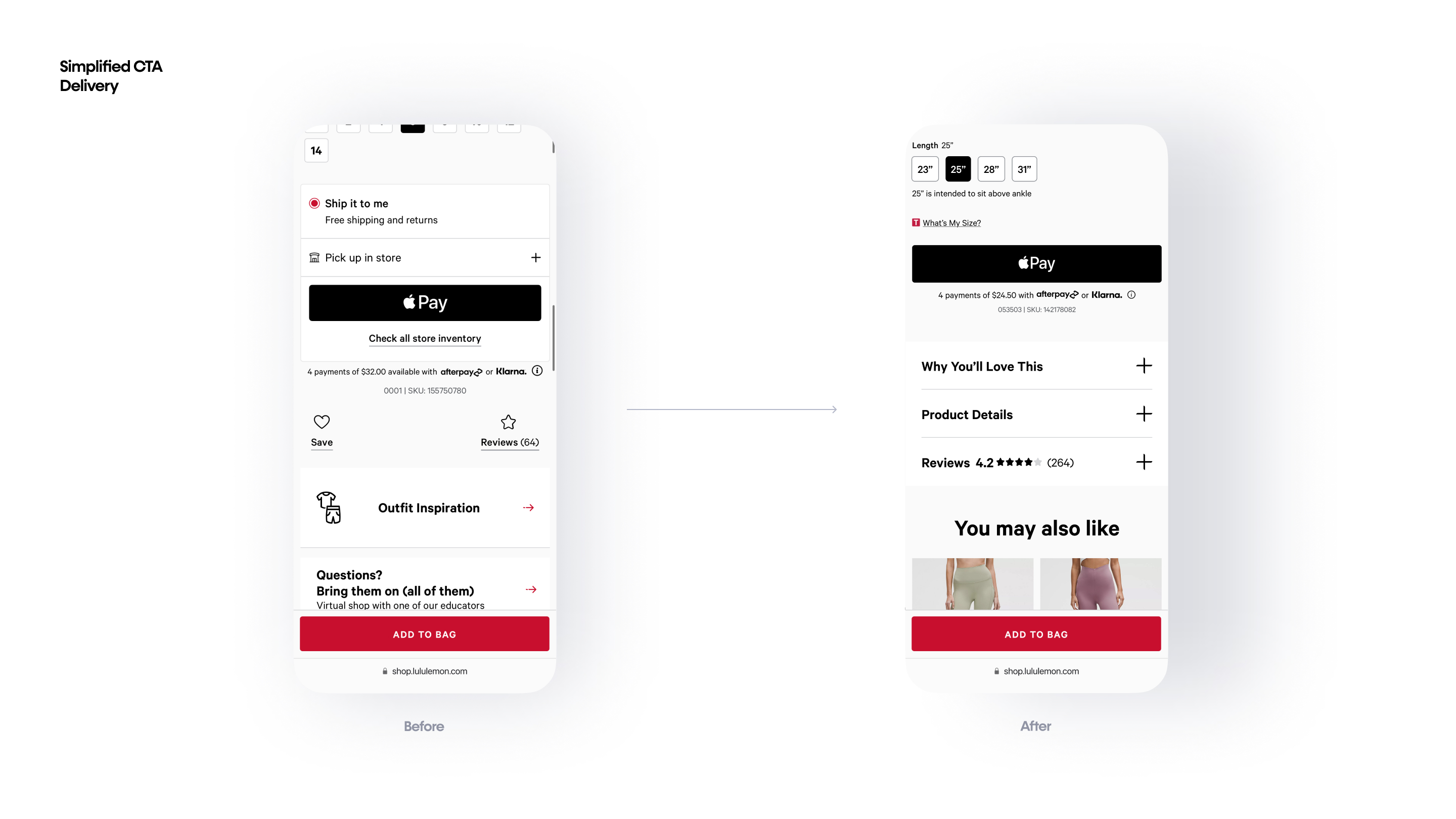
This step targets the “buy stack” – the decision point on the page where a customer chooses to purchase and selects their payment and delivery options (ship to me, pick up in store, and so on). It’s the moment of commitment and in the previous experience it was crowded with distractions.
Two problems stood out for direct entry customers specifically. First, some options in the buy stack simply didn’t matter to them: pick-up-in-store and physical inventory checks, for instance, were engaged far less by direct entry customers than by non-direct-entry customers – they’re arriving cold from an ad, not planning a store trip. Second, the elements stacked below the buy stack – the Save icon, the entry point to reviews, the help link, outfit inspiration – were severely underperforming, with engagement roughly between 0.05% and 1.57%. The issue was placement, not relevance. Some of these elements are genuinely needed – reviews, for example, were one of the strongest factors customers relied on before deciding, according to the research. But sitting off-context, they were both unused and a distraction, cluttering the exact moment a customer was trying to commit.
So the plan simplifies the buy stack for this segment: remove the low-engagement options that don’t serve direct entry customers, and relocate the elements that do matter to where they’ll actually be used. Give them the cleanest possible checkout – room to breathe at the moment they decide.
Process
Refinement – Simplified Navigation
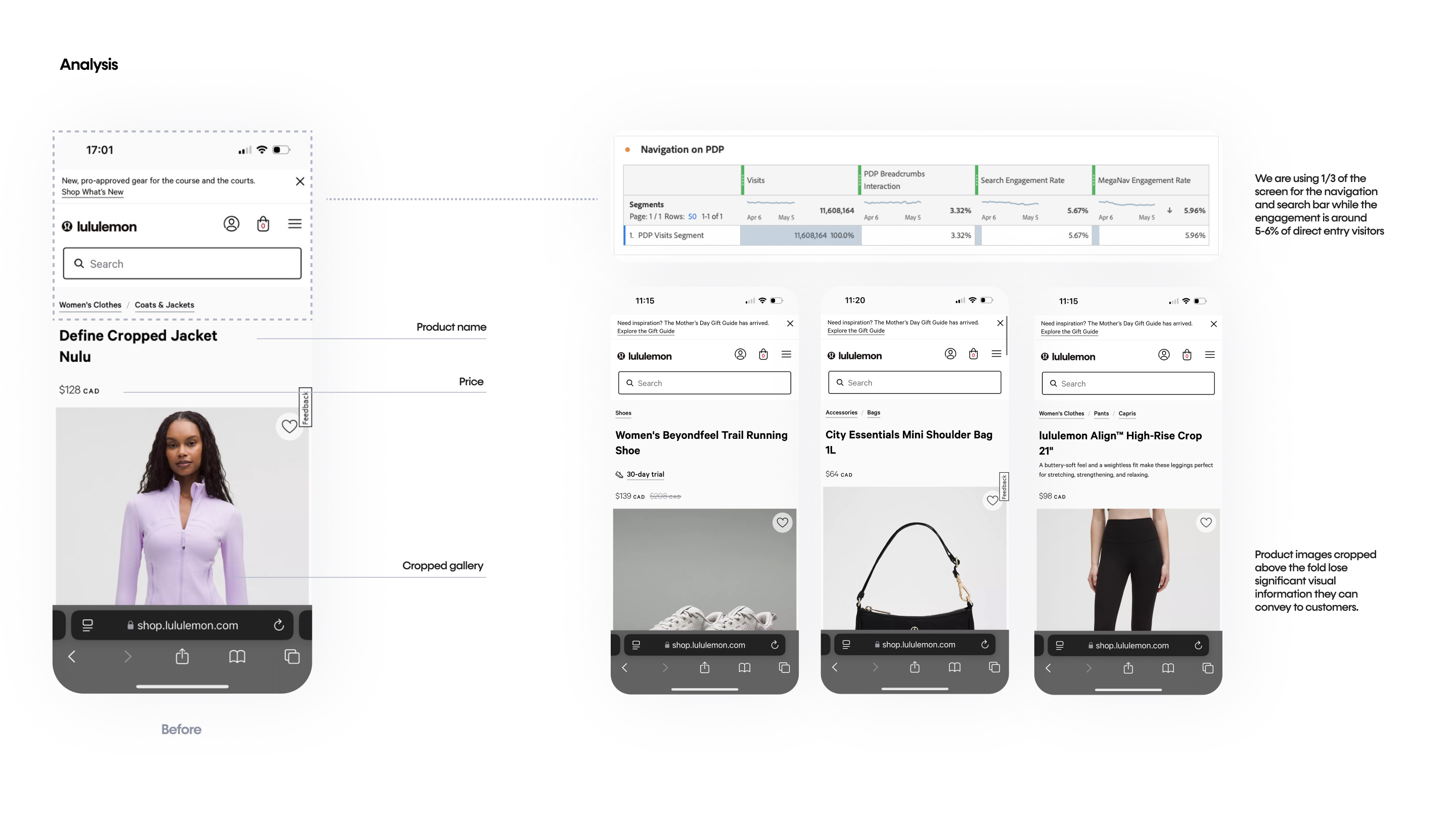
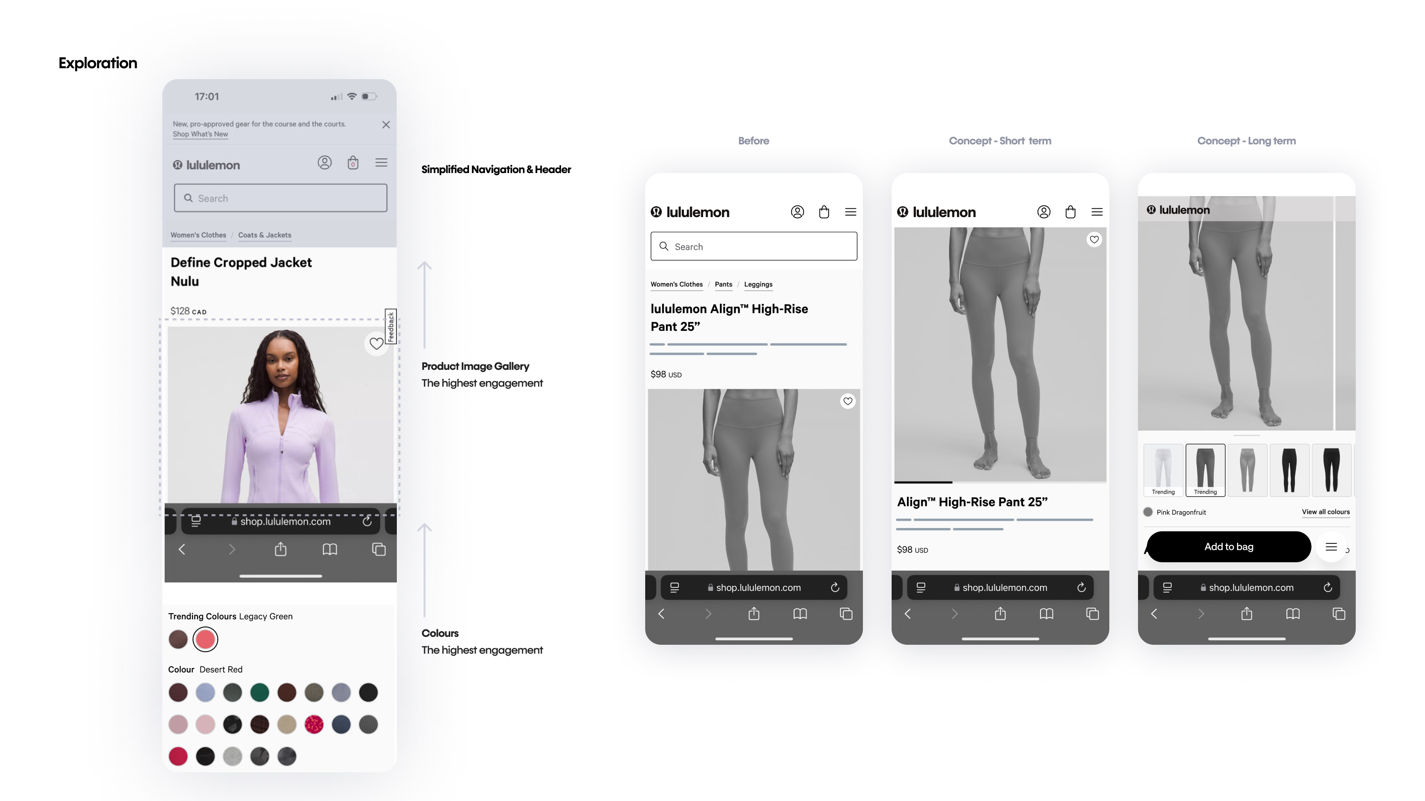
The data was clear on what direct entry customers engage with most: the product image gallery and the colour options. Yet the moment they landed, the experience worked against that – the product image was truncated, cutting off exactly the visual information these customers came for. For customers who decide this fast, a truncated product image withholds the key information at exactly the point they’re forming a first impression.
Looking closely at the layout showed why. The navigation and header alone took up roughly a third of the screen – while engagement with those elements sat at just 5–6%. It was a clear misallocation: the least-used part of the page was crowding out the most-wanted part. And it reinforced the core insight about this segment – direct entry customers aren’t searchers, they’re viewers. Window shoppers. They want to see, not navigate.
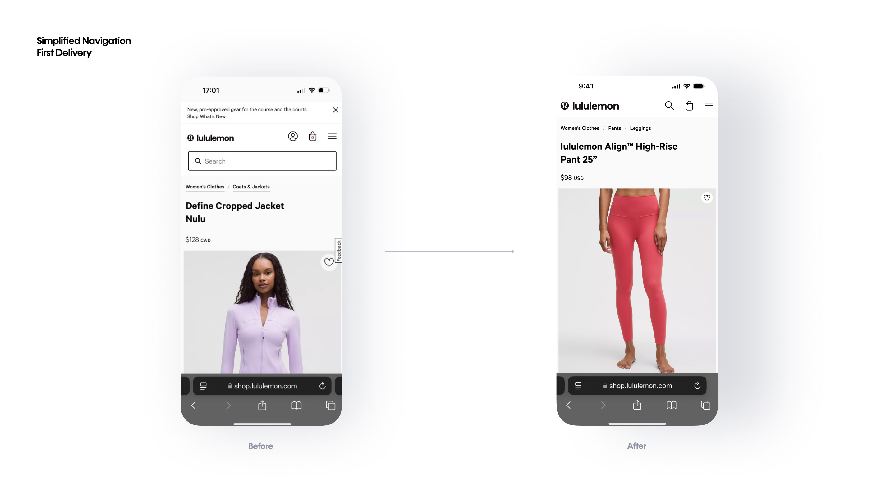
So the plan reclaims that space for what matters. We simplify the navigation – replacing “My Account” (which direct entry customers are far less likely to have or use) with a search icon and removing the persistent search bar. We limit the promotional banner pushing down from the top. Together, this lets the product image render at full size with no truncation and brings the colour options above the fold, or within a minimal scroll so the first thing a customer sees is the thing they actually came to assess.
Outcome
Wins
A PDP ~65% shorter with all core content intact, two conclusive wins (reviews-in-accordion on Add to Cart, Recommendation grid on Canadian order conversion), and a repeatable principle validated across tests: simplification is the enabler, not the win itself. The win comes from what you surface in the space it creates. Three learnings anchored the work: reduce cognitive load, prioritize key info (social proof first), and encourage discovery only where placement feels organic.
Prospects
The wins opened the follow-on roadmap: the expansive / “View More” recommendation design, buy-stack and navigation simplification (above), category navigation from the PDP, stronger trust signals, and exploring the potential of the social aspect. A broader thread is segmenting and testing direct entry customers more precisely—designing for quick-scan behaviour and revisiting the recommendation algorithm now that recommendations sit more prominently.
Takeaways
Using data that proves what’s effective as inspiration for a new feature
“Less is more” is easy to say and hard to earn. This project showed that simplification only works when you know what you’re clearing space for – otherwise you might be just removing, not prioritizing. For direct entry customers, the thing worth surfacing was trust: an upfront rating did more than a page full of specifications ever could. Simplification’s value is that it lets the most decision-relevant content come forward.
Context is part of the customer
We tend to design for “the lululemon customer” as if that’s one person. This project was a reminder that who someone is on our page is shaped by where they were the moment before and that upstream context changes everything.
A direct entry customer and an intentional customer can land on the identical page and behave like two different people. One arrived from a scroll with no plan and no patience, carrying the fast, visual, low-commitment rhythm of a social feed. The other came in searching, ready to buy. Same page, opposite mindsets and the design that serves one can actively cost the other.
The real unit of design wasn’t “the user.” It was the user plus the context they came from. Knowing that a customer arrived from a paid social ad, not just that they are on a PDP, is what let us design for how they actually move:
quick to scan, curious to explore, needing a trust signal rather than a spec sheet. These distinctions feel subtle, easy to flatten into an average. But the average is where the real behavior disappears and with it, the chance to design something that actually fits.